Chart anatomy
Understanding the principles of chart anatomy is important to learning how the different parts of Salt charts work.
This will include:
- Axis title
- Axis label
- Legend
- Grid lines

The chart’s title should summarize the data on display. If revealing key findings, supporting an argument, story or message, capture it in the title.
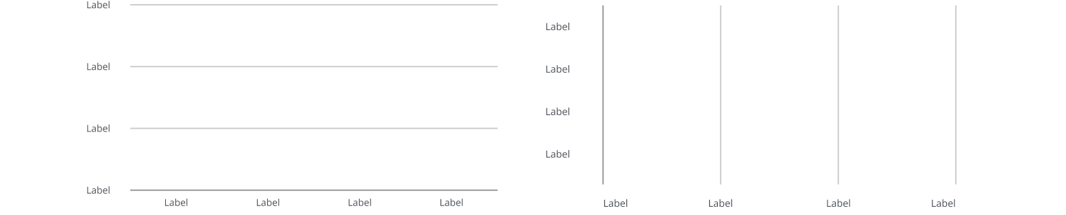
Horizontal (x) and vertical (y) axes display two variables and include their range, scale and units of measurement. Axes are used in two-dimensional charts, with each axis representing a measure of data.
The axis title should summarize the variables shown. Consider including the unit of measurement in the title to avoid repeating it on the axis labels, e.g., M for millions, or for percentages.
Label each axis clearly and concisely to reduce visual clutter. Keep labels horizontal, not vertical or at an angle, to maintain readability.

Grid lines are vertical or horizontal lines that divide a chart, helping users read data values and make visual comparisons.
When possible, keep the number of grid lines to a minimum to avoid cluttering your chart. Some chart types, such as bubble and scatter charts, may require both horizontal and vertical grid lines to support accurate data interpretation.
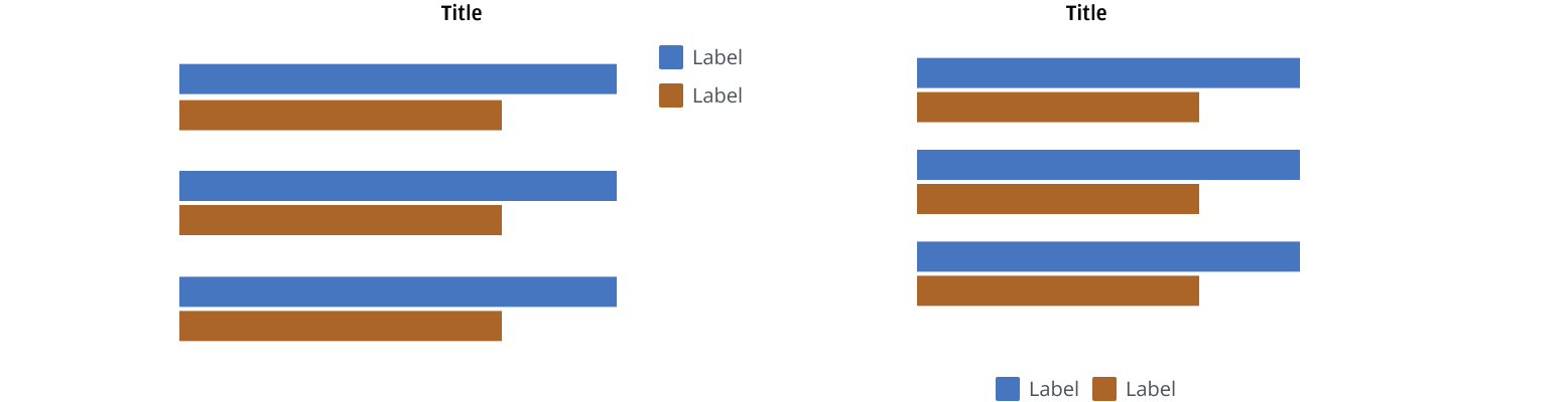
Legends are optional elements in a chart that use symbols and labels to identify each data series and its corresponding segment within the chart.
Certain chart types, such as scatter and bubble charts, use legend symbols that visually match the representation of the data points within the chart. This is a design choice that enhances clarity and makes the chart easier to interpret.

Position your legend to the right or below the chart where it’s most appropriate in your layout, considering the number of legend items. Use a vertical position when displaying many legend items, if space allows.
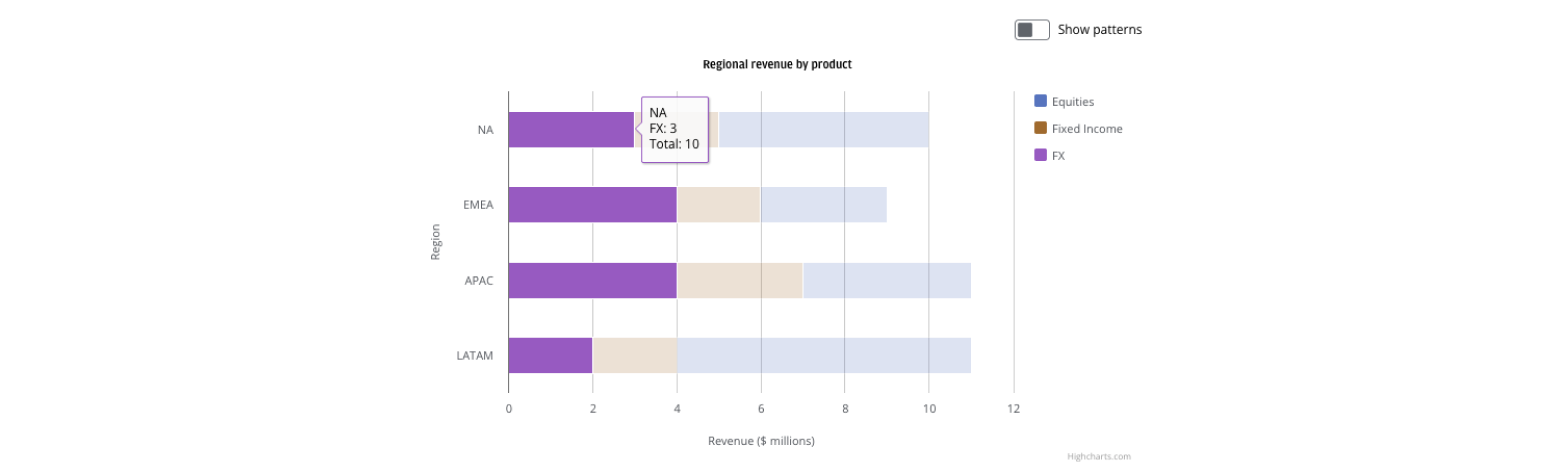
Users can select or click on a legend item to show or hide the related data series, isolating data points that are important to them.

When a user hovers over a data series, that series is highlighted with a tooltip. Simultaneously, other data series are dimmed in opacity. Tooltips are a flexible way to communicate details within a chart, such as highlighting specific calculations or data points. Visually, the tooltip’s border color matches the color of the selected data series, helping users quickly associate the information with the relevant chart element.
We appreciate your thoughts and feedback on any content in the Salt foundations. Please contact us if you have any comments or questions.