Density
Density relates to the amount of content that can fit on a screen based on the size and spacing of components. When building a product with Salt, select the density that best suits your use case. All components, spacing, and typographic elements will align and remain proportionate regardless of the density you choose.
Read about implementing density in code on the SaltProvider documentation.
Desktop densities are tailored for different types of applications, from complex data platforms to content-focused interfaces. Select the density that best fits your app or websites complexity and user needs.
| Densities | Use case |
|---|---|
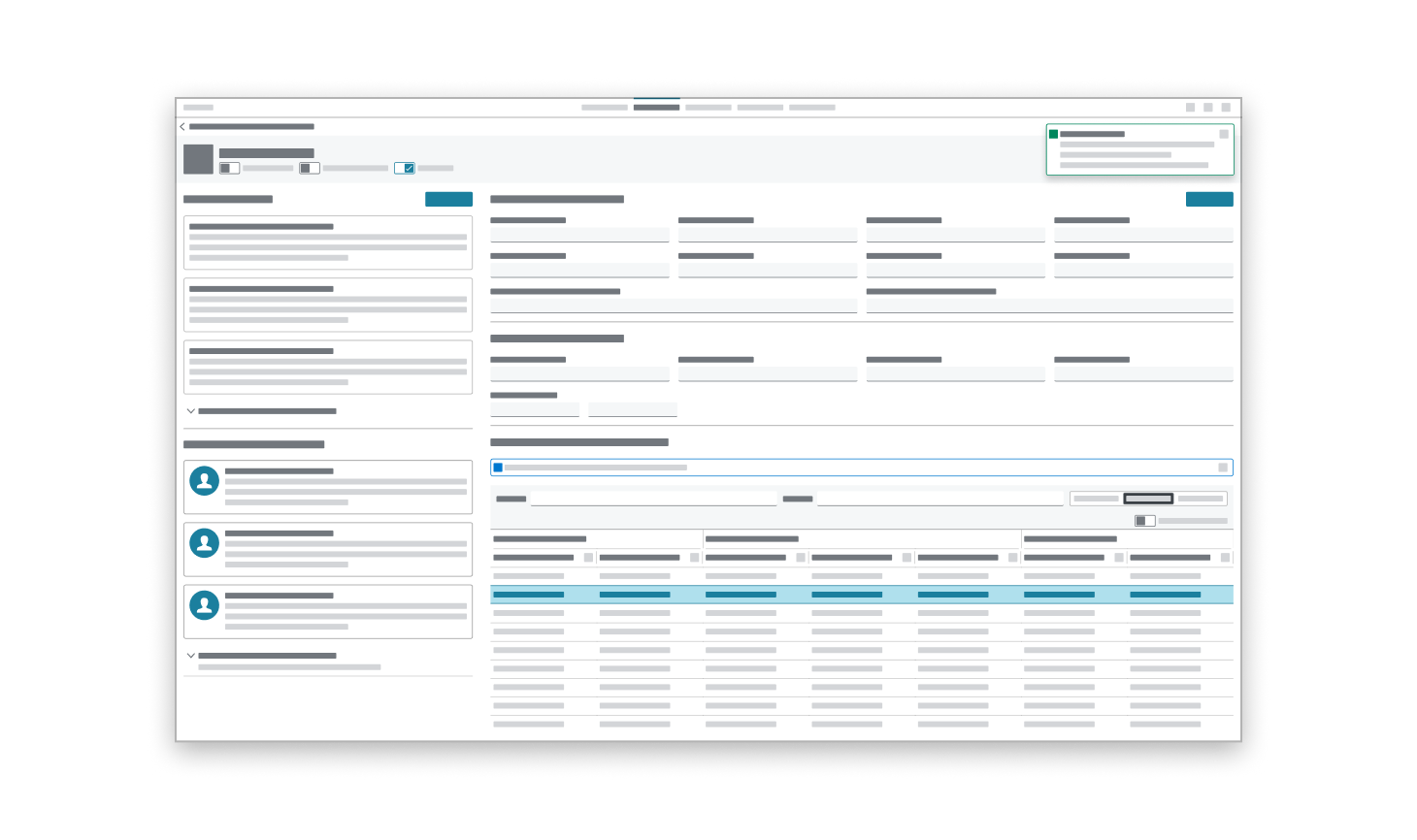
| High | Ideal for data-heavy or complex applications, such as trading platforms, where maximum information needs to be displayed efficiently. |
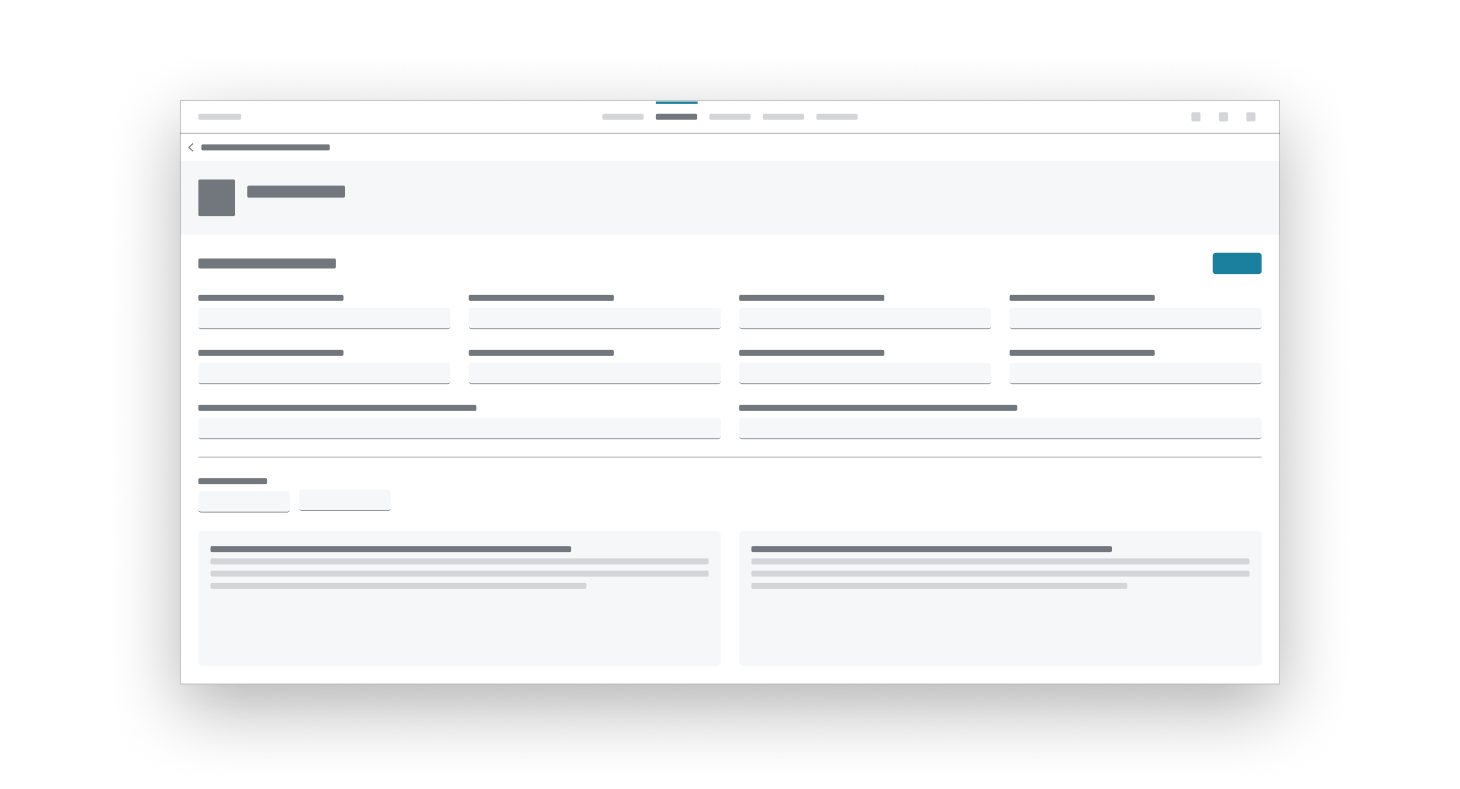
| Medium | Suited for standard applications and websites, providing a balanced default density for most use cases. |
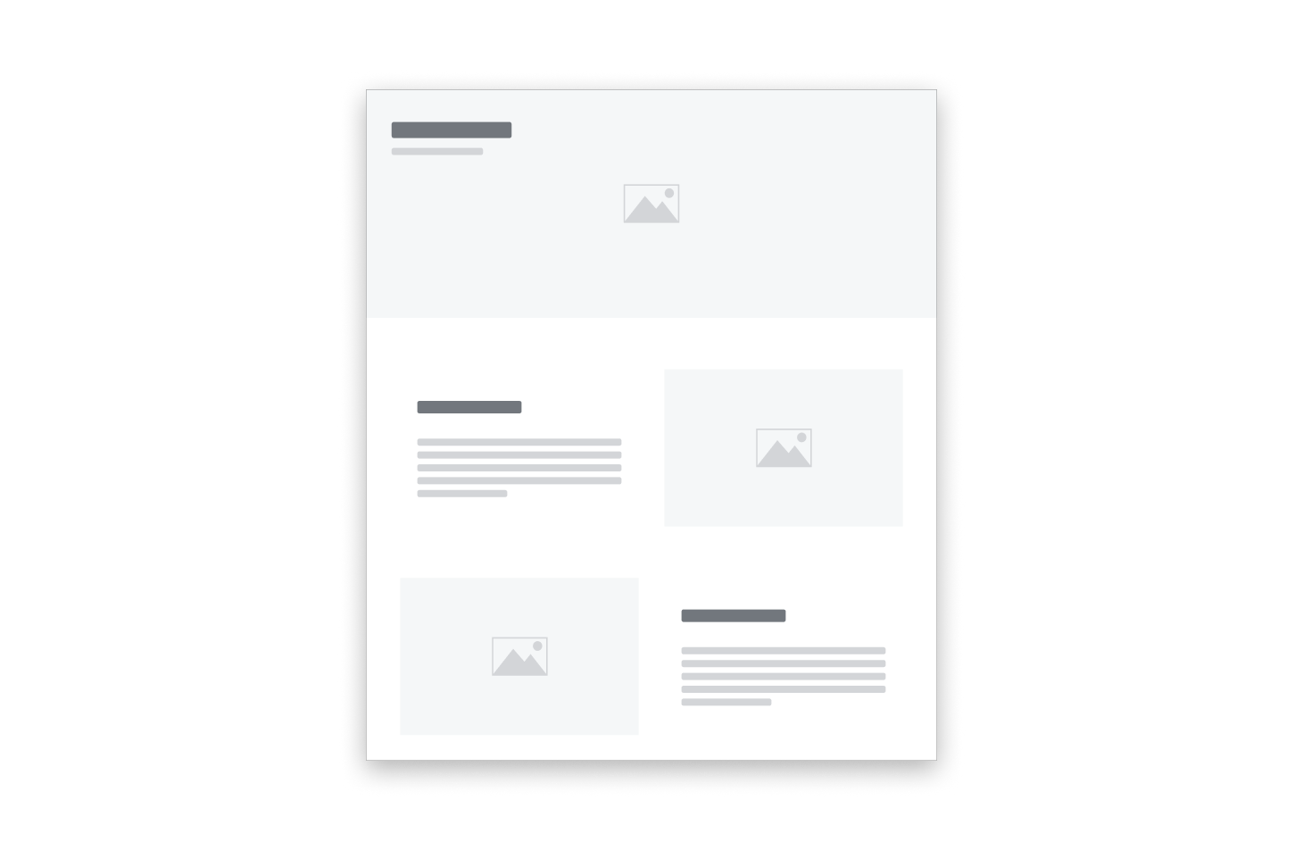
| Low | Best for data-light or content-focused interfaces, such as marketing and communications, where a spacious layout enhances readability. |

High density is suitable for specialized use cases. It’s ideal for data-dense applications where screen real estate is maximized, or for applications frequently used by experienced users.

Medium density is suitable for most use-cases. It's ideal for standard applications or content-rich websites.

Low density is suitable for use cases that require increased legibility and whitespace. It’s ideal for marketing applications or interfaces with simpler layouts.

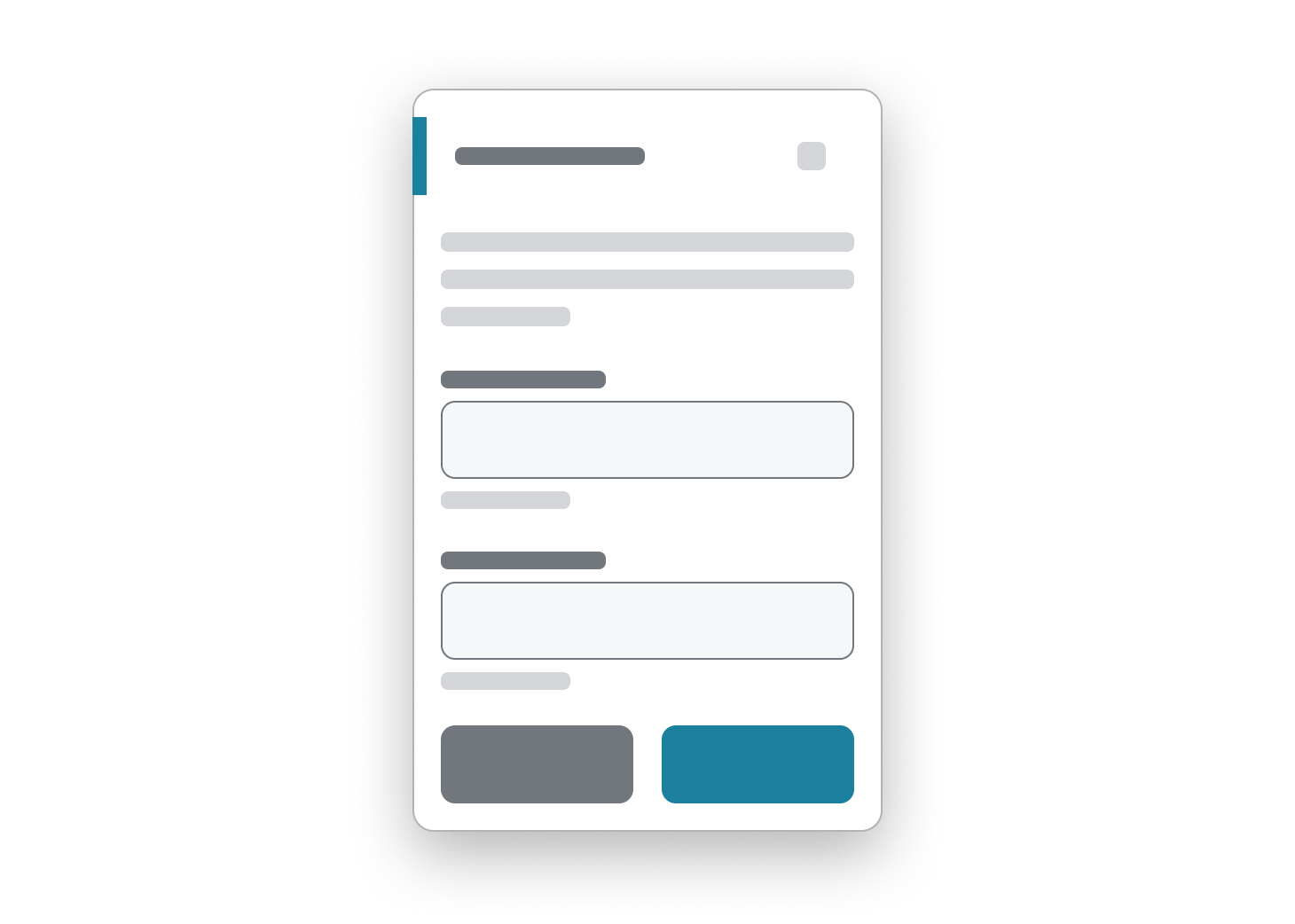
Mobile density optimizes component sizing and spacing for phones and tablets, ensuring touch targets are met and layouts remain clear and usable.

Touch density’s main purpose is to address accessibility concerns on smaller viewports that deal with higher resolutions. When a screen has a higher resolution, touch targets are adjusted to remain large enough for easy interaction.
Touch density deprecation
Touch density will be removed in the next breaking change.
It was originally introduced to support basic touch accessibility, but is not optimized for smaller screens—as density increases, components and spacing become larger, leading to inefficient layouts and usability issues on mobile devices.
What you should do:
- For mobile or tablet experiences, migrate to mobile density.
- For desktop or web experiences, migrate to low density.
Refer to the Migrating from touch to mobile density (Internal users only) for step-by-step instructions.
Select a density early in the design process to meet your application's requirements. Salt’s scaling system ensures components fit together seamlessly when using a consistent density. Mixing densities can cause alignment issues and reduce overall design quality.
In some cases, you may want to switch density to optimize the experience for different devices or screen sizes. There are two main approaches:
-
By screen size (breakpoints): change density as the viewport crosses defined breakpoints. For more information on breakpoints, see the breakpoints documentation.
-
By device type: change density depending on whether the user is on a mobile, tablet, or desktop device. See an example of this in the SaltProvider documentation.
We appreciate your thoughts and feedback on any content in the Salt foundations. Please contact us if you have any comments or questions.