Modes
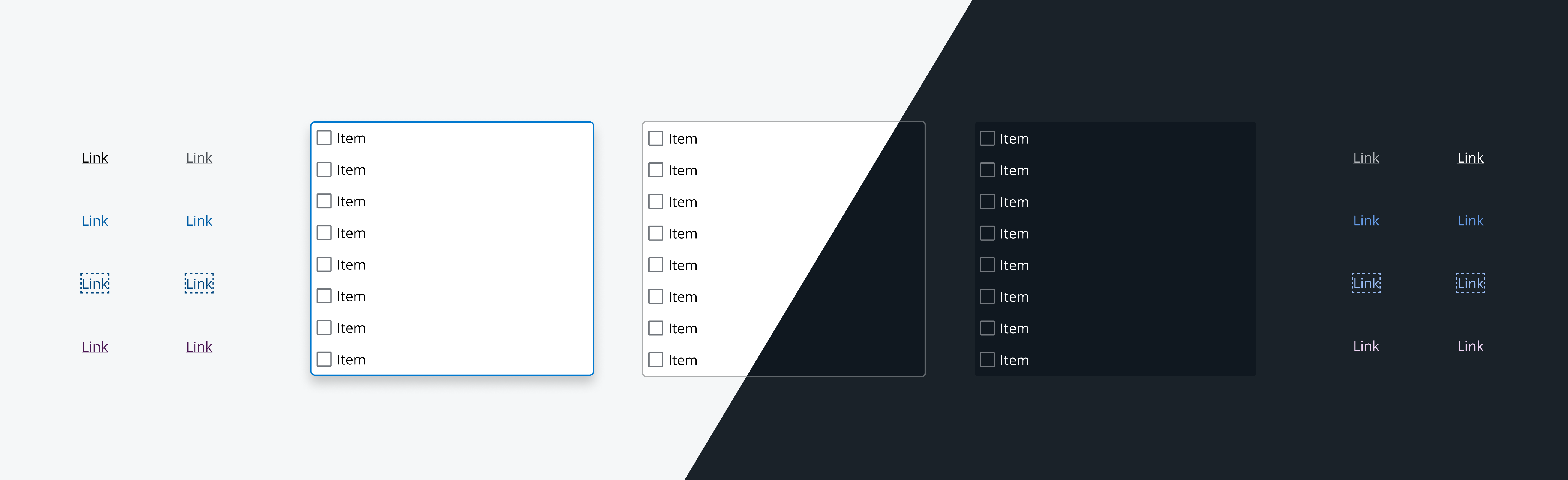
Modes enable the color palette to change from light to dark, providing the flexibility to choose an option that best fits a preference or need. Choosing a suitable mode can improve accessibility, reduce eye strain in low-light conditions and increase reading speed.
Each mode shares the same components and design tokens, with only the colors changing dependent on which mode is specified. Salt offers a range of background colors fit for each mode which are separate from the normal color ramps.
Light mode works well when users are likely to visit your application content semi-regularly. It appears more open, familiar and friendly, but may cause eyestrain when viewed for lengthy periods.
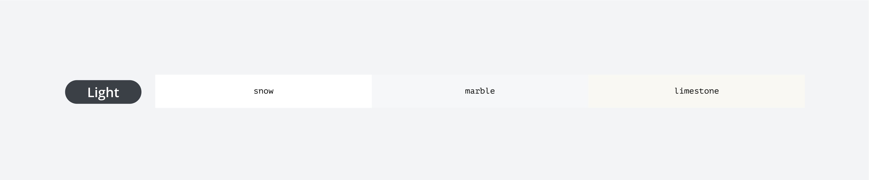
Salt offers three background colors for light mode:
| Color | Purpose |
|---|---|
| Snow | Primary |
| Marble | Secondary |
| Limestone | Tertiary |
Dark mode offers an alternative display setting that shows light-colored text against a dark background. This is a inversion of the lightened mode with equivalent mapped colors.
Consider applying a dark mode if you're designing an interface that will be used continuously for long periods. It may be easier on the eyes in certain environments, but it could increase eye strain when reading long text passages.
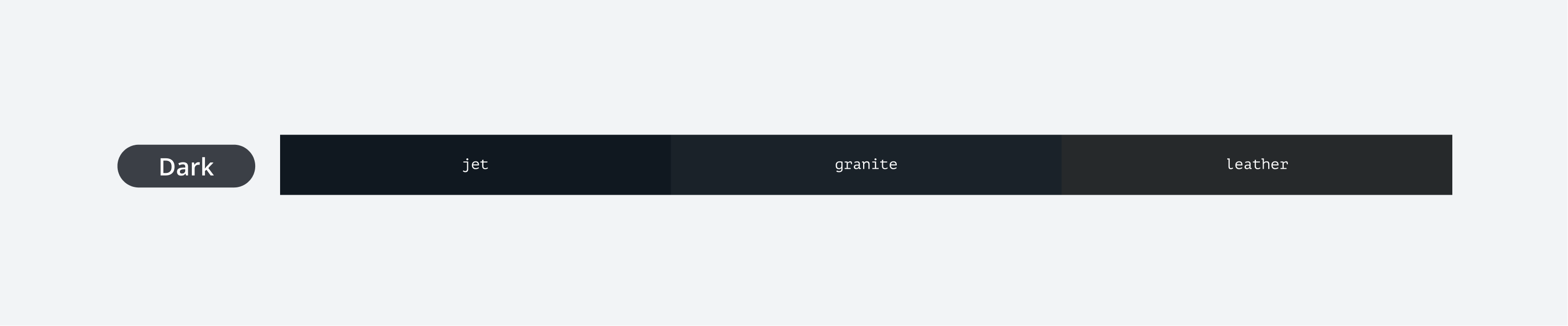
Salt offers three background colors for dark mode:
| Color | Purpose |
|---|---|
| Jet | Primary |
| Granite | Secondary |
| Leather | Tertiary |
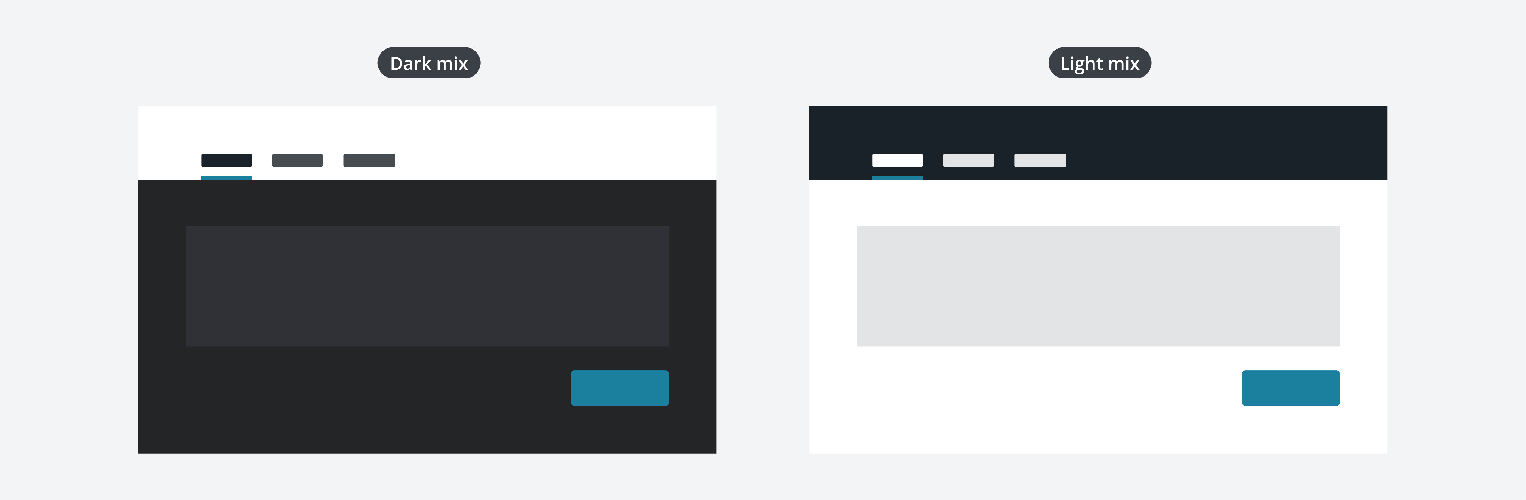
Mode is intended to be used one at a time. However, mixing modes is adopted in certain use cases and combines light and dark mode regions dependent on need. The impact of implementing mixed modes is significant, so it's important to carefully consider the design's intent, audience, and purpose.
Mixing modes is recommended to be done at a region level rather than at a component level. Please keep in mind that a light mode region in dark mode will be visually striking and may not achieve the look and feel you intend.
We appreciate your thoughts and feedback on any content in the Salt foundations. Please contact us if you have any comments or questions.