Typography
Typography refers to the predefined typographic styles that guide the presentation of written language. Typography is essential for improving readability, creating a clear hierarchy, and establishing a visual tone, all of which contribute to more effective and expressive communication. Each text style in Salt includes a font family, font size, line height and font weight. The specific values for each is dependent on the applied theme.
The typography foundation offers two font families for UI design: Open Sans and Amplitude, along with PT Mono for code blocks.

Font families are used differently by each theme. For more information about the themes offered in Salt, please refer to theme guidance.
Each theme uses font families differently:
-
JPM Brand
- Amplitude - heading, display and action styles
- Open Sans - body, label and notation styles
-
Legacy (UITK)
- Open Sans - all typographic styles
To download the Amplitude font, please refer to the font brand resources (Internal users only).
Salt offers a series of text styles designed to create a visual hierarchy through typographic design. Each text style is dependent on the applied theme. By effectively utilizing Salt's styles, you can guide the reader's focus and clearly convey the content's structure.
Font size is determined by the selected text style and the density. Density influences how much content fits on a screen by adjusting the size and spacing of components. As density changes, font size adjusts accordingly to maintain proportionate and harmonious design elements.
Line height controls the space between baselines in a block of text and is proportional to the text size. It's set to 1.3 times the font size across all styles and is influenced by the selected density.
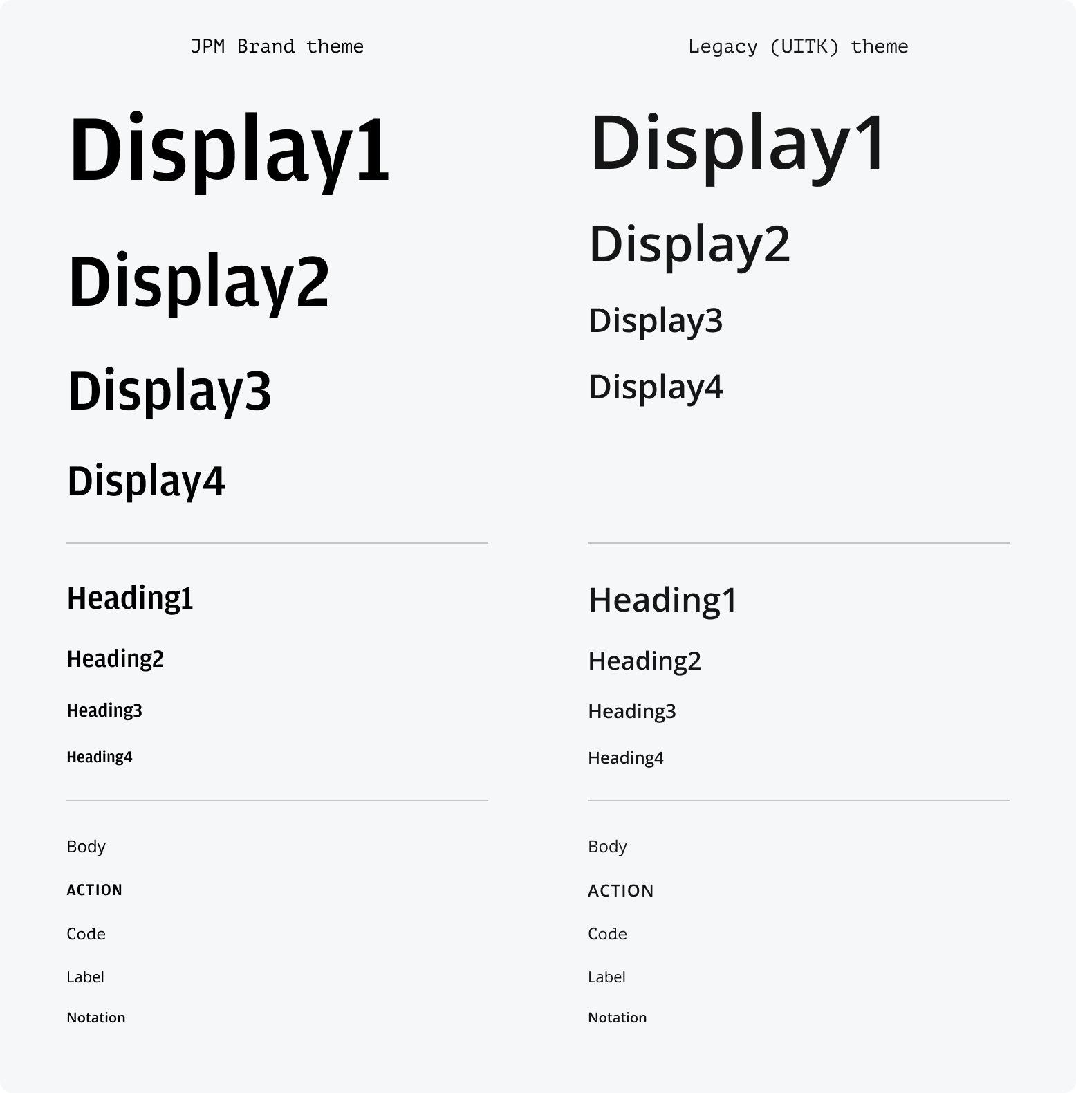
The typographic hierarchy has seven levels, with variants within some levels:
| Text style | Purpose |
|---|---|
| Display | Display1 to Display4. Display styles are intended for showcasing key metrics or highlighting prominent messaging within a masthead. |
| Heading | H1 to H4. Headings are used to divide content into a clear hierarchy and adhere to HTML standards. |
| Body | Body is the default style for most components and textual content. If no specific style is applied, the text will default to the body style. |
| Action | Reserved for actionable items such as buttons. |
| Label | Label provides clear and concise style for form fields and data grid headings, ensuring users can easily understand and interact with various interface elements. |
| Notation | Notation provides a small font size, ideal for compact components, footnotes, and disclaimers. It ensures important but less prominent information is clearly communicated without overshadowing the main content. |
| Code | Reserved for representing code examples. |
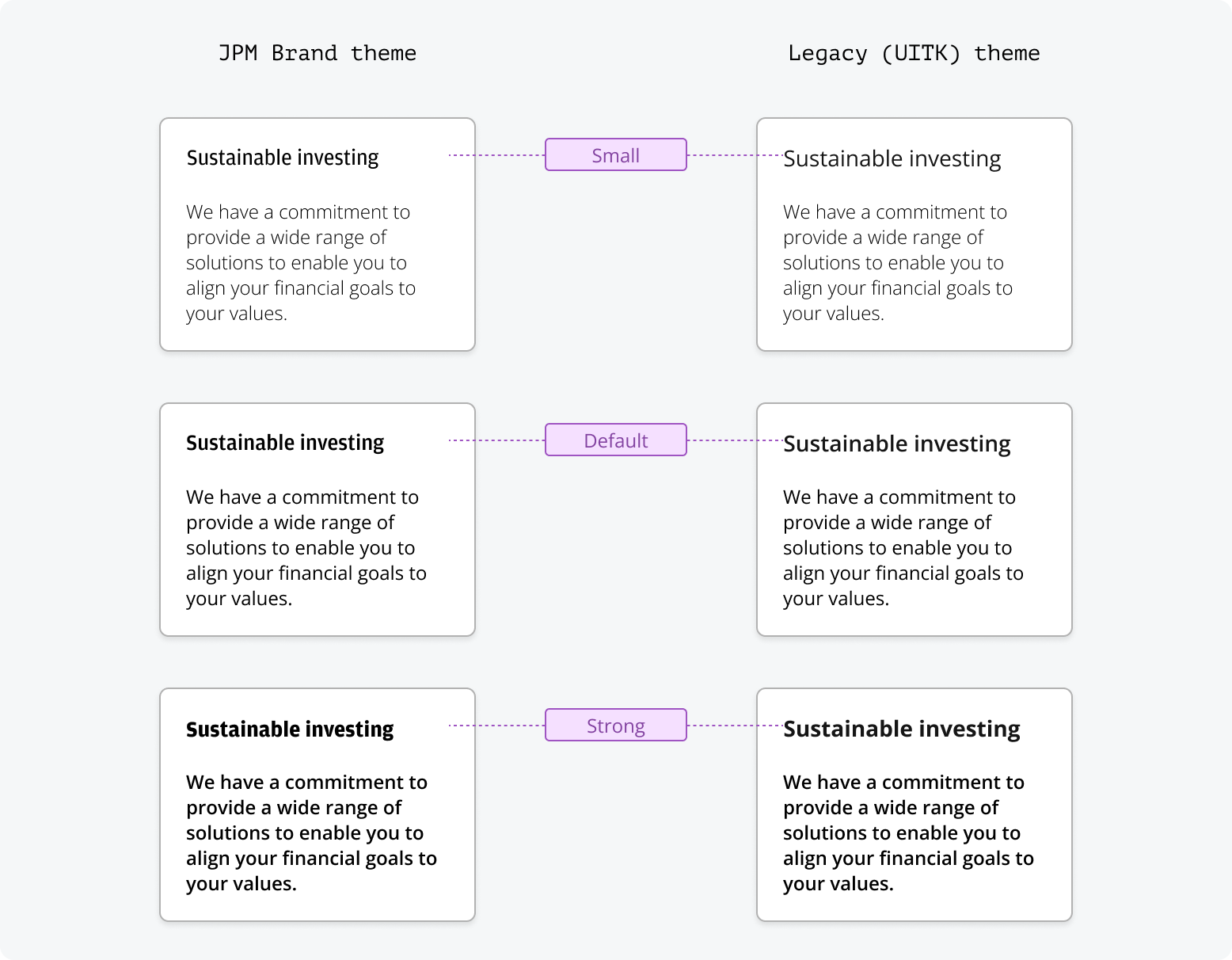
Font weight refers to the relative thickness of a font's stroke. Each text style in Salt offers three different weights, allowing you to establish a visual hierarchy even when using the same text style. The specific font weight is dependent on the text style and theme being used. Each text style has a default weight which can be made ‘small’ to de-emphasize the text or ‘strong’ to emphasize it.
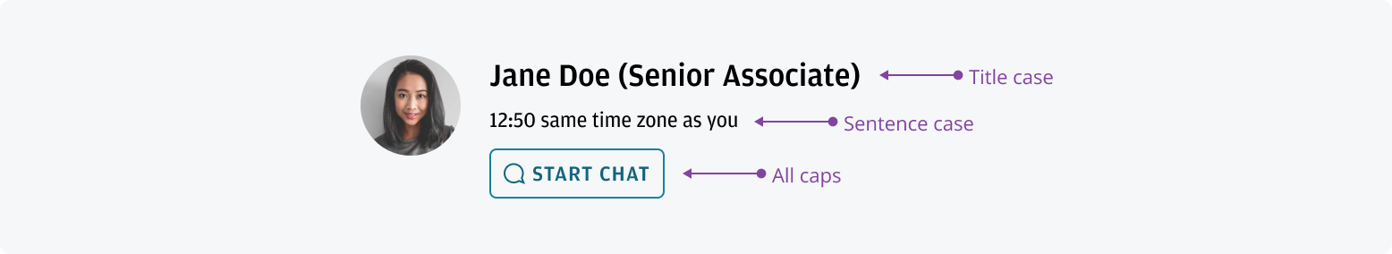
Sentence case is mainly used for body copy, page titles, navigation, subheadings, form titles, field labels, and chart titles and text.
Title case is reserved for proper nouns and job titles, referring to specific individuals, companies, products, or objects.
All capitals are used for button labels to give them prominence and differentiate them from other non-actionable items. All caps should be avoided in general writing.
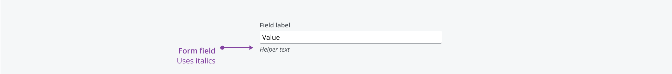
Italics are applied sparingly to short pieces of text to help differentiate them from the surrounding content. They should be used independently of font weight changes. Full sentences or blocks of text are generally not italicized, and combining italics with font weight for emphasis is not recommended.
We appreciate your thoughts and feedback on any content in the Salt foundations. Please contact us if you have any comments or questions.