Breadcrumbs
Breadcrumbs are a secondary navigation pattern that helps users keep track of their current location within a hierarchy. It provides a space-efficient means of allowing quick navigation to previous levels.

Use the pattern when the user navigates through related pages, or drills down into tables or charts. It provides further navigation relative to a users workflow/selection within their current area, page or widget. They are especially useful for identifying a location in a hierarchy when the user lands on a page via deep-linking from search or an external source.
- We recommend keeping the number of breadcrumb levels concise to a maximum of four, including the first level if it's displayed. Content is more easily discoverable when navigating a relatively wide and flat information hierarchy within applications. This prevents users from feeling overwhelmed.
- Use breadcrumbs to complement the application's main navigation—never to replace it.
- Don't show breadcrumbs when there is only one level in a hierarchy.
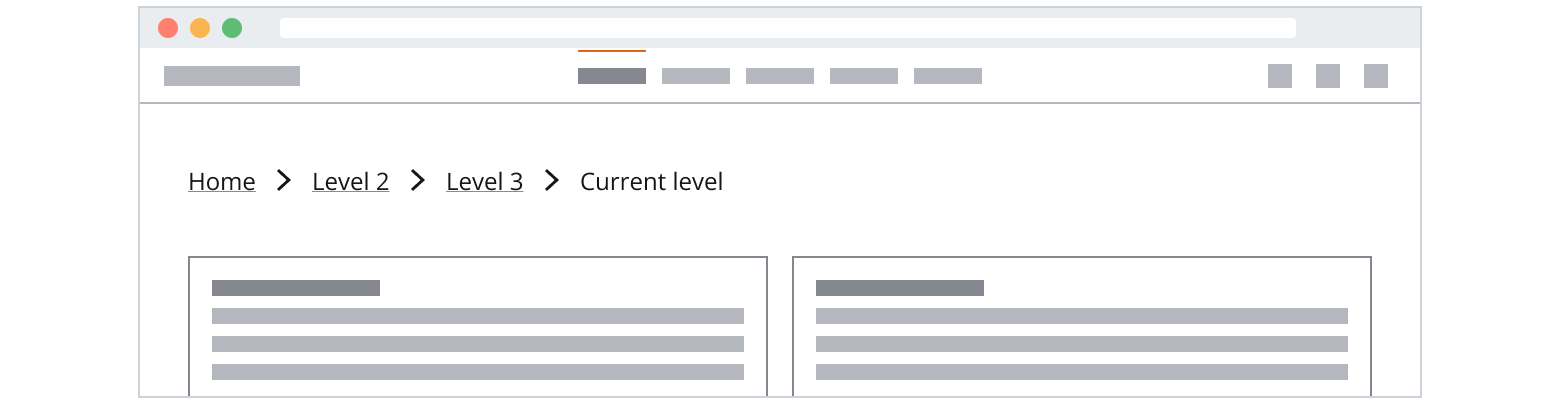
Breadcrumbs contain:
- Breadcrumb: Previous levels displayed as links icons separating them.
- Current level: A text label showing the user’s current location.
- Overflow menu: Use an overflow menu to show collapsed breadcrumbs.
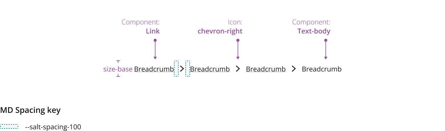
- Use the
Linkcomponent as the breadcrumb. - Use the chevron-right
Iconas the separators. - Use the icon only menu button for the overflow menu trigger.

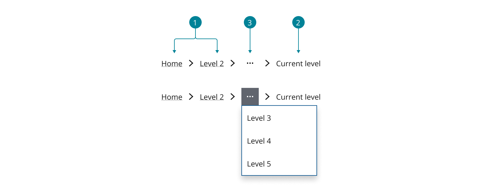
Breadcrumbs can be collapsed to save space or hide lower priority levels (e.g. only displaying Home and the current level). The hidden levels can be revealed in 2 different ways:
Use an overflow menu when there is not enough horizontal space available, the order of the menu items should match the hierarchy of the levels.

Alternatively (if there is sufficient horizontal space), use an use an expansion button to reveal all levels. Showing the levels inline can make the hierarchy of the levels more visible.

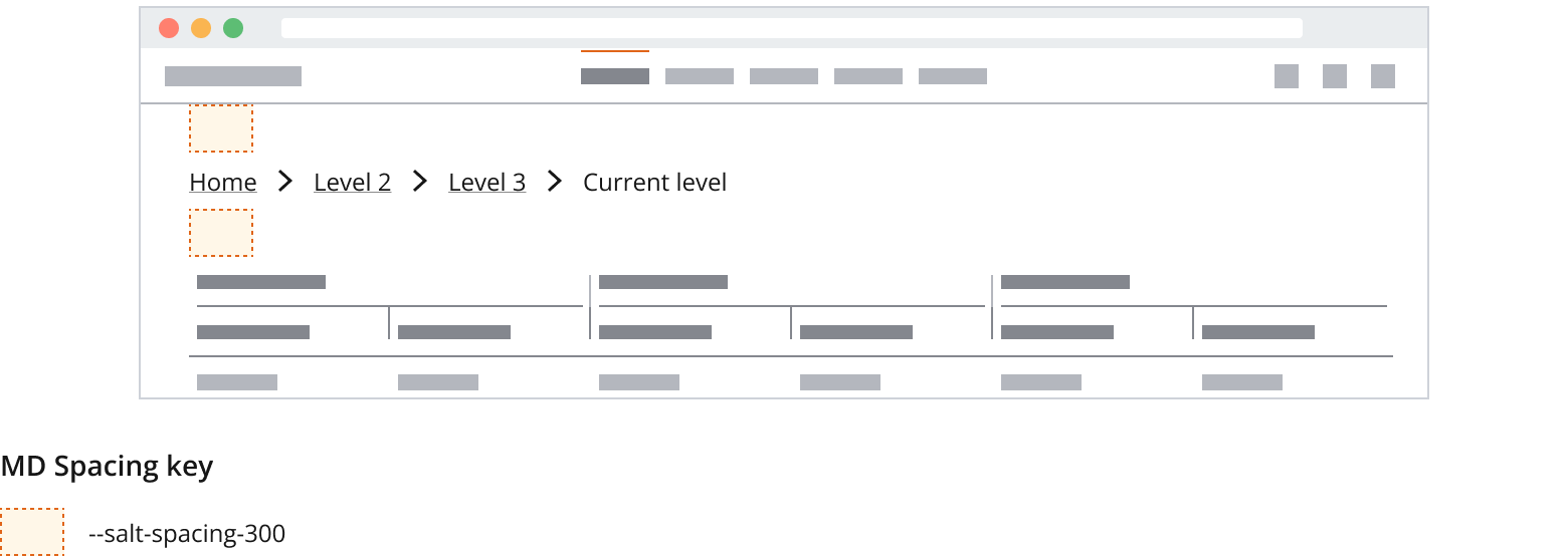
Wrap breadcrumbs when there is a need to keep the breadcrumb trail visible in the app, breadcrumbs can wrap onto subsequent lines. The breadcrumb and its separator should be on the same line.

In some cases, you might want to hide breadcrumbs to make the path shorter or change breadcrumb labels to provide more context and help users understand the current task.


If you need to expand the pattern or share feedback with us, please contact the team.