Button bar
A button bar displays possible actions for users to take when they reach the end of a task. You can use it to provide consistent presentation of button types and orders within pages or dialogs across your applications.

Use the pattern when the user needs to perform actions after reaching the end of a task in a page or a dialog. Some examples include:
- Navigating to previous or next steps
- Submitting a form
- Acknowledging or canceling changes
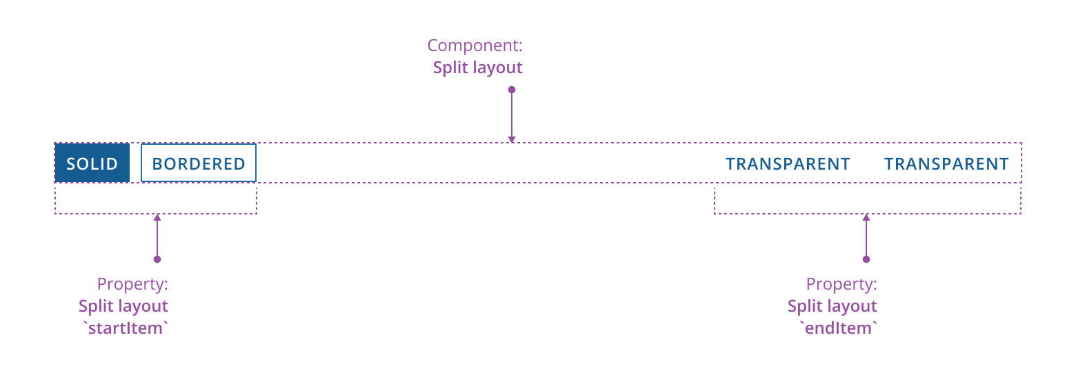
A button bar typically contains:
- Buttons: possible actions for users to take.
- Groups: used to visually communicate which buttons are related to each other.
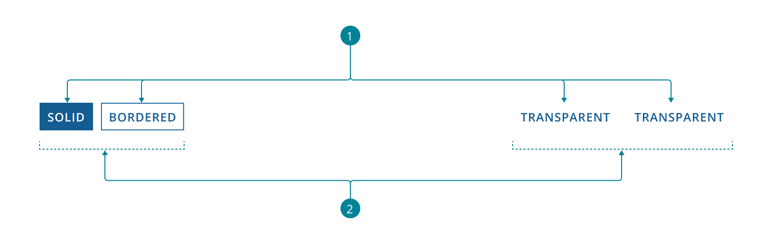
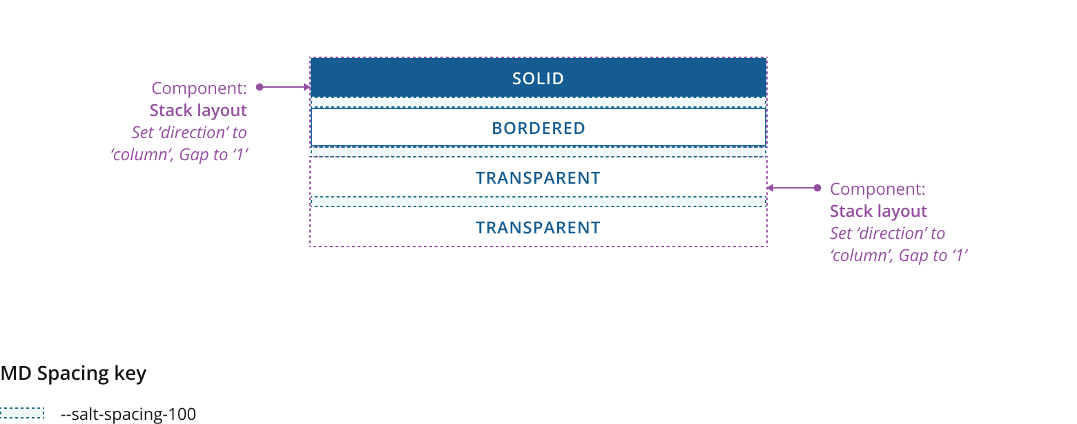
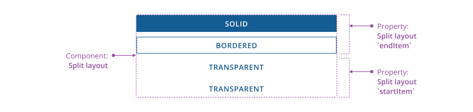
-
Use
Buttonto display actions in a button bar. -
Use
StackLayoutto group your buttons together. -
Use
SplitLayoutto separate the button groups.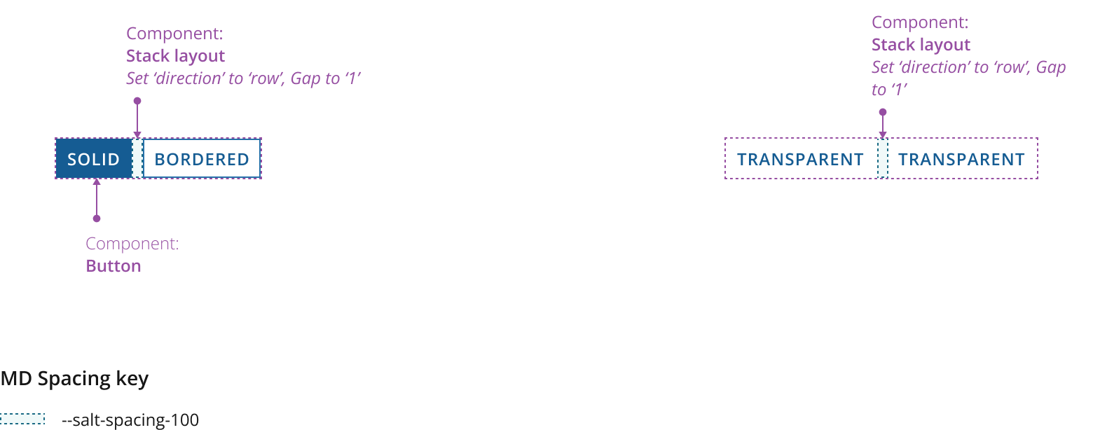
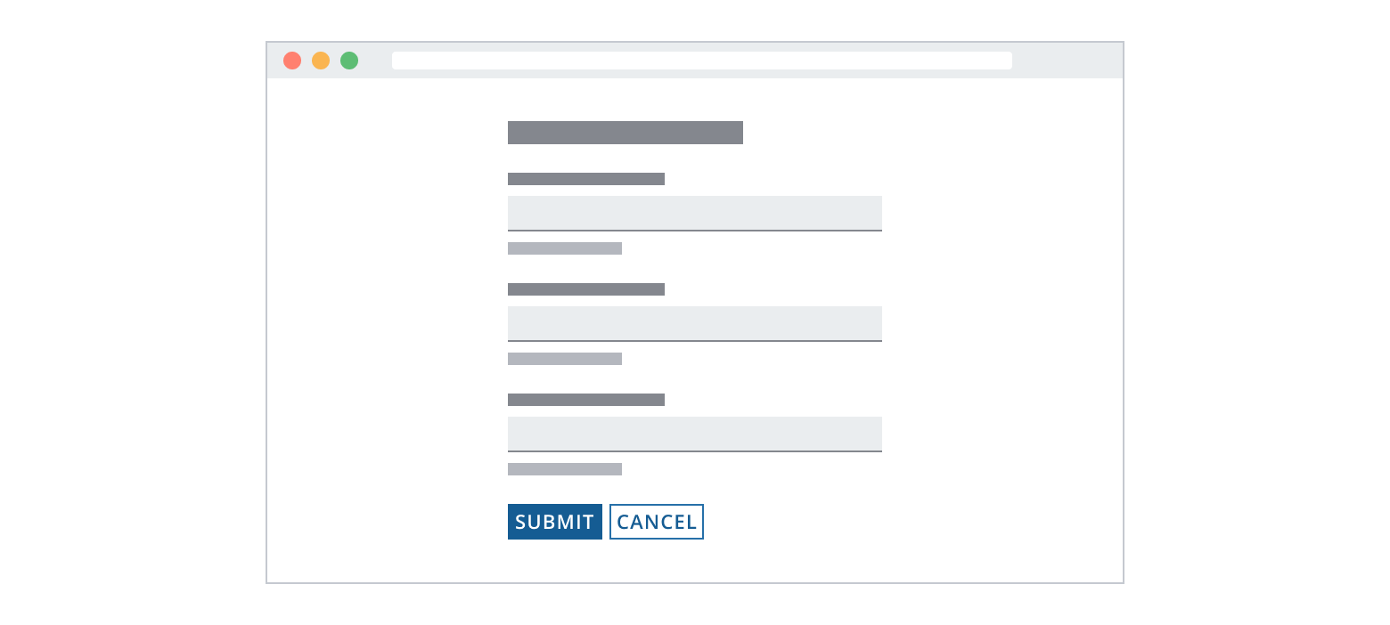
There are three button appearances to choose from. Choosing the correct button depends on the context and is ultimately the choice of the application team. For guidance on button choices, please see the Button docs. We recommend using the accented button set for a majority of use cases, alongside the following guidelines for consistent design:
Solid
- Use for the primary path you intend the user to take.
- In almost all cases, your scenario should have one solid button within the button bar so the desired path is clear.
- This is commonly an affirmative action allowing users to proceed or complete the task, such as Next, Save or Submit.
Bordered
- Use for the secondary functions you're offering the user.
- There can be multiple equally weighted secondary functions within a button bar.
- You can use it as a dismissive action alongside the affirmative (solid) action, such as Cancel or Dismiss.
Transparent
- Use for the tertiary functions you're offering the user.
- There can be multiple equally weighted tertiary functions within a button bar.
- This is commonly a related task or function that’s lower priority than the secondary functions, such as Import or Export.
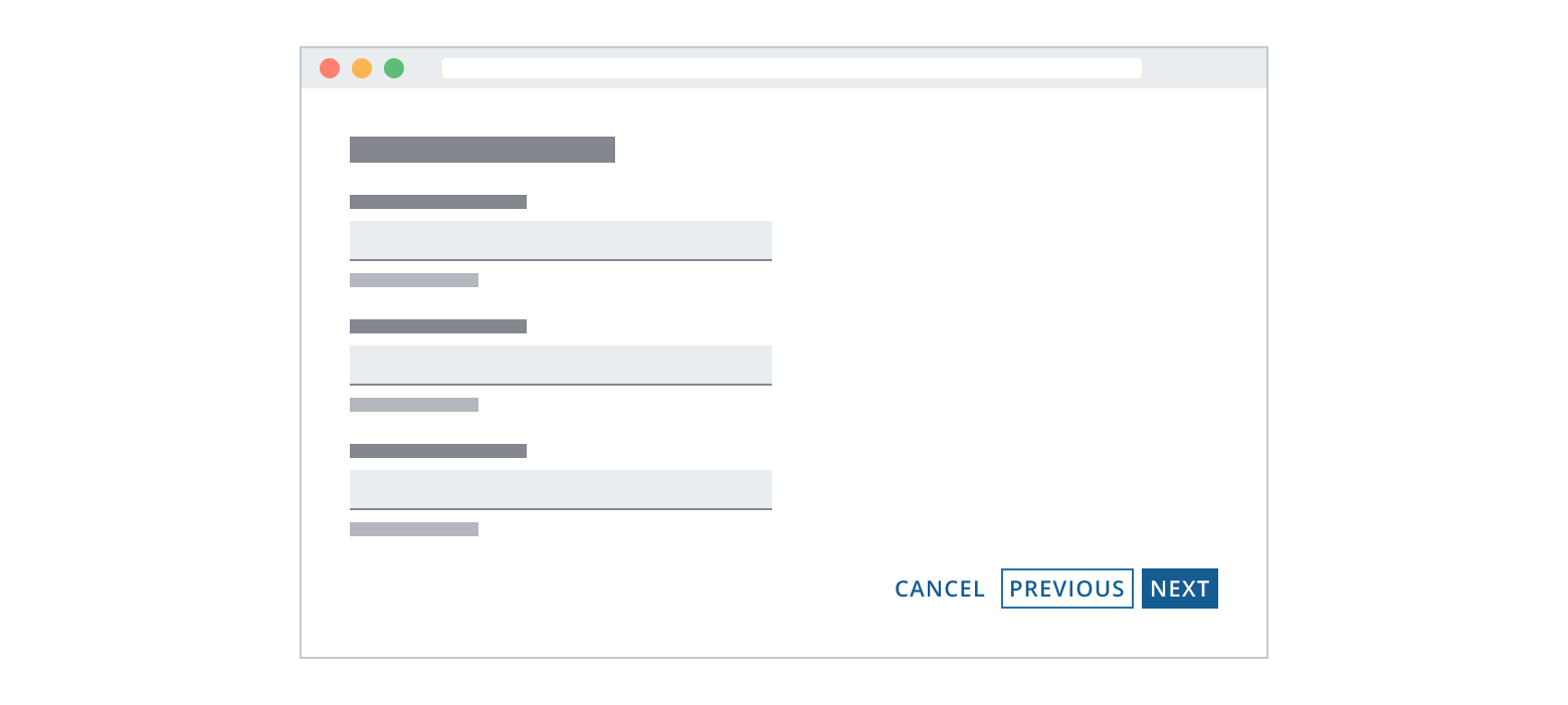
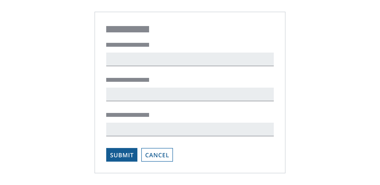
Remember to use a hierarchy when making your button choices, much like following a type ramp. In Example 1 below, Cancel is the alternate function and uses a solid button because there are only two options. However, in Example 2, Cancel uses the transparent button because three actions are available to the user, with this one being tertiary and the least desired option.
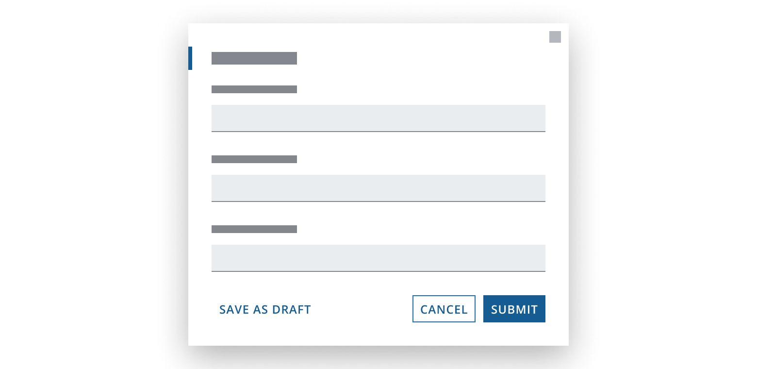
- The Submit solid action uses the solid button.
- The Cancel secondary action uses the bordered button.
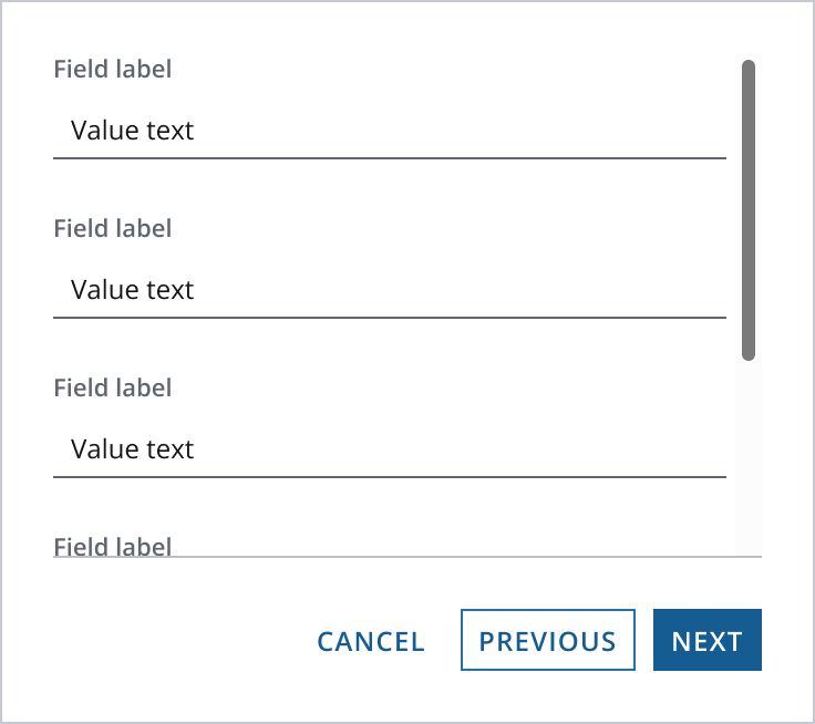
- The Next primary action uses the solid button.
- The Previous alternate action uses the bordered button (order follows sequential forms).
- The Cancel tertiary action uses the transparent button.
Provide only one solid button for a given task—the action that allows the user to complete the task.
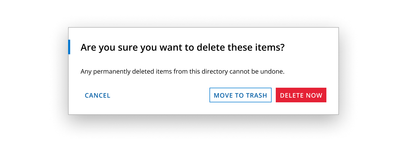
Optionally, use colored sentiment buttons within a button bar depending on the sentiment of the action - i.e. positive, caution and negative. We recommend combining a sentiment with the button appearance (solid, bordered or transparent) that best represents the importance of the action.
In the example below, the ‘Delete now’ button is styled using a solid appearance and negative sentiment to emphasize the risk of permanently deleting items as an action.
The container and the type of scenario determine the position of actions (solid, bordered and transparent buttons).
- Groups core actions on the left.
- Follows an F-pattern reading model, allowing users to scan down quickly.
- Groups core actions on the right.
- Always positions Next right of Previous and Cancel to reflect the direction of the steps.
- Always displays core actions on the right.
- Follows a Z-pattern reading model, where actions are the last focal point in the dialog.
- Group core onward actions for the form to ensure they remain accessible on browser zoom (e.g., Previous, Next, Cancel or Submit).
- You should display tertiary actions that aren’t core to the workflow at the opposite end of the button bar.
There are two ways to position the button bar.
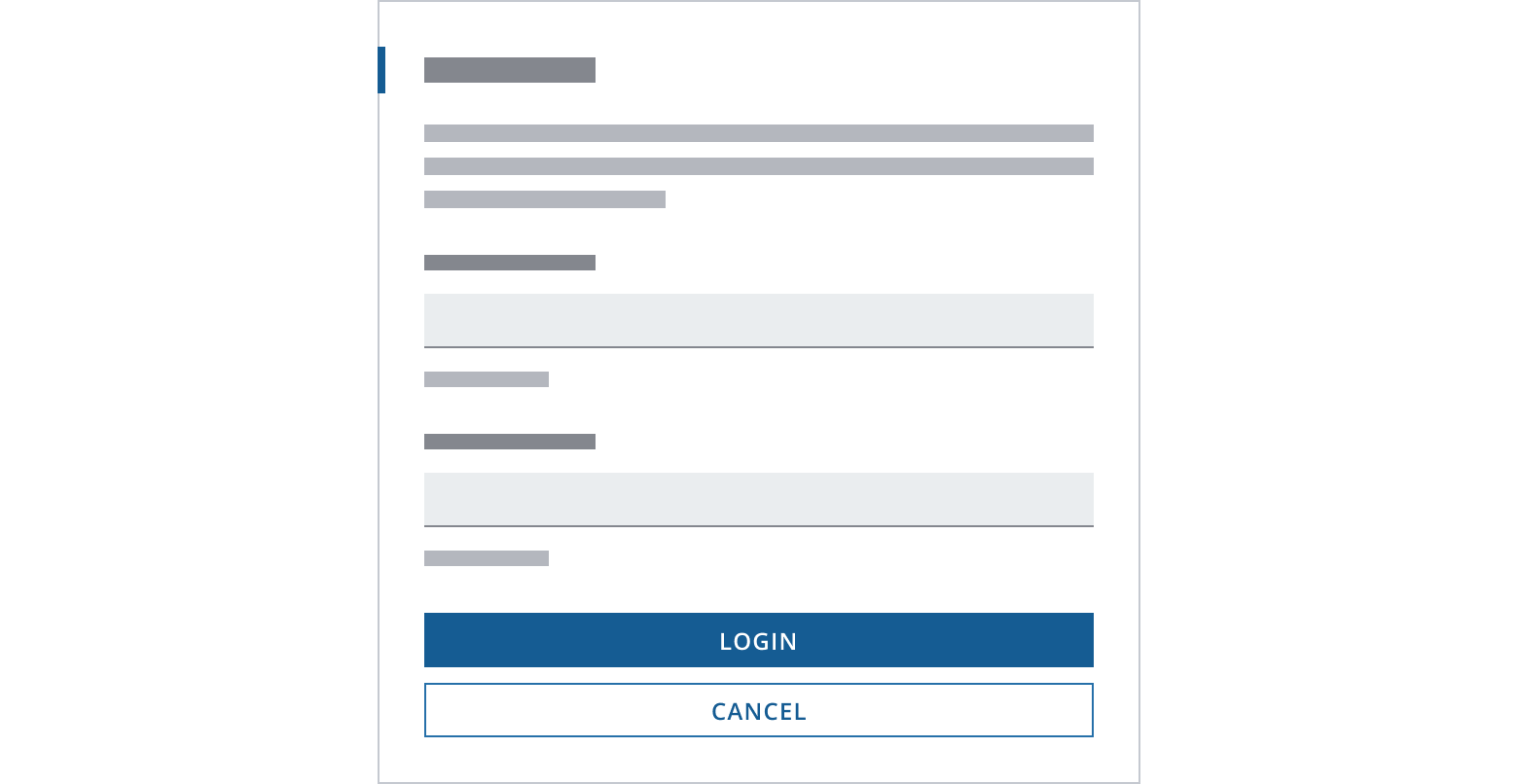
Fix the button bar at the bottom of the viewport when:
- A user can proceed (or step back) regardless of task completion.
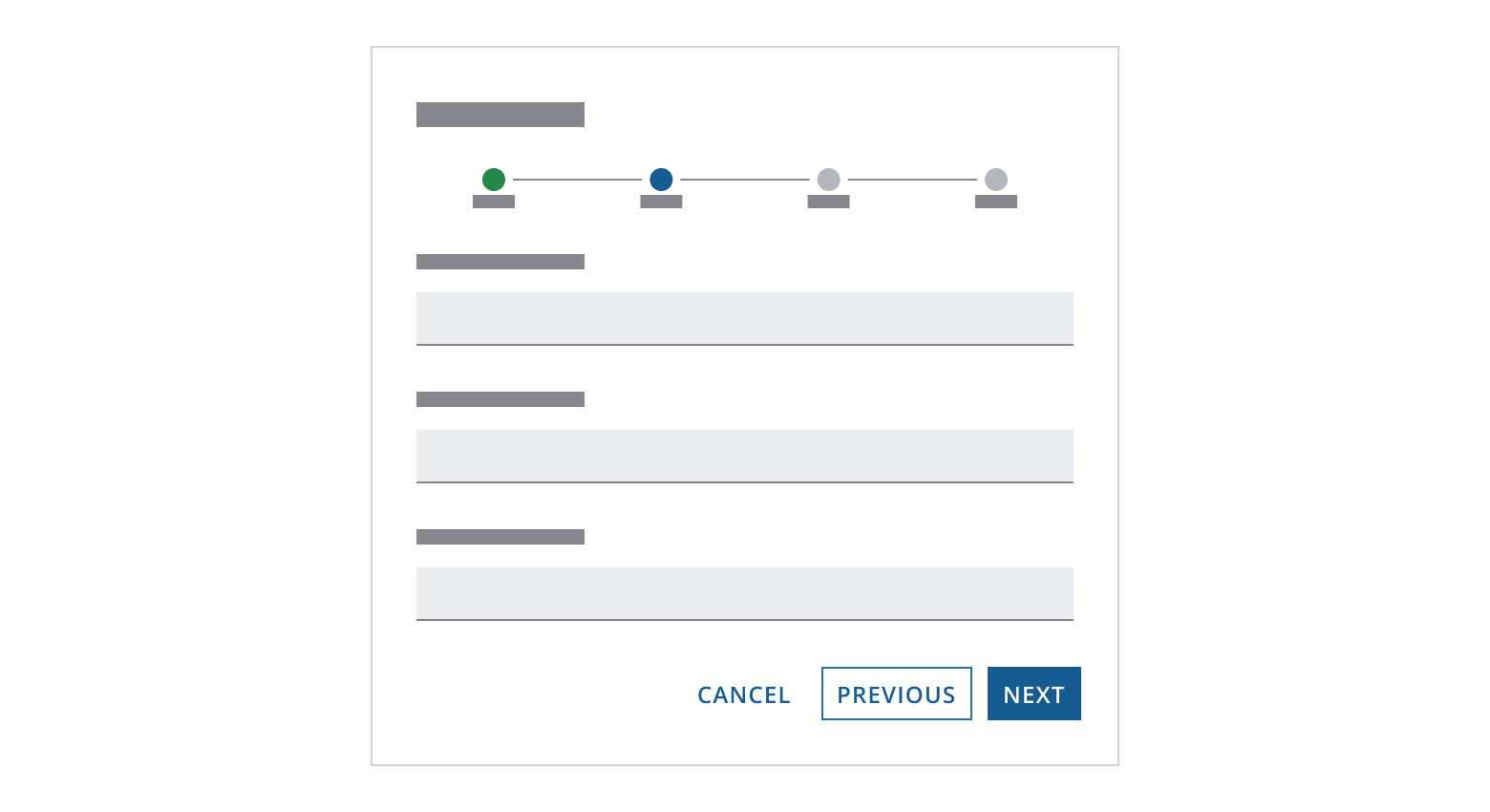
- The task is in a wizard.
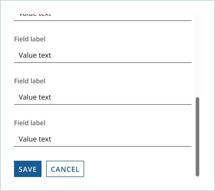
If content overflows, the button bar uses a secondary border style.
When fields overflow behind the button bar, a border should indicate if more fields are available.
Hide the button bar border if content is no longer overflowing (i.e., the user has reached the bottom of the form or the form is entirely above the fold).
The button bar is located at the end of the task when:
- The user needs to complete the entire task before proceeding, for example, if there are mandatory fields in a form.
- The system needs the user to acknowledge all information on the page.
When the button bar is at the end of the task, the button may not be visible when the user is at the top.
The button bar is visible when the user scrolls to the bottom of the task.
For improved usability at smaller screen or app resolutions, we recommend responsively stacking the button bar when it reaches a specific viewport width or application breakpoint.
We recommend stacking at the xs breakpoint by default. Buttons will expand to fill the full width of the button bar when stacked.
Order of stacked buttons: In a stacked button layout, we recommend buttons stack in order of importance from the top down.
- Enable the stacked layout when you have longer button labels that may not fit within the horizontal layout at smaller button bar widths.
- If users will access your application on a mobile device, use a stacked button layout to ensure an adequate touch-area for the buttons.
- Build a button bar following the foundational guidelines provided earlier in the documentation.
- Adjust the direction property on both stack layout and split layout (if used) to
{{xs: "column", sm: "row"}}. This responsive setting arranges the buttons into a column for extra small (xs) screens and a row for small (sm) screens and upwards. This ensures a responsive layout that adapts to the viewport width. - When the button bar has core actions on the right, you'll need to configure an alternative stack layout.
- Reverse the buttons in this layout to ensure that the core actions are at the top.
- Employ Salt's responsive design utilities to render this alternative layout at the desired breakpoint. You can refer to our examples for more information.
If you need to expand the pattern or share feedback with us, please contact the team.