List builder
A list builder allows users to create a bespoke list of items from an original list, also known as a pick list, adding or removing items as required. Users can filter the items by using the filter input field.

Use this pattern when users need to customize a list from a selection of options.
List builders are useful when you want to distinguish selected items from a larger list of available items. This is particularly useful when the initial list is so large that it's difficult to see which items the user has selected. With the two lists side-by-side, users can easily view or compare selected and available options.
Typical use cases for using a list builder include:
- Choosing visible columns or chart series from a dataset.
- Customizing a client, account or research list in a CRM (customer relationship management system).
- Creating a distribution list.
- Creating a list of accounts for use in transactions.
- Apply a consistent logic to the order of displayed items. Display pick list items chronologically or in alphabetical order, provided there are no pre-defined requirements.
- Only use a list builder when there are at least five items to choose from. If you have fewer items, use a single re-orderable list.
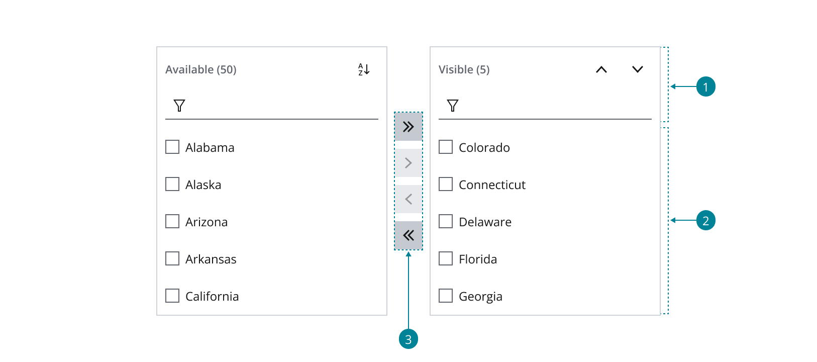
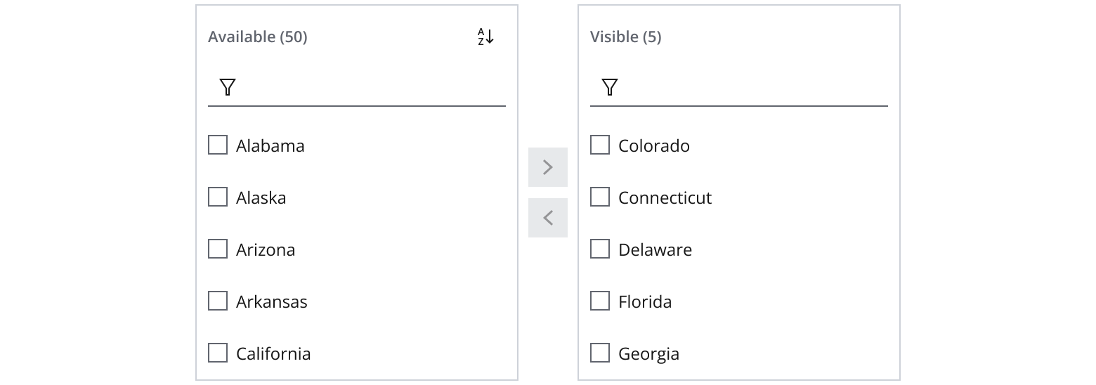
The list builder has three functional areas:
- Header: Contains a list label (with optional item count), a button bar and a filter.
- List: Serves as the container for the list items (multi-select or single-select).
- Move buttons: Provides functionality to move items between the two lists.
Apply a consistent logic to the order of displayed items. Display pick list items chronologically or in alphabetical order, provided there are no predefined requirements.
-
Use
StackLayoutto display the two lists and move buttons that make up the list builder in a row formation. -
Use
StackLayoutto orient the move buttons between the two lists in a column formation.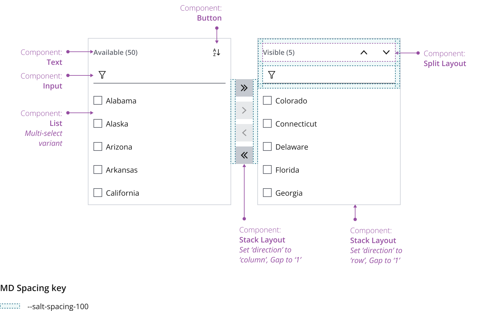
There are two common behaviors for positioning selected items within the list:
- Automatic end positioning: Moving an item from the pick list automatically places it at the end of the selected item list. In a large list where scrolling is necessary, always adjust the view to display the newly added item.
- Relative positioning: If a user has an item selected in the added list, moving an item from the pick list to the selected item list positions it after the selected item. This maintains the relative order within the added list.
When moving items from the selected item list back to the pick list, position them according to the pick list's existing sort order. This makes items in large pick lists as quick and easy to find as possible.
- Change list labels based on your use case. Make sure to keep them clear and concise.
- Always display a label for ADA compliance and to help users identify the purpose of the list, for example, a list of available/picked columns within a grid.
- Show a count in brackets to help users keep track of the number of items in the list.
- Incorporate more buttons into the button bar according to your use case. Examples include “move to top” and “move to bottom” functionalities.
Users can move multiple items in a single action between the pick list and the selected item list using the list builder, allowing movement in both directions.
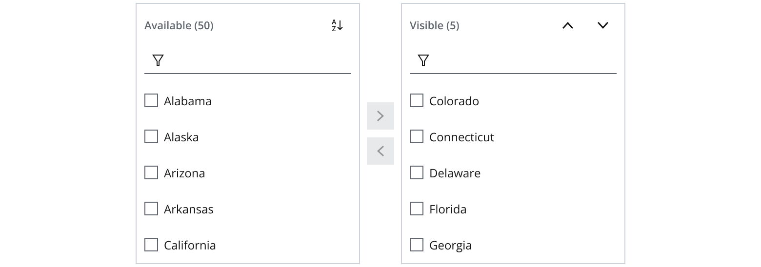
Single selection allows users to move only one item at a time between the pick list and the selected item list.
If users don’t need to reorder items in the new list, remove this feature.
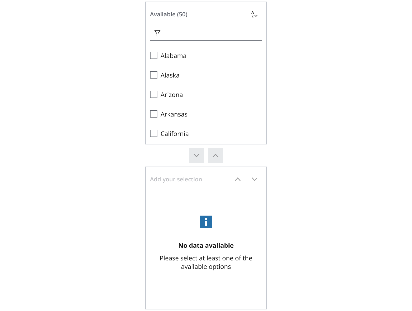
Display a message to prompt or instruct the user when a list is empty. You can customize this message. Make sure that the text is concise, descriptive and clearly understood. Use the content status pattern to display empty state messages.
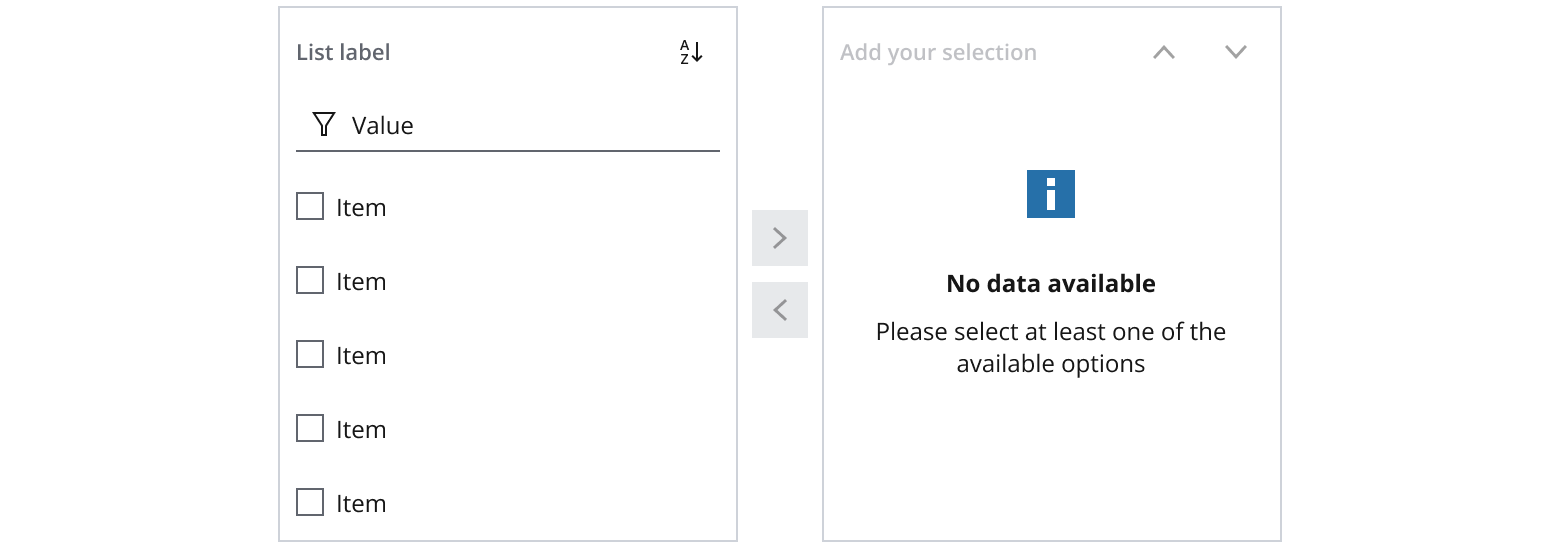
Horizontally and vertically center the empty state message in the container.
Use a stack layout to compose the list builder vertically for interfaces with limited viewport width, such as mobile devices.
Use a minimum width of 8ems and ensure that the list builder spans the full width of the screen or its parent container.
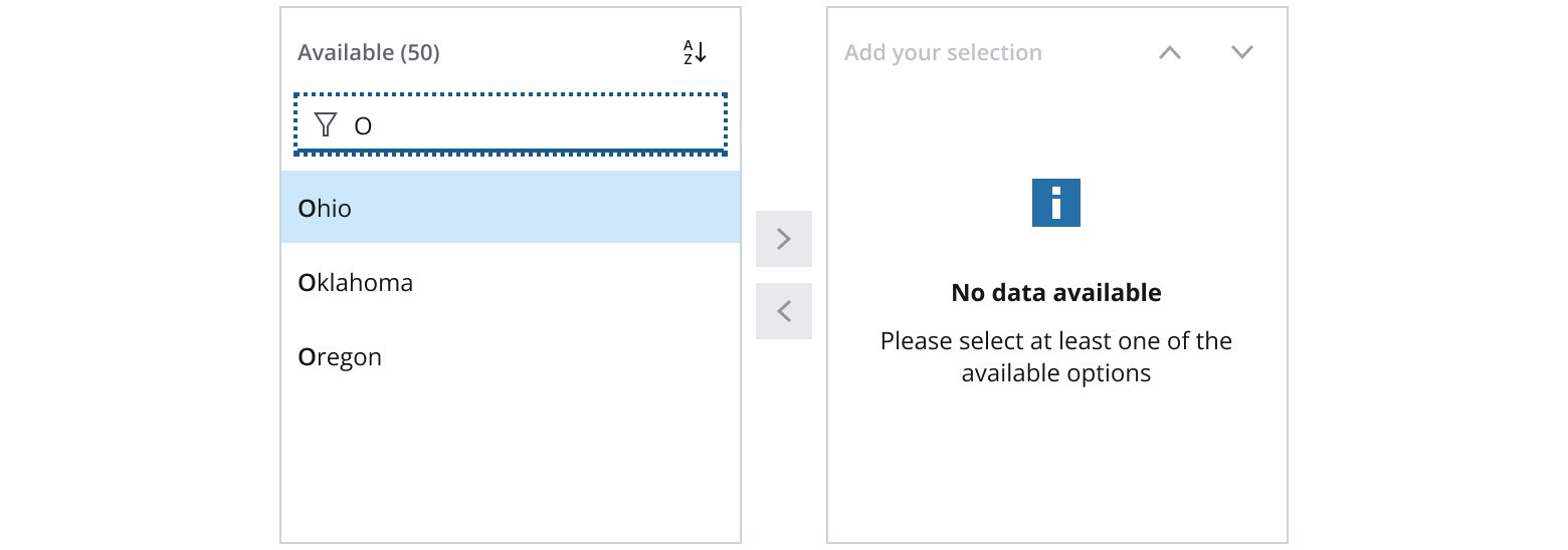
In both the pick list and the selected item list, users can apply filters with the input field, enabling real-time filtration from a large data set. The list dynamically refreshes to display only the items that match the search criteria.
Include a sort button within the pick list, enabling users to organize the list in either ascending or descending order.
If you need to expand the pattern or share feedback with us, please contact the team.