Menu button
A menu button expands to reveal numerous contextual options when there's limited space to display them. The items within the menu are often less frequently used and don't require constant display within the interface.

Use a menu button when multiple related actions need to be viewed in context but are not necessarily deemed high enough priority to be displayed on screen. When activated, the menu button reveals a list of actions a user can take. The options are displayed across a single level or multiple hierarchical levels, in a cascading menu. Clicking one option closes the menu and performs the action.
Menu buttons are ideal for where space is limited, or if certain actions are not a priority in impacting the page content. They can be positioned alongside headings, within filter bars, or within alternative layouts composed of various elements.
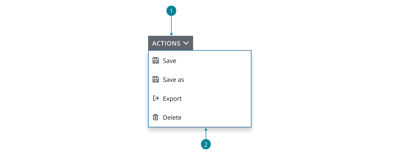
A menu button contains:
- Main action: the default action a user can take.
- Supplementary actions: lower priority or alternative actions displayed in a menu.
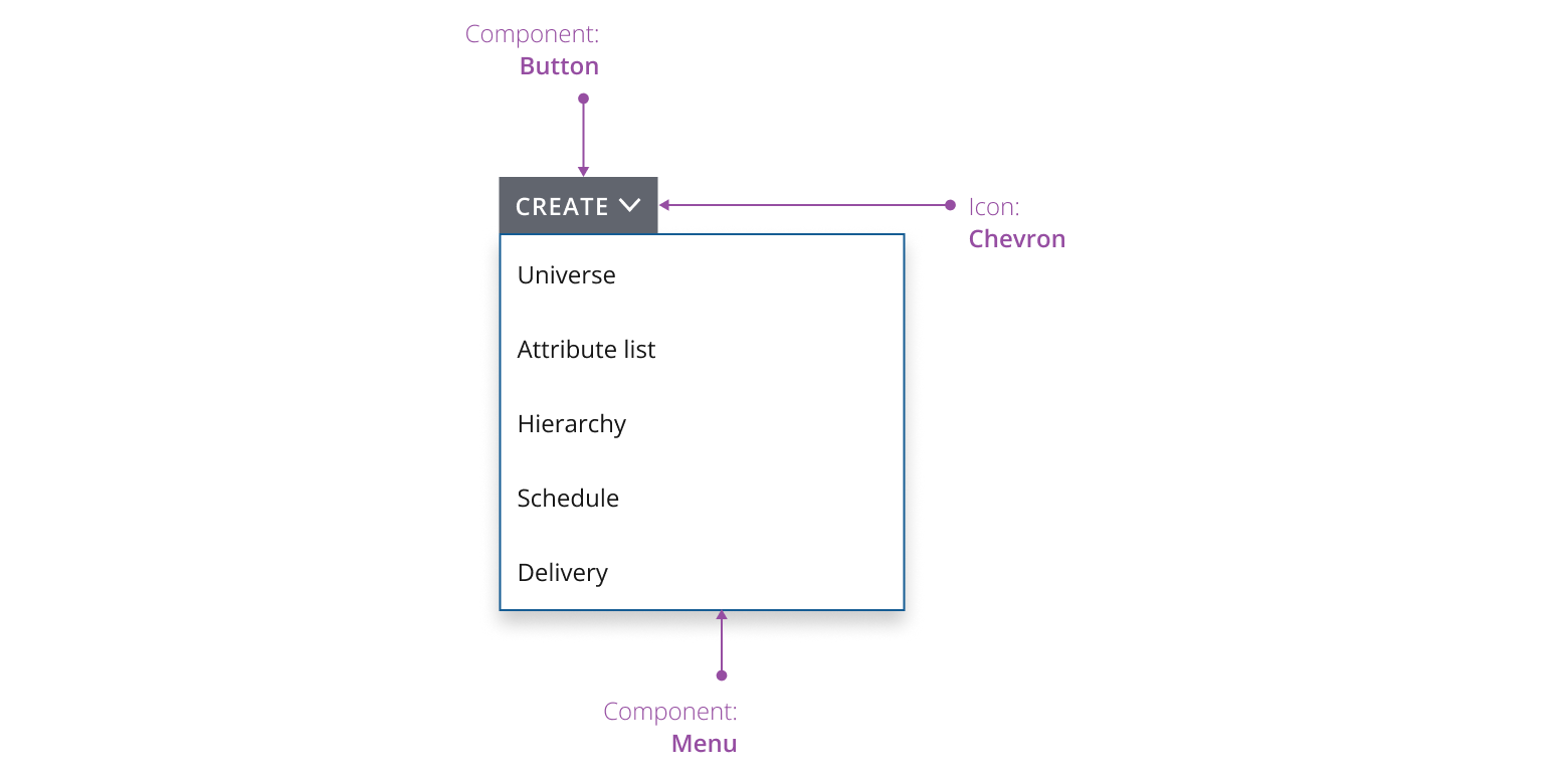
Use a chevron icon to indicate the main action button can expand to reveal options to select from. Optionally, you can use left-aligned descriptive icons to effectively signify a menu item’s purpose.
- Use a button as the trigger for the main action.
- Use a menu to display the selection of supplementary actions for users to choose from.
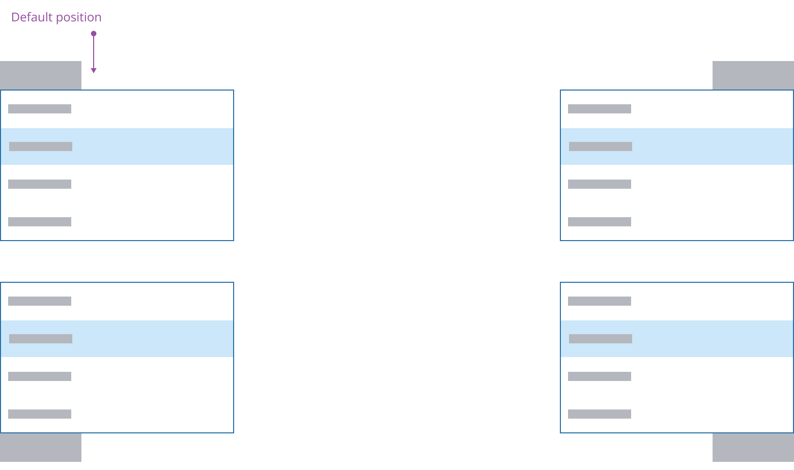
By default, the action button is aligned to the top left with the menu below. Depending on where the button is positioned within the available space and layout of the interface, the menu will dynamically adjust positions in order for its options to remain visible.
Menu button uses a primary button and is used when actions in the menu are related to the core functionality of an application. The button value is typically a string supported by a chevron icon, or can be an icon-only button, provided the icon is well-known and not likely to be misinterpreted.
Consider your particular use case, the number and characteristics of menu options you need to display, your layout and available space – when determining the most appropriate button label.
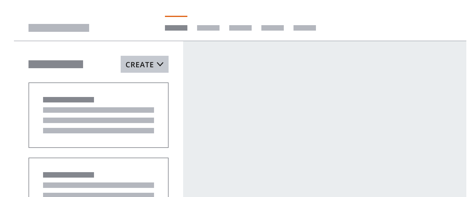
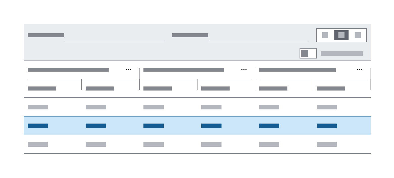
Overflow menus contain actions that affect a smaller type of content within an interface, such as within cards or data grids. This is typically represented by a three dot icon as the action button. This is useful when space is limited or the interface needs to remain uncluttered to reduce cognitive load.
Icon-only menu buttons can be configured to contextually align to the product requirements, instead of being displayed as a chevron. See guidance for button options to select the most suitable button affordance for your application.
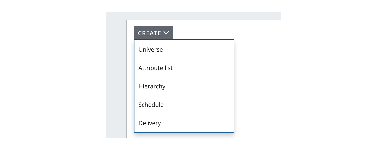
You can use a menu button to control the content displayed within an application underneath a heading. Vertically align a button to the right of a heading or display text that reflects the hierarchy for your design. Use --spacing-100 between the button and text.
If you need to expand the pattern or share feedback with us, please contact the team.