Split button
A split button enables users to perform a main action and access relevant, supplementary actions inside a menu.

Use the pattern for actions with multiple associated commands. Users are able to immediately perform the default action and access supplementary actions, which include more specific or less commonly-used actions.
For example, a paste-focused split button could include:
- Default action: Paste.
- Supplementary actions: Keep source formatting, Match destination formatting, Paste text only.
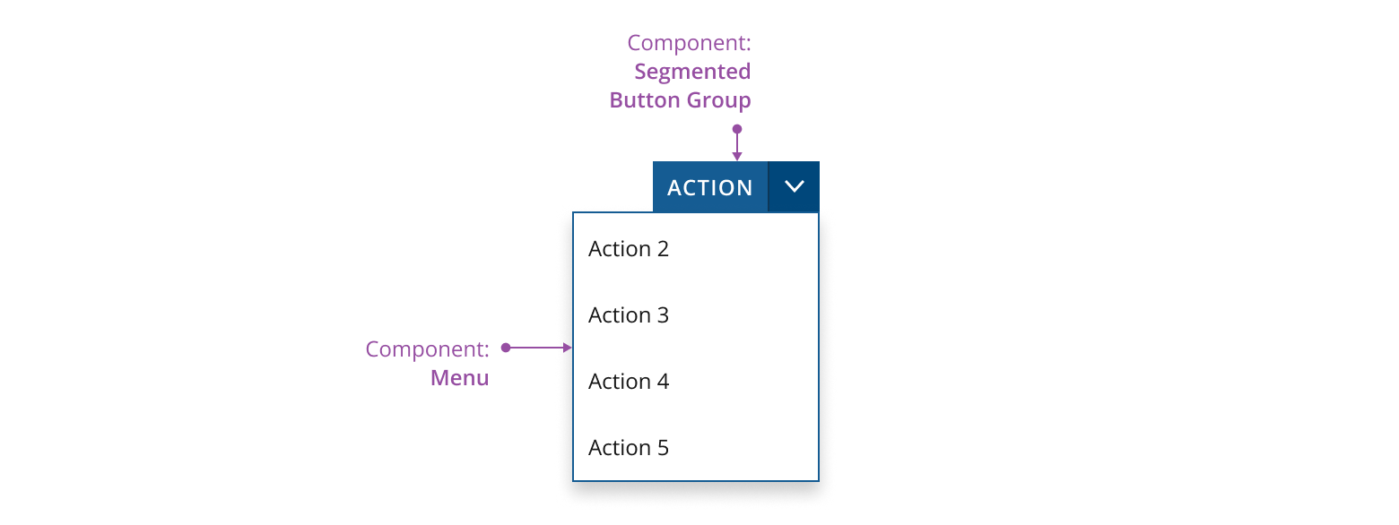
A split button contains:
- Main action: the default action a user can take.
- Arrow button: contains a chevron-down icon and triggers the menu.
- Supplementary actions: lower priority actions displayed in a menu.

- Use the segmented button group component as the base structure of the split button.
- Use the chevron-down icon for the menu trigger.
- Use a menu component to display supplementary actions for users to take. Set the component's
placementprop to "bottom-end" without quotation marks.
You can use CTA buttons, primary buttons and secondary buttons in a split button pattern. See guidance for button options to select the most suitable ones for your application.

Don’t mix the button variants in the same split button.
Include multiple main actions if they have the same importance/priority.

The main action is represented by an icon-only button to minimize the width of the entire split button.
- Avoid using an icon-only split button if your target audience is unlikely to recognize the proposed icons.
- Use a textual label if your main action is high priority. This ensures users are more likely to see it.
- Use a tooltip to describe or label the action.
If you need to expand the pattern or share feedback with us, please contact the team.