Themes
A theme is a collection of design tokens that define the overall look and feel of an interface. Themes allow you to quickly switch the visual style of components to match different brands or user preferences, ensuring consistency across your application.
In Salt, a theme is made up of tokens for colors, typography, shadows and corner radius. Themes help platforms and applications align with a specific visual identity and can be switched to suit different audiences.
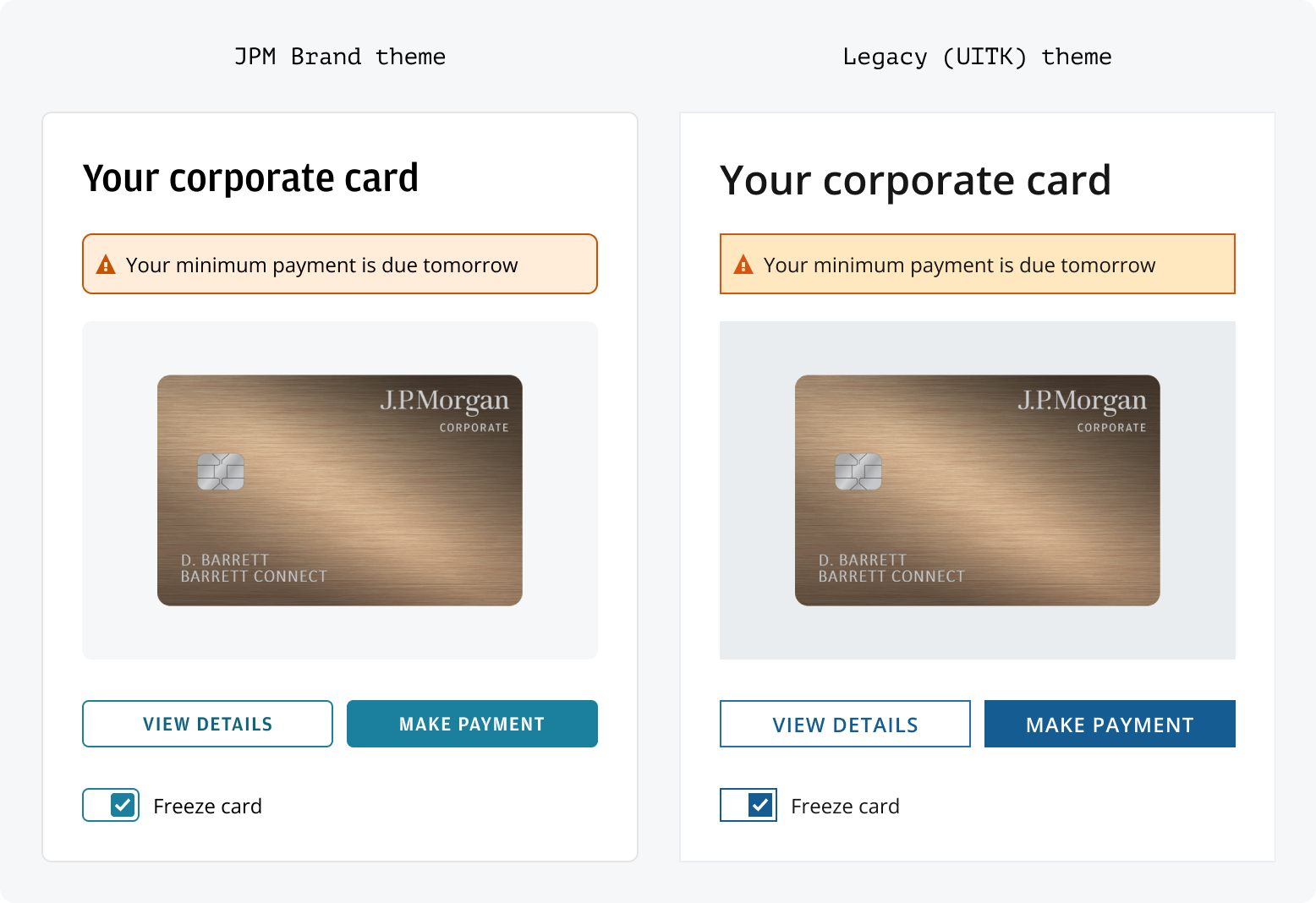
Salt offers three themes: the default JPM Brand, recommended for all new projects; Legacy, designed to support the migration of applications from Salt's predecessor; and Chase, available exclusively to JPMorganChase employees for applications serving Chase customers. The long-term goal for Legacy users remains transitioning to the JPM Brand theme.
The JPM Brand theme is Salt’s long-term visual style, designed to match the JPMorgan look across CIB digital applications. Developed with Corporate Brand and CIB Marketing, it uses approved styles for consistent visuals on desktop and web. Salt recommends switching to the JPM Brand theme for better accessibility and brand alignment.
For a gradual move from the UITK system, Salt’s Legacy (UITK) theme can be used with UITK components to support different migration timelines and needs. J.P. Morgan employees can find more details on migration options and system comparisons.
The Chase theme enables teams to build and deliver products within the Chase visual identity. Chase is available as a separate library in Figma and as a standalone package in code. JPMorganChase employees can find installation instructions and setup guidance internally.
You can set themes in code using a provider and CSS imports:
To ensure that every user sees the Amplitude font correctly, you'll need to add it to your application, which can be downloaded from fonts on the internal site if you're part of JPMC.
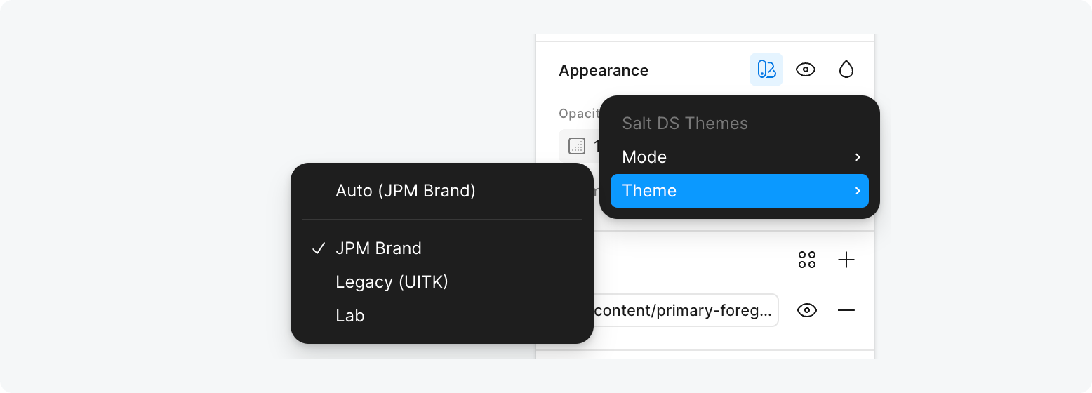
When using the Salt DS Figma libraries, you can use the variable mode ‘Theme’ to change between ‘Legacy’ (UITK) and JPM Brand. All components, patterns and styles are compatible with each theme in Salt.
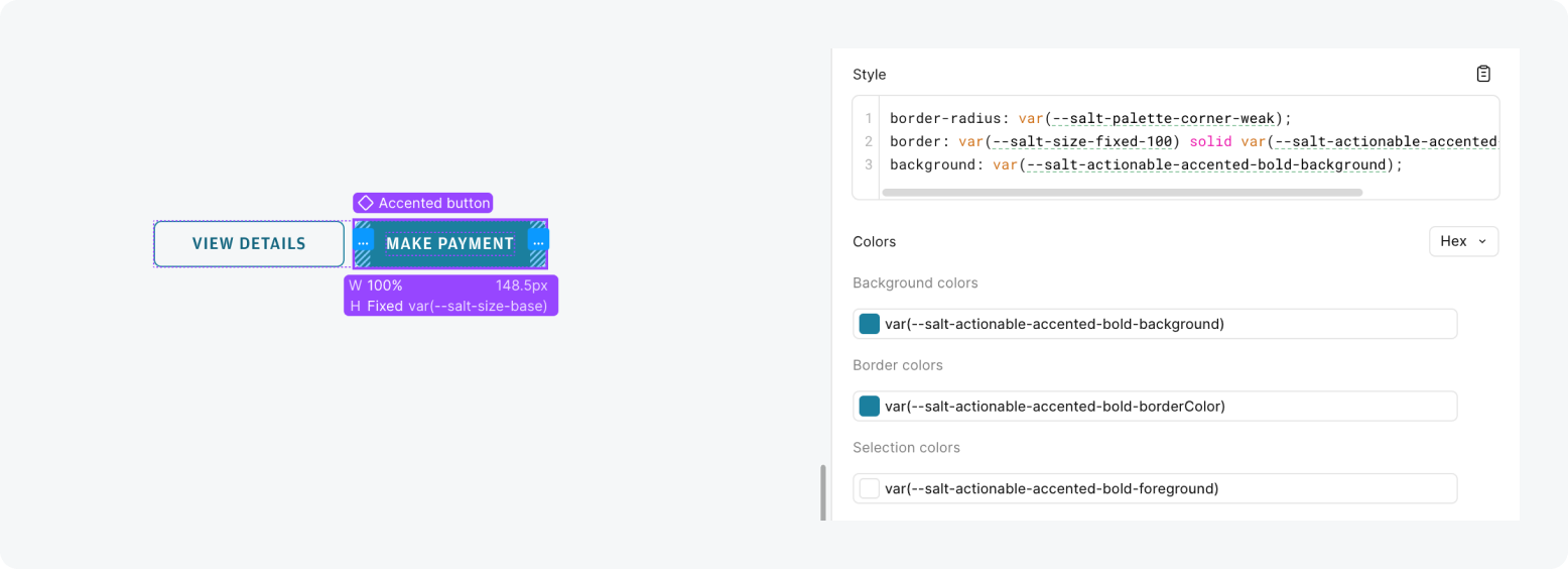
The Salt DS Themes library includes all the Figma variables needed to style with Salt. It includes the semantic characteristics, size and spacing values, shadows, corner radii and typographic styles.
The Figma variables are set up to match Salt tokens in code. When inspecting a design in Figma's Dev Mode, you can see references that match the tokens, such as color, size and spacing values.
When referencing a design created using Salt with ‘View only’ Figma access, you’ll be able to see the Figma variables but not the token references. However, the variables match the same structure, so they should be relatively easy to translate.
Design tokens are the building blocks for how Salt styles components and patterns. Learn more about how design tokens function in Salt.