Semantic use of color
Salt uses semantic naming conventions for color, organizing tokens by their intended meaning—such as error, warning, success, or informational states. This approach ensures designs are consistent, adaptable, and accessible across themes and modes.
Colors are grouped into semantic categories, which are used to communicate concepts consistently across the design system.
For help with applying themes in Salt, visit Themes. To find out more about the use of semantic tokens, learn How to read semantic tokens
Statuses provide visual cues that communicate the current state of a system or process. Each status—error, info, caution, and success—helps users quickly understand what’s happening, identify issues, and determine if action is needed. Consistent use of status tokens ensures users can respond confidently and efficiently to changes or events within your application.
Salt represents each status with a distinct color, helping users quickly identify and interpret system states visually.
To learn how to use status tokens, read the Status characteristic guide.
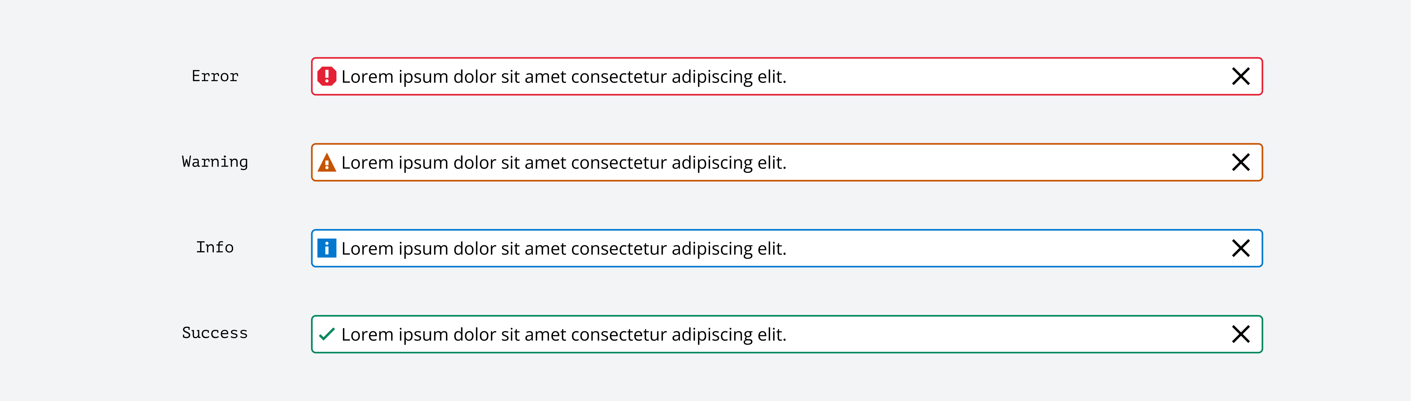
| Status | JPM Brand theme color |
|---|---|
| Error | Red |
| Info | Blue |
| Success | Green |
| Warning | Orange |
Sentiment colors provide visual cues that help guide users through an interface by suggesting potential outcomes and evoking specific feelings. Each sentiment—accent, neutral, positive, negative, and caution—can be used to reinforce meaning, highlight important elements, or influence user perception. When applied thoughtfully, sentiment colors make interfaces more intuitive, engaging, and emotionally resonant for users.
To learn how to use sentiment tokens, read the Sentiment characteristic guide.
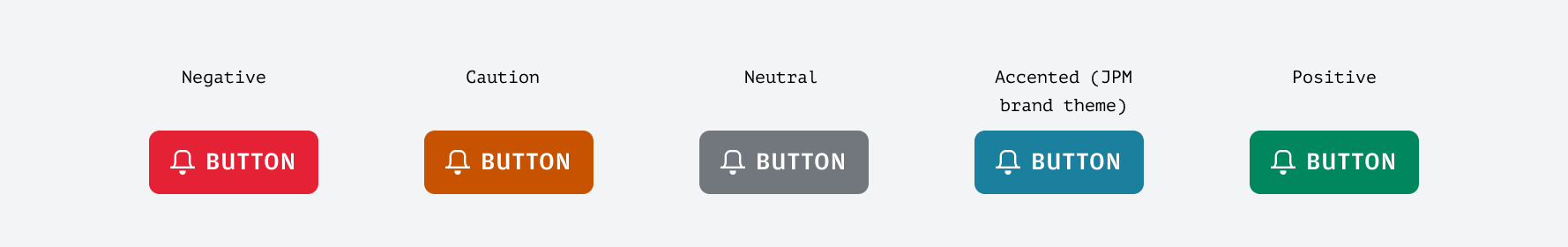
| Sentiment | Feeling | JPM Brand theme color |
|---|---|---|
| Accent | Trust | Teal |
| Caution | Carefulness | Orange |
| Negative | Negativity | Red |
| Neutral | Neutrality | Gray |
| Positive | Positivity | Green |
We appreciate your thoughts and feedback on any content in the Salt foundations. Please contact us if you have any comments or questions.