Color and pattern
Color is a valuable tool that helps effectively present data in your visualization. Using color correctly guides users’ attention and supports their understanding and interpretation of data.
Consider the purpose and impact of color in your chart. Color can be used to:
-
Show relationships: Use similar colors to imply that items are related. Contrasting colors, however, show that items are from distinct categories.
-
Highlight key elements: Use color to direct your audience's attention towards the main element or emphasize data that supports the story you’re communicating.
-
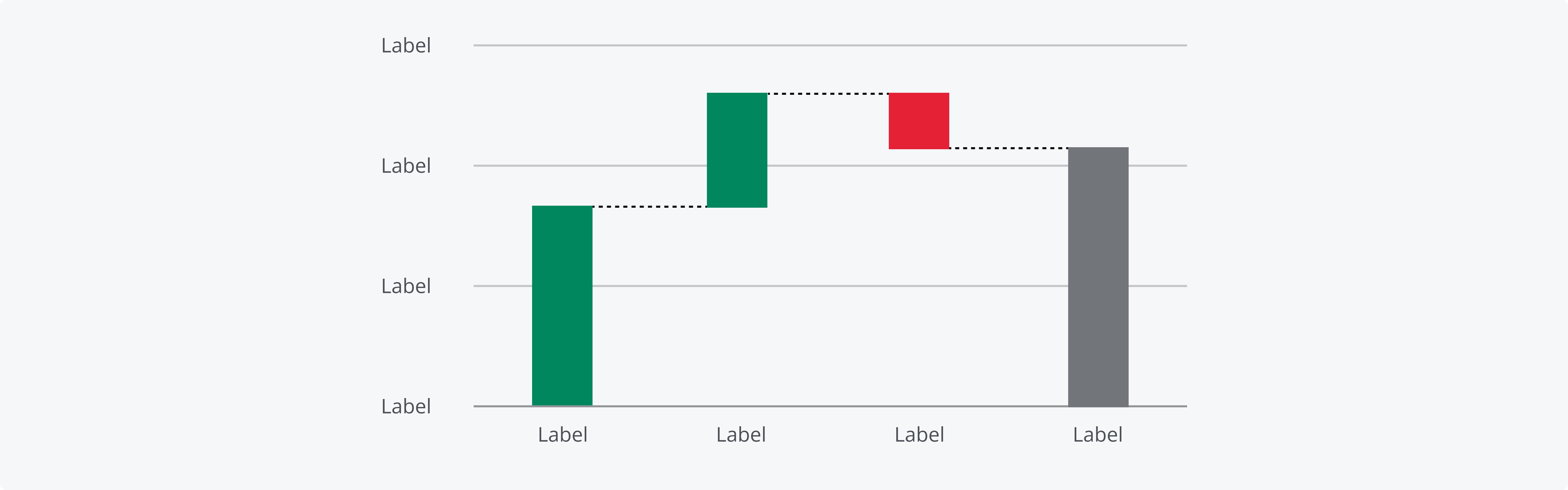
Indicate meaning: Some colors are strongly associated with certain objects, concepts or emotions. Leveraging these associations helps you communicate more efficiently and improves comprehension of your chart. For example, waterfall charts indicate the net positive or negative change in the total quantity between two points.
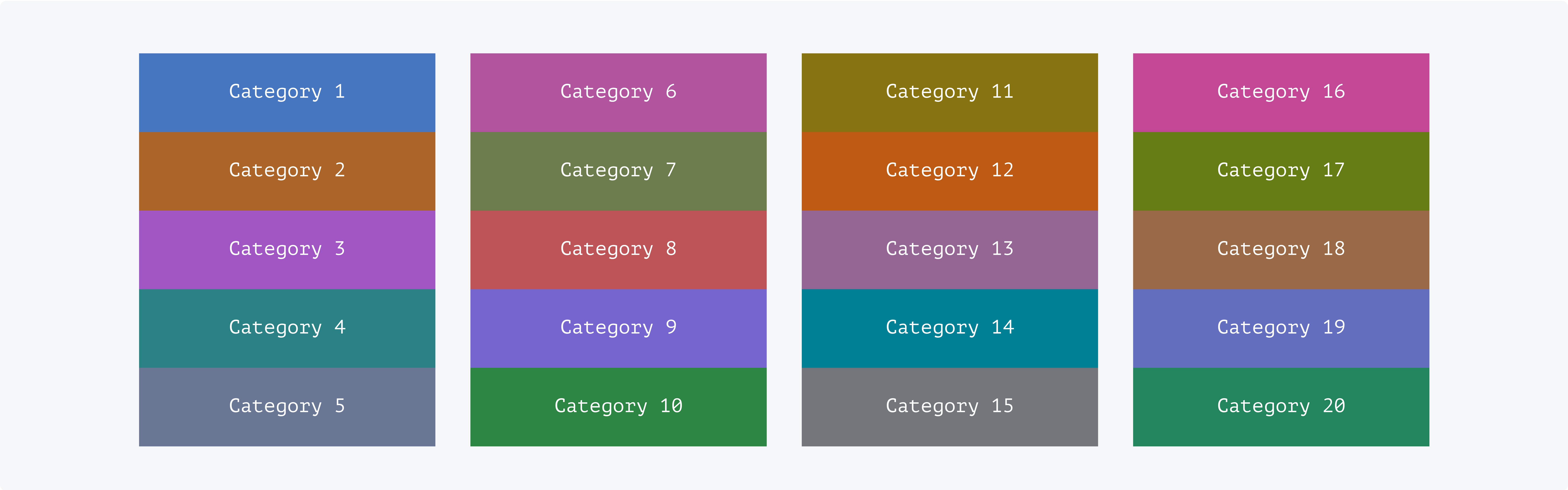
The categorical palette is designed to visualize distinct groups of items. Categories are intended to be used in numerical order, from 1 through 20, to maximize color contrast and visual clarity. Don't associate categorical colors with status or sentiment. Use the dedicated characteristics in this case for a consistent user experience.
For more information, please refer to the Categorical color page and the Semantic use of color page.
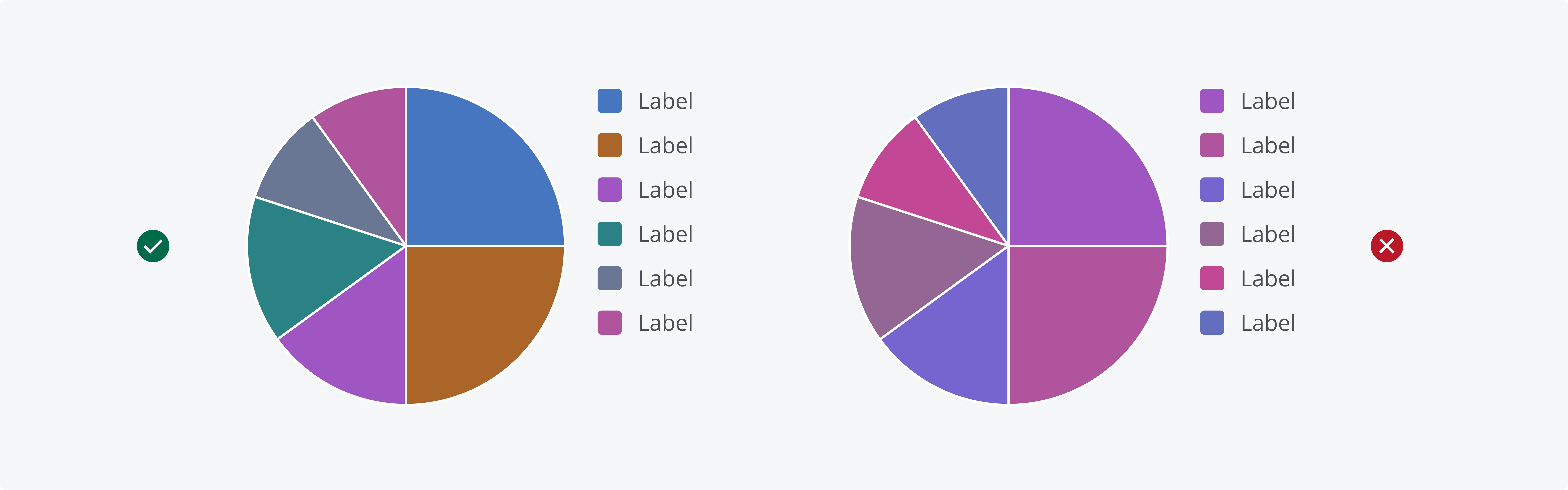
A well-defined, distinct color palette ensures that everyone can easily interpret the data. Using the set categorical palette colors minimizes the risk of misinterpretation and ensures a visual order. Don’t apply similar categorical color colors to the same chart.
Salt's categorical colors are intended to be used in numerical order, from 1 through 20.
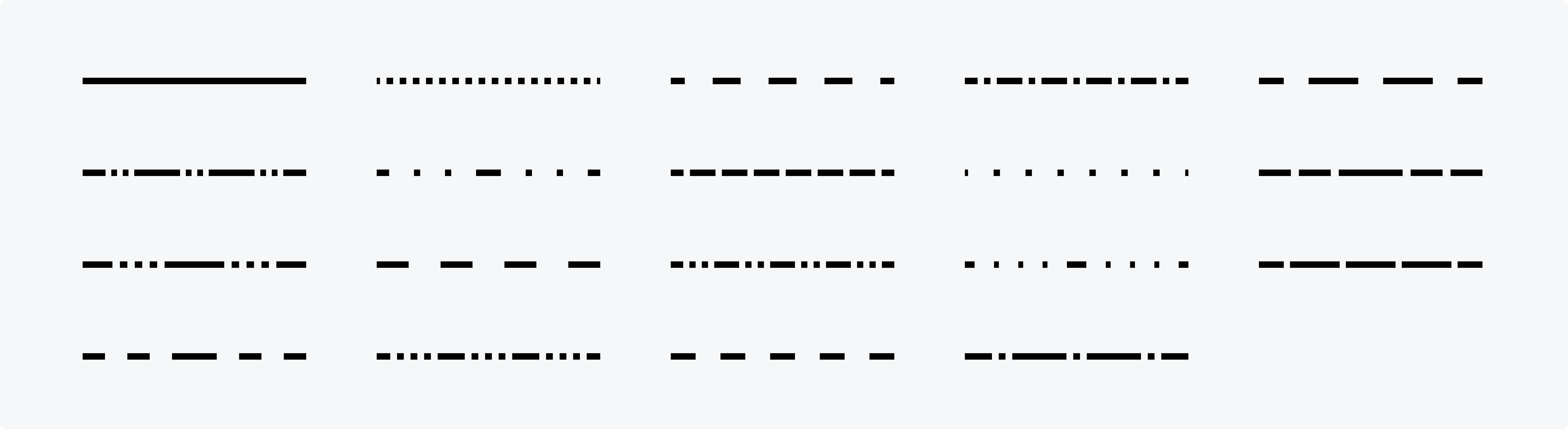
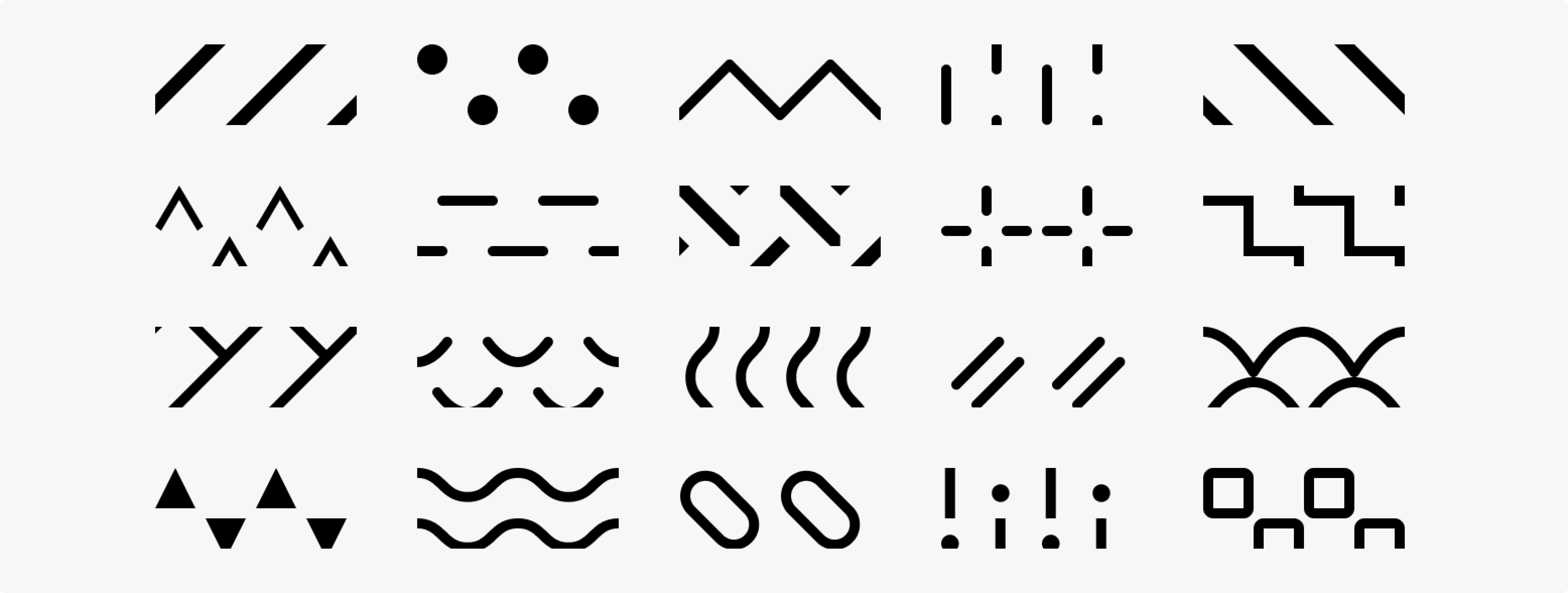
Salt provides line parts and fills to help further distinguish data. The order of line patterns and pattern fills is predefined to support consistency and ease of interpretation.
Salt provides 19 different line patterns.
Charts that include two-dimensional shapes with area, such as rectangles or slices, can be enhanced with pattern fills. Salt offers 20 distinct pattern fills to help differentiate data sets..
We appreciate your thoughts and feedback on any content in the Salt foundations. Please contact us if you have any comments or questions.