Layout grid
A layout grid provides a consistent structure for Salt user interfaces, organizing content into columns separated by gutters and framed by margins. The grid adapts to different screen sizes, with column number and width changing by density and breakpoint. This ensures layouts remain clear, balanced, and accessible across devices.
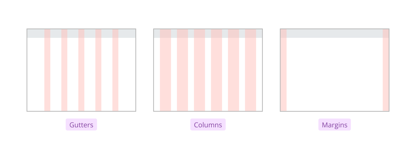
Salt’s layout grid uses four key types of spacing to structure and separate content. Each type plays a distinct role in organizing the user interface and ensuring clarity.
| Spacing type | Definition |
|---|---|
| Columns | The space that divides the content of the page into numbers depending on the content width for that breakpoint. |
| Gutters | The equally distributed space between columns that defines the width of UI elements. |
| Margins | The left and right spacing on the edge of the screen that defines the distance between UI elements and their container's boundary. |
These spacing types work together to create a balanced, readable, and visually appealing layout. Columns organize content, gutters separate columns, margins provide padding at the edges, and gaps space elements within the grid.
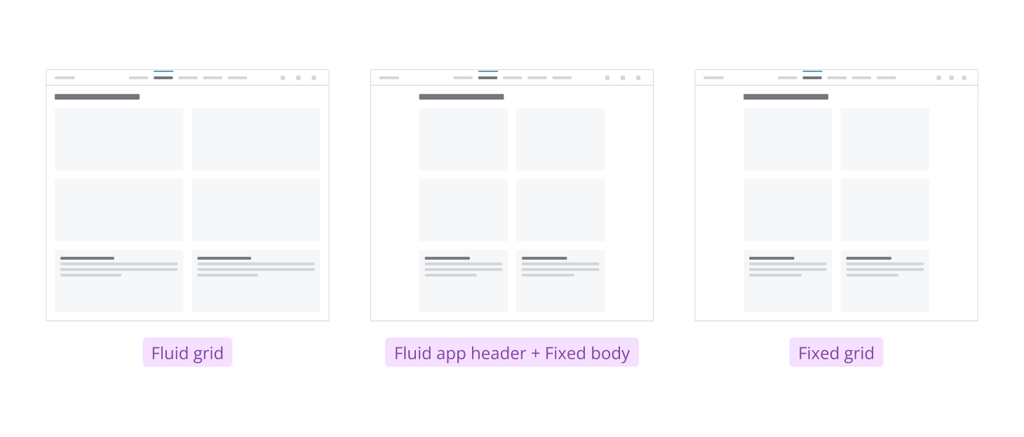
Salt supports two grid types to suit different layout needs: fluid grids adapt to the screen size, allowing columns to resize responsively, while fixed grids use set column widths for consistent structure.
Fluid grid: Fluid grids automatically adjust the size and position of content as the application window changes. This ensures layouts remain readable and accessible on any device. Fluid grids are commonly used for dashboard design and layout.
Fixed grid: Fixed grids expand with the application window until reaching a maximum width. Beyond this point, the grid stays centered, with margins on either side, and the content width remains constant. A maximum grid width of 1280px is recommended for text-heavy applications to improve readability.
Learn how to adjust your Salt grid in this video tutorial (Internal users only).
Salt offers a variety of layout components to help you build flexible, responsive interfaces. The list below highlights each layout option available in the Salt component library.
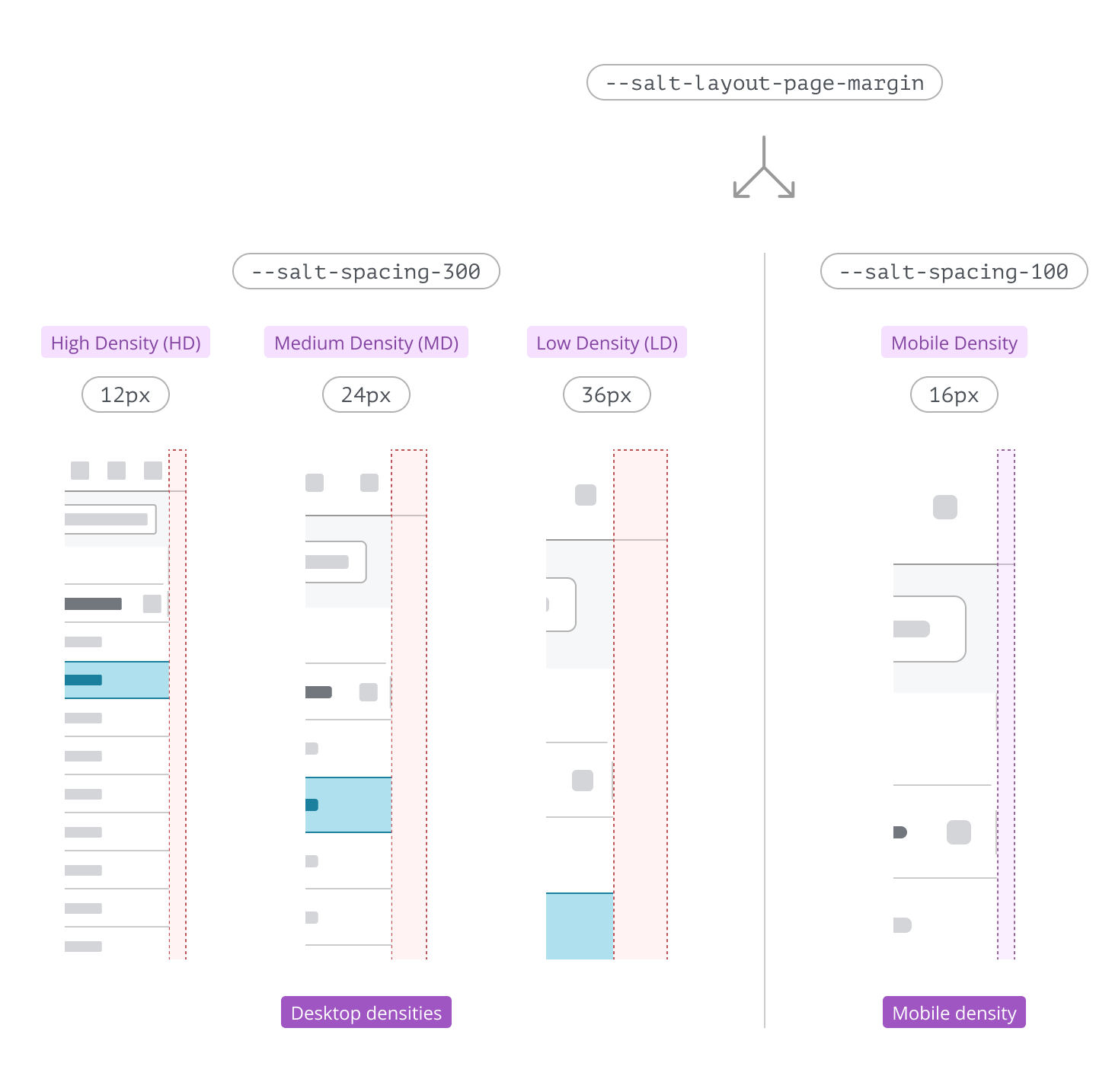
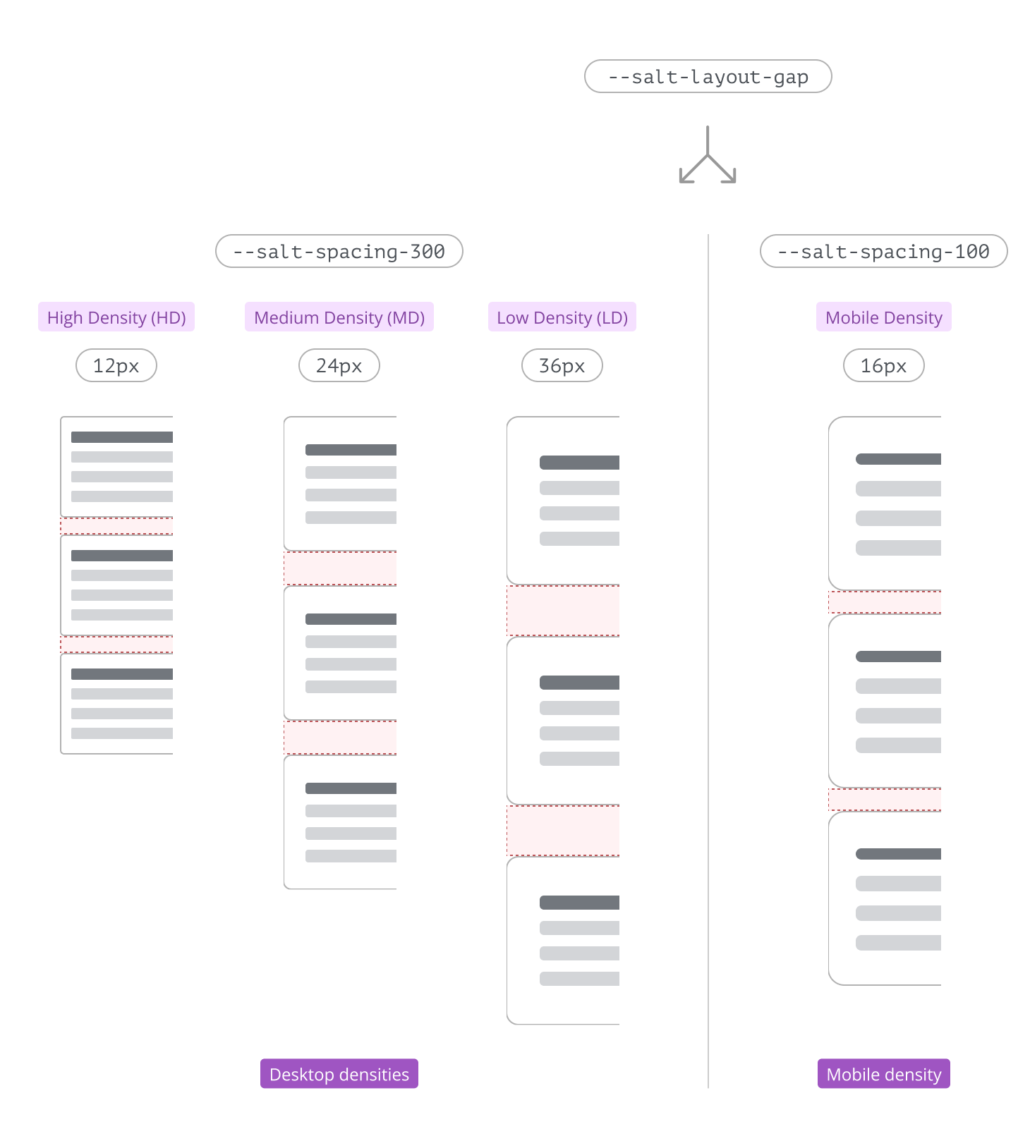
Layout tokens help manage margins and gaps in your layouts, especially when switching dynamically between desktop and mobile densities—In this scenario layout tokens ensure that margins and gaps are always optimized for each density and screen size without manual adjustments.
Learn more about switching density.
- Use the
--salt-layout-page-margintoken to set left and right margins. - Use the
--salt-layout-gaptoken to set spacing between elements, for both horizontal and vertical gaps.
| Token | High Density (px) | Medium Density (px) | Low Density (px) | Touch Density (px) | Mobile Density (px) |
|---|---|---|---|---|---|
--salt-layout-page-margin | 12 | 24 | 36 | 48 | 16 |
--salt-layout-gap | 12 | 24 | 36 | 48 | 16 |
Below is a visual comparison showing how the --salt-layout-page-margin token differs between desktop and mobile densities, ensuring each page uses space optimally for different devices and screen sizes.
Below is a visual comparison showing how the --salt-layout-gap token differs between desktop and mobile densities, ensuring each page uses space optimally for different devices and screen sizes.
We appreciate your thoughts and feedback on any content in the Salt foundations. Please contact us if you have any comments or questions.