Size
Size defines the height and width of components within the design system, ensuring consistent and harmonious design across applications. It refers to the specific dimensions allocated to elements to maintain uniformity and balance. By controlling these dimensions, Salt provides a structured framework that supports visual consistency and functionality.
Consistent use of size tokens ensures uniformity in component dimensions, enhancing the visual harmony and functionality of your application's design. Each size token responds to density, ensuring components remain aligned as the density is changed.
| Token | Dimension | High Density (px) | Medium Density (px) | Low Density (px) | Touch Density (px) | Mobile Density (px) |
|---|---|---|---|---|---|---|
--salt-size-base | Height only | 20 | 28 | 36 | 44 | 44 |
--salt-size-selectable | Height and width | 12 | 14 | 16 | 18 | 18 |
--salt-size-icon | Height and width | 12 | 12 | 14 | 16 | 16 |
--salt-size-adornment | Height and width | 6 | 8 | 10 | 12 | 12 |
--salt-size-bar | Height or width | 2 | 4 | 6 | 8 | 8 |
--salt-size-bar-strong | Height or width | 4 | 8 | 12 | 16 | 16 |
--salt-size-indicator | Height or width | 1 | 2 | 3 | 4 | 4 |
--salt-size-base is the fixed default height for base components in each density within the design system. It ensures the consistent alignment of components in horizontal layouts, as well as the vertical alignments of the text values within them. This means the text within each component sits on the same baseline.

Using --salt-size-base, in conjunction with a spacing token above and below, creates a consistent height for components that can nest a --salt-size-base component within them. This provides further standardized heights across the design system.
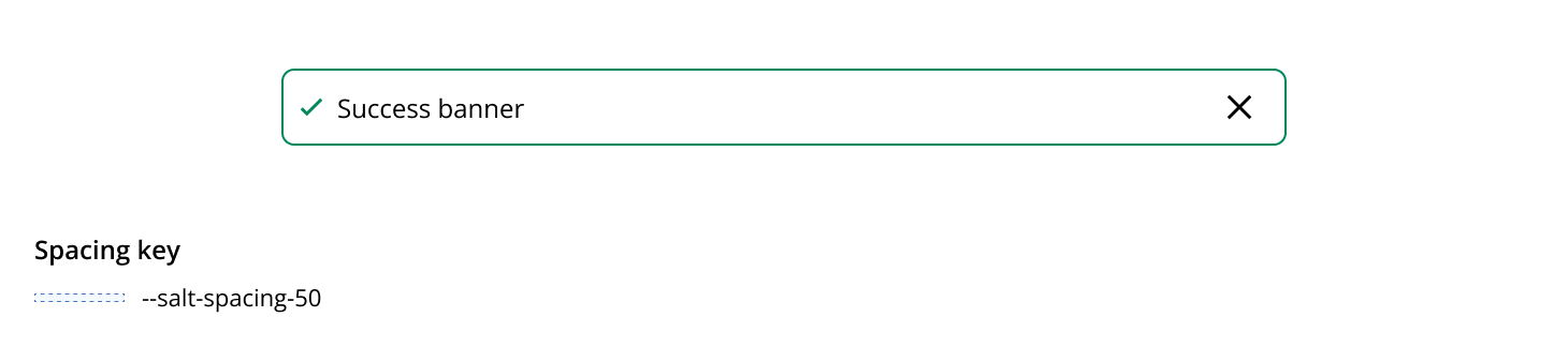
The following example shows how components can use --salt-size-base and --salt-spacing-50 (top and bottom) to define the height of a component or stackable element, such as a Data Grid row. The height allows a --salt-size-base component to be contained within it, but it's not dependent on the component to force the height.
--salt-size-selectable is used to set the dimensions of selectable components, including Radio Button, Checkbox, and Switch.

--salt-size-icon controls the size of all icons throughout the design system. Icons are designed to be displayed no smaller than 12px x 12px; therefore this is set as a minimum size within the token's values.
You can find out more in the iconography foundation.
The purpose of --salt-size-adornment is to set the size of a discrete element within an editable field or cell intended to indicate a state, such as an error or warning.

--salt-size-bar is used to define the thickness of an accent bar or track, suitable for both vertical and horizontal orientations, such as in Card or Progress.

--salt-size-bar-strong is used to control the thickness of an accent bar, when it's positioned on top of a track, such as in Progress.

--salt-size-indicator defines the thickness of indicators, such as those used in Tabs or NavigationItem.

Fixed-size tokens offer dimensions that remain constant across all densities. For example, --salt-size-fixed-100 equals 1px regardless of density, providing a stable reference for attributes like borders and dividers. This ensures precise control and uniformity in design elements that require consistent sizing, enhancing the overall coherence of the design system.
| Token | All densities (px) |
|---|---|
--salt-size-fixed-100 | 1 |
--salt-size-fixed-200 | 2 |
--salt-size-fixed-300 | 3 |
--salt-size-fixed-400 | 4 |
--salt-size-fixed-500 | 5 |
--salt-size-fixed-600 | 6 |
--salt-size-fixed-700 | 7 |
--salt-size-fixed-800 | 8 |
--salt-size-fixed-900 | 9 |
Unlike other attributes, borders are a fixed size regardless of the density. To set consistent border sizes across all densities --salt-size-fixed-100 and --salt-size-fixed-200 are used. These values are used throughout the design system to control the size of all borders and separators.
We appreciate your thoughts and feedback on any content in the Salt foundations. Please contact us if you have any comments or questions.