Designing with Salt Figma libraries
Salt provides a comprehensive set of components and styles, which include themes, typography, color palettes, iconography and more. Designers can use the components as they are, out of the box, or adapt them to suit the needs of a business or application.
To start designing with Salt, you should allow 30 minutes and begin with the following:
- Make sure you have an active Figma account.
- To use the Salt typography style, install the Open Sans, PT Mono and Amplitude fonts. If you don't already have them, you can download Open Sans and PT Mono from Google Fonts.
- If you are a JPMC employee and Mac user, download the Amplitude font from Self Service by searching for "JPMC Brand Fonts". You can find additional guidance on Salt's Resources page about fonts.
Watch our tutorial video (JPMC Employees Only) on setting up Salt DS Figma libraries for your project.
We maintain a comprehensive set of up-to-date libraries in Figma to help you make beautiful, consistently designed UIs and applications. If you want to start using Salt Design System for your project, first you need to set up the Salt libraries on Figma with the steps below.
Salt offers the following libraries in Figma, and you'll be installing those that best suit your needs:
| Library | Description |
|---|---|
| Salt DS Components and Patterns Essential | This library includes all Salt DS components and patterns that are represented in code and are documented on the site. To use Salt components and patterns directly, please install this library. |
| Salt DS Themes Essential | This library includes all typography and effect styles as well as all color, size and spacing variables needed for the themes available within the components and patterns library. All variables are reflective of the design tokens in code. |
| Salt DS Assets | This library offers Salt icons and country symbols. |
| Salt DS Logos | This library contains logo variations, including J.P. Morgan, Chase and dual-brand logos. This library is for internal JPMC use only. |
If you're a JPMC employee and would like to use Salt's Chase theme, please refer to our internal documentation for Chase theme setup and installation (internal only).
Salt DS JPM Brand Colors, Legacy (UITK) Colors libraries
The color libraries below provide the color variables for each theme. However, using these color variables directly in a design file is not recommended, as it does not reflect the way Salt components reference colors in code. Instead, please use the semantic variables provided in the Salt DS Themes Figma library.
| Library | Description |
|---|---|
| Salt DS JPM Brand Colors | This library provides variables for each foundational color needed with the Salt DS JPM Brand theme. |
| Salt DS Legacy (UITK) Colors | This library provides variables for each foundational color needed with the Salt DS Legacy (UITK) theme. |
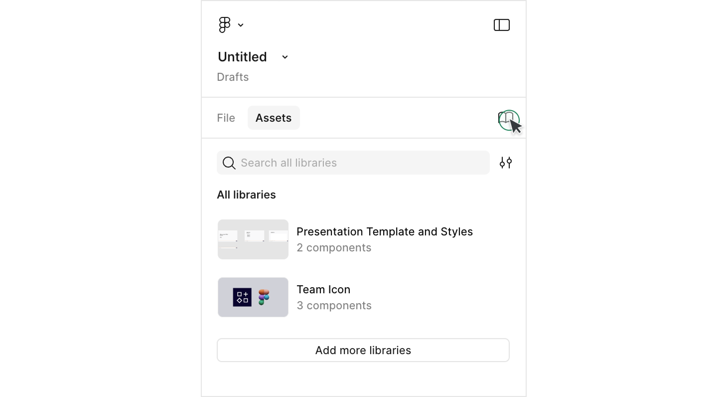
To start using the Salt libraries, enable them directly from the 'Assets' panel within your Figma file.
To start using the Salt libraries, To use Salt libraries, open Figma library files and publish the libraries from the 'Assets' panel. Then proceed with the steps below.
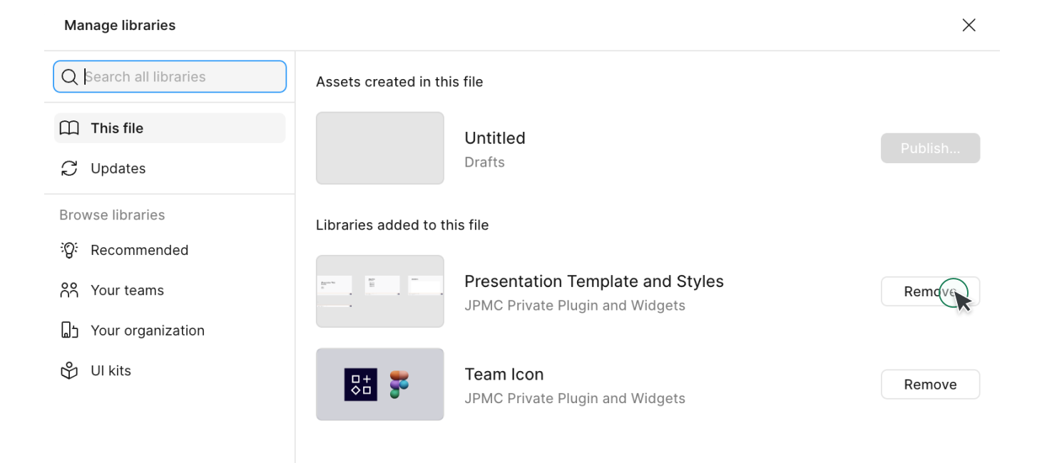
Start by opening a new design file in Figma. You’ll notice some pre-installed libraries in the 'Assets' panel. Click on the library icon located in the 'Assets' panel to manage your libraries.
Identify any libraries you don’t need and click the 'Remove' button on the right side to tidy your workspace.
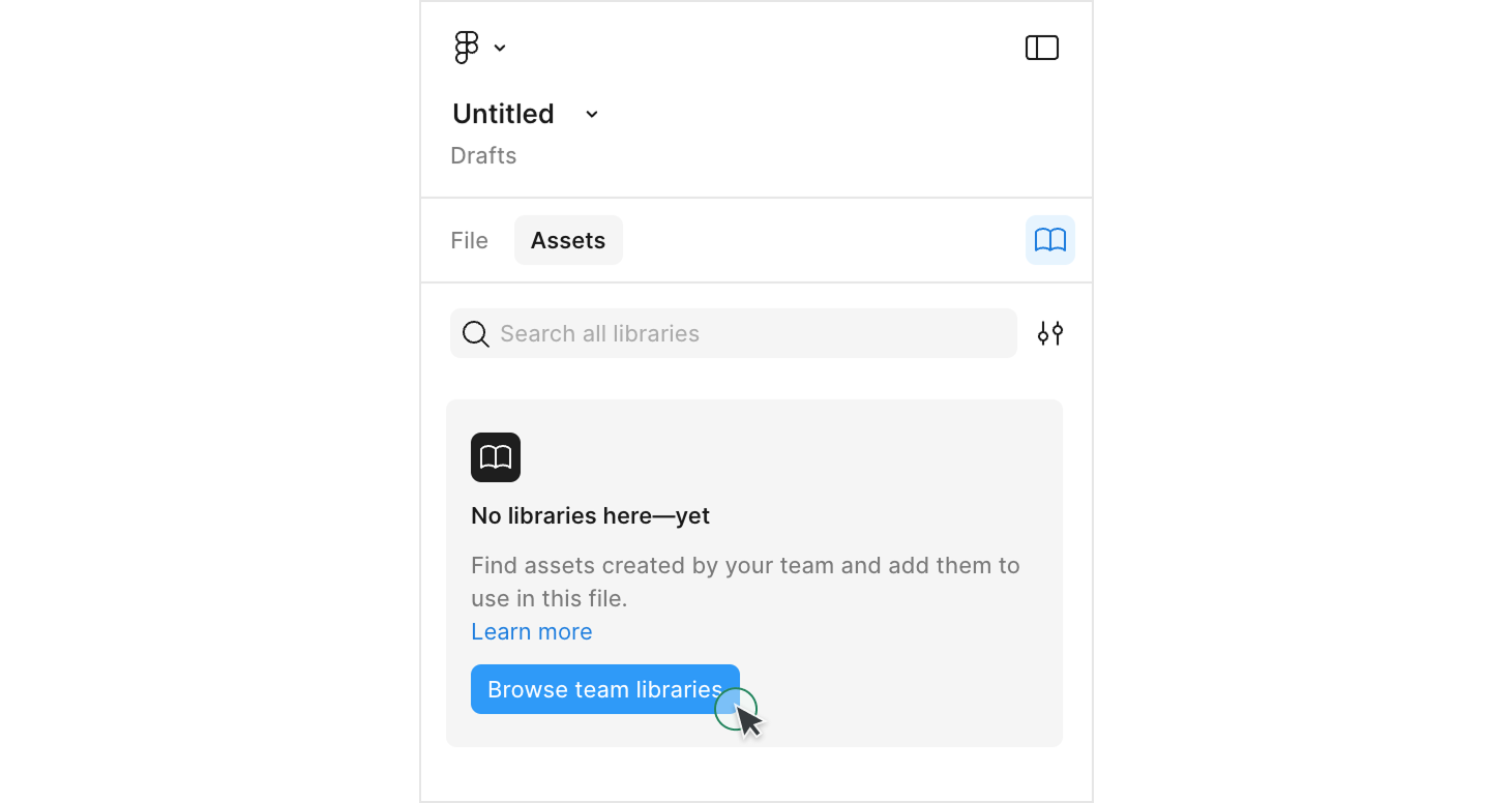
Once your workspace is clean, click the 'Browse team libraries' button to search for and install new libraries.
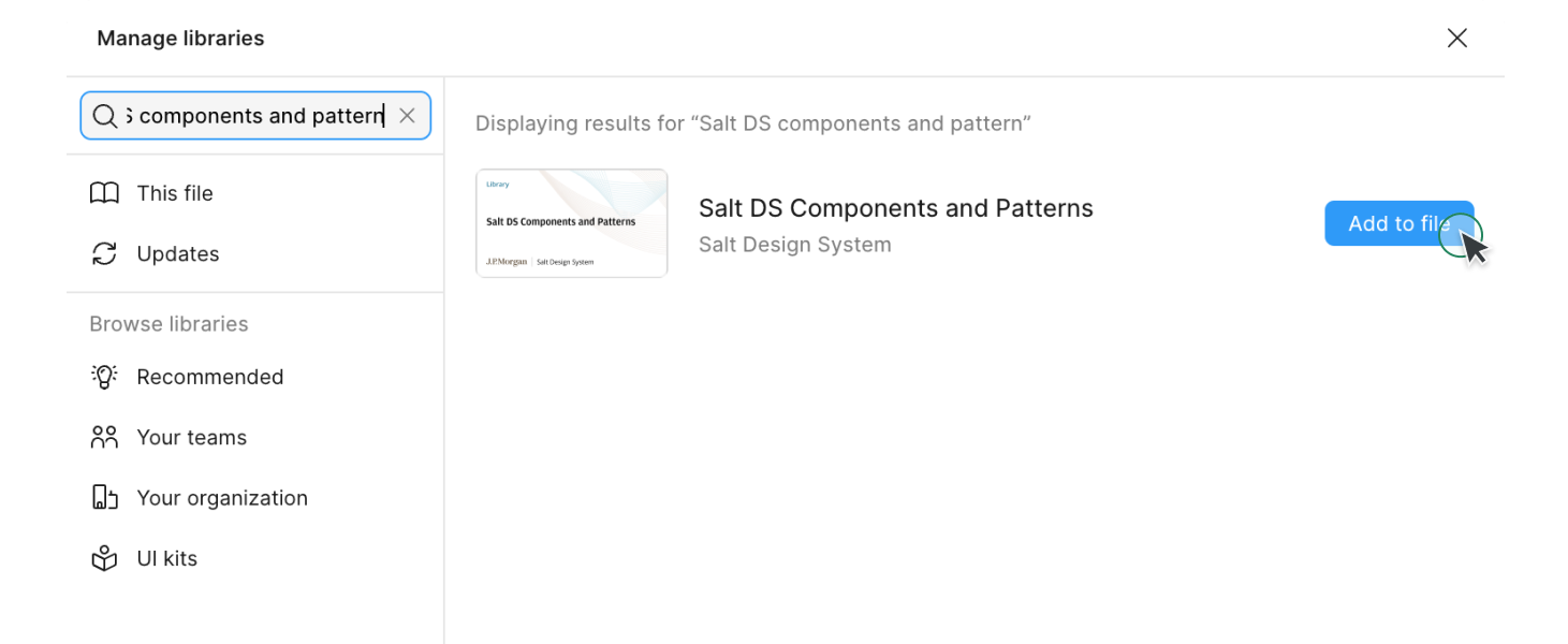
In the search field, type “Salt DS” to see the Salt DS libraries. Alternatively, type the whole name of the library you want to install. You can find the essential Salt DS libraries info in the table above.
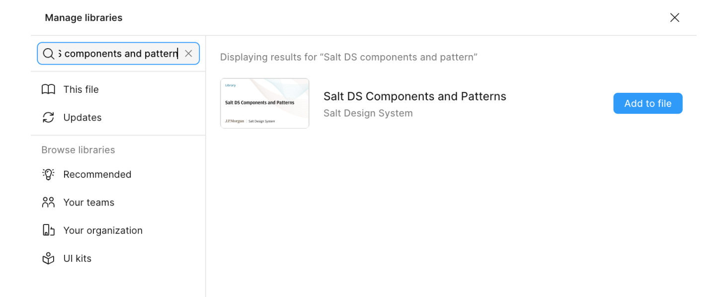
Click the 'Add to file' button to include a Salt DS library in your design file. For details on each library, see the section below.
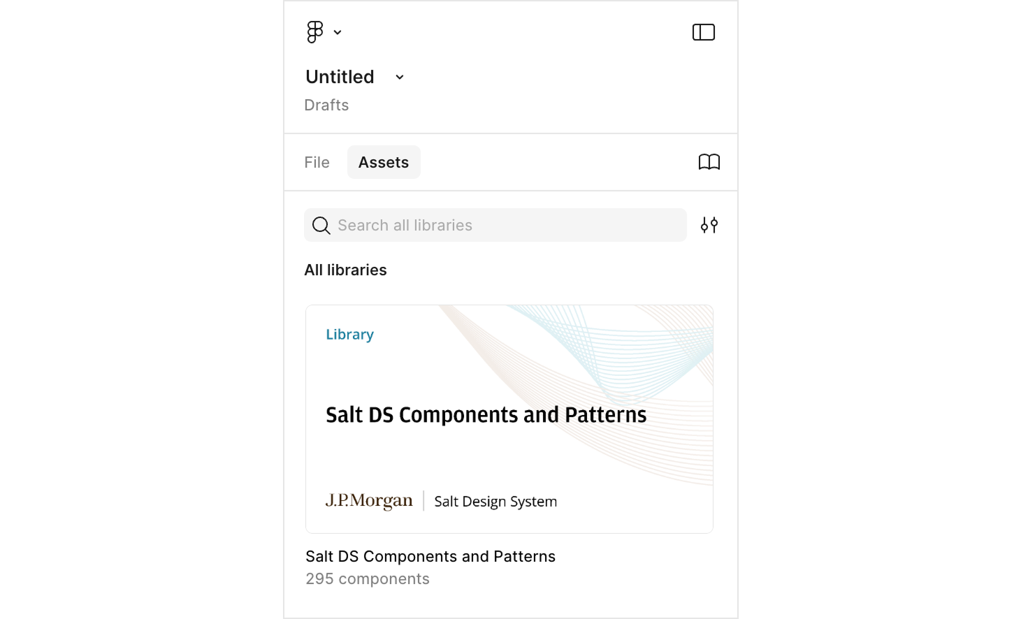
Now you'll be able to see the available Salt DS libraries in the 'Assets' panel. You can start using the library in your design projects. Next, once you successfully add a component to your project, you'll know for certain that the library is in place.
This table shows the definitions of Salt design assets in Figma:
| Salt DS Figma artifact | Definition | Figma Library | Figma library example |
|---|---|---|---|
| Component | Salt components distributed as Figma components. Configurable with props. Shouldn't be detached. | Salt DS Components & Patterns Library | Avatar, Banner, Button |
| Template | Salt components AND patterns distributed as Figma components. Initially configurable with props. Should be detached to customize the composition (e.g., add or remove elements) | Salt DS Components & Patterns Library | Checkbox group template, Data Grid template |
| Sticker | Patterns built by Salt (or contributions) available as example frames. Can be copied into files. Not distributed as components. | Salt DS Pattern Stickersheets | Forms, International Address Form |
If you are migrating from other libraries, including Salt (Next), Salt Light, Dark libraries, and UITK, please refer to our migration guide (JPMC employees only).
If you encounter any issues or need additional help, please don’t hesitate to reach out. Our support team is here to assist you: