Tableau
Tableau is a data visualization tool. It allows users to create customized dashboards for business information analytics.
This guidance outlines how you can best align your Tableau dashboards with the Salt design system foundations. It's not possible to fully align Tableau designs with all of the foundations due to the tool's limitations, but this guidance will help you achieve greater visual consistency in spacing, typography, color and icons.
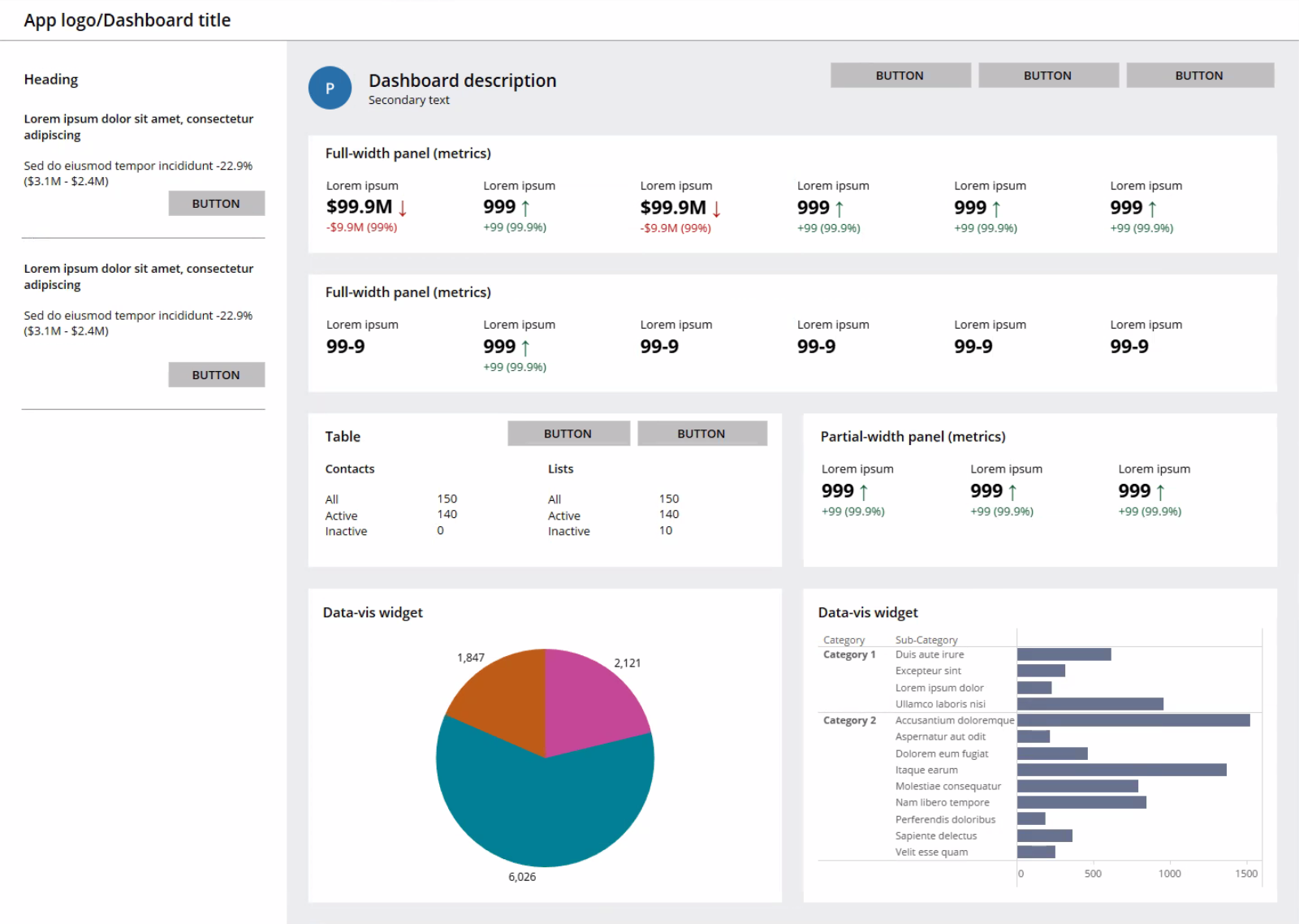
They key principles this guidance covers derive from the Analytical Dashboard pattern. We highly recommend reading the pattern prior to building a dashboard design within Tableau, as this will enable you to form a foundational understanding of the layout features and components recommended to maintain effective visual hierarchy.
(J.P. Morgan employees only) Follow the instructions to access and start using the Tableau template within the dedicated Salt server. For any issues with the steps highlighted, please contact us.
The dimensions and specifications in the examples below use the medium density (MD) in light mode. To design a Tableau dashboard following other Salt densities and modes, refer to the relevant foundations where applicable.
Spacing refers to the organization of space to separate elements and create a consistent visual rhythm throughout a layout. Refer to the spacing foundation for further guidance on how to apply spatial tokens.
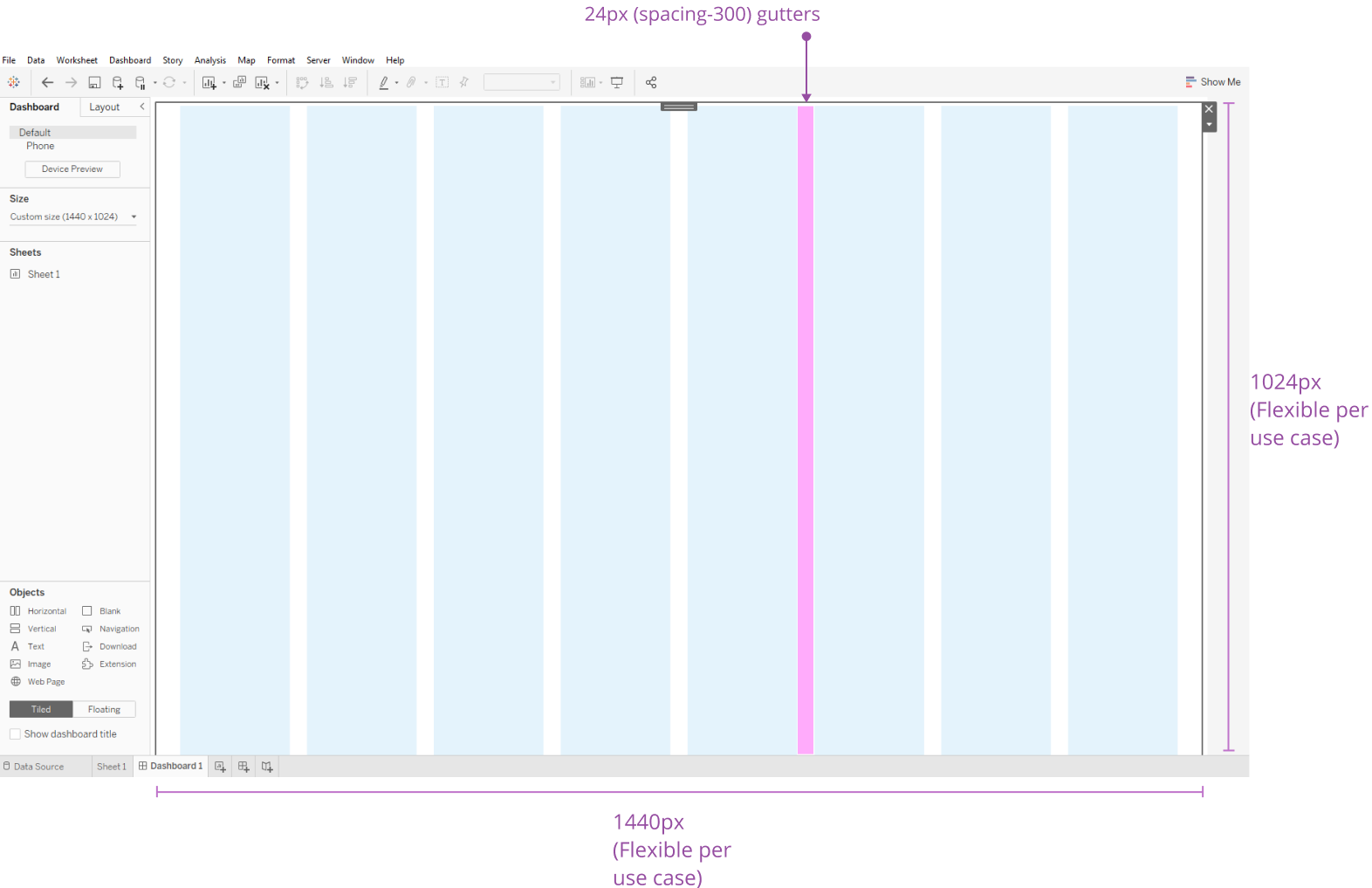
Tableau does not currently offer the ability to set and apply a layout grid with margins, columns and gutters to a dashboard.
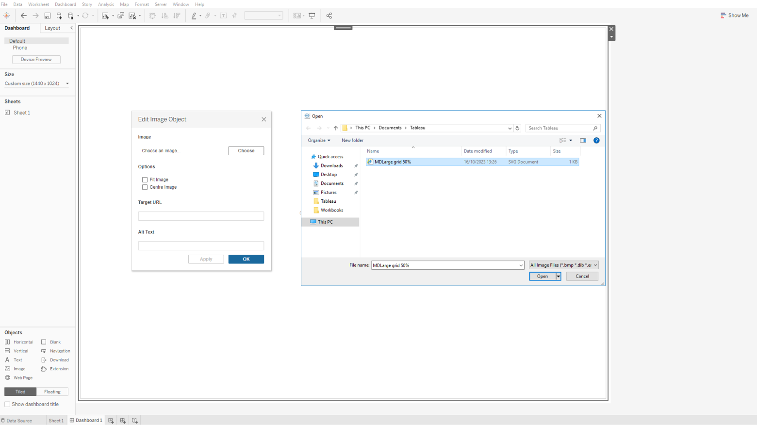
A temporary solution is to create a layout grid, or select a grid from the Salt layout grid library, that fits the intended dashboard and density size. You can then export the grid as an SVG image at full scale from Figma, and import this into Tableau to use as a background image.
To export a layout grid from Figma:
- Create a frame dimensioned to your dashboard size. Apply a layout grid, or select a Layout Grid from the Salt library that fits your intended dashboard size.
- Export the frame as an SVG image using the export settings in the bottom right of the design panel.
- Save the image within your files as an SVG.
To import a layout grid SVG into Tableau:
- Create a new tableau dashboard with the desired viewport dimension.
- Drag and drop an image object from the dashboard panel.
- Select the correct layout grid file to import as an image.
- Treat this container as a background image.
- Place your dashboard content over the top of this base container.
- Delete the image layer once the dashboard design is complete.
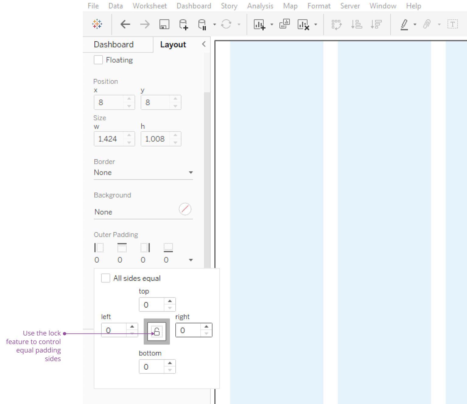
Tableau does not import images at 100% scale, and instead applies 4px outer padding across all borders by default. In the layout panel, change the padding values to 0px on all sides. This ensures any content aligned to the grid is sized and positioned accurately.
The Salt example dashboard uses an eight-column MD large grid.
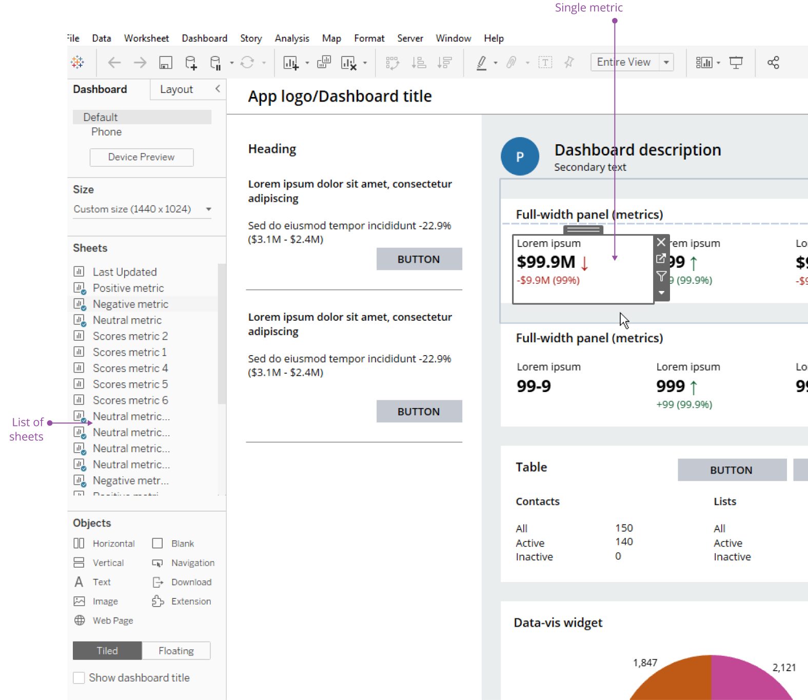
The Salt dashboard pattern recommends using Card to display data within the main body region of a dashboard. You can achieve this within Tableau instead by styling and positioning containers as panels.
Refer to the content module spacing recommendations within the dashboard pattern to better establish readability in your dashboards.
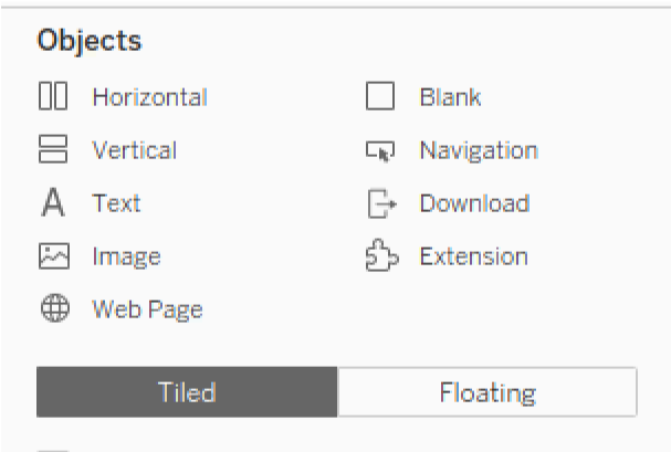
Objects within a Tableau dashboard typically sit in one of two container types: tiled or floating.
- Tiled containers don't overlap and instead form part of a single-layer grid that's responsive to a change in dashboard size. You can nest tiled containers with additional containers and use fixed width/height values for sizing.
- You can layer floating containers over other objects and resize them manually, making them easier to adjust and position.
There are three types of containers to organize elements within :
- Horizontal: a horizontal container that controls the height.
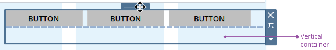
- Vertical: a vertical container that controls the width.
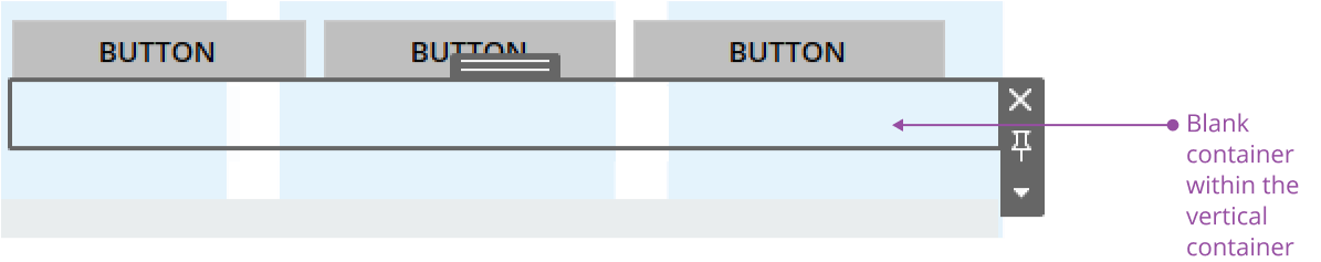
- Blank: a versatile container that provides flexibility over both width and height. Blank objects add spacing and help with the organization of a layout.
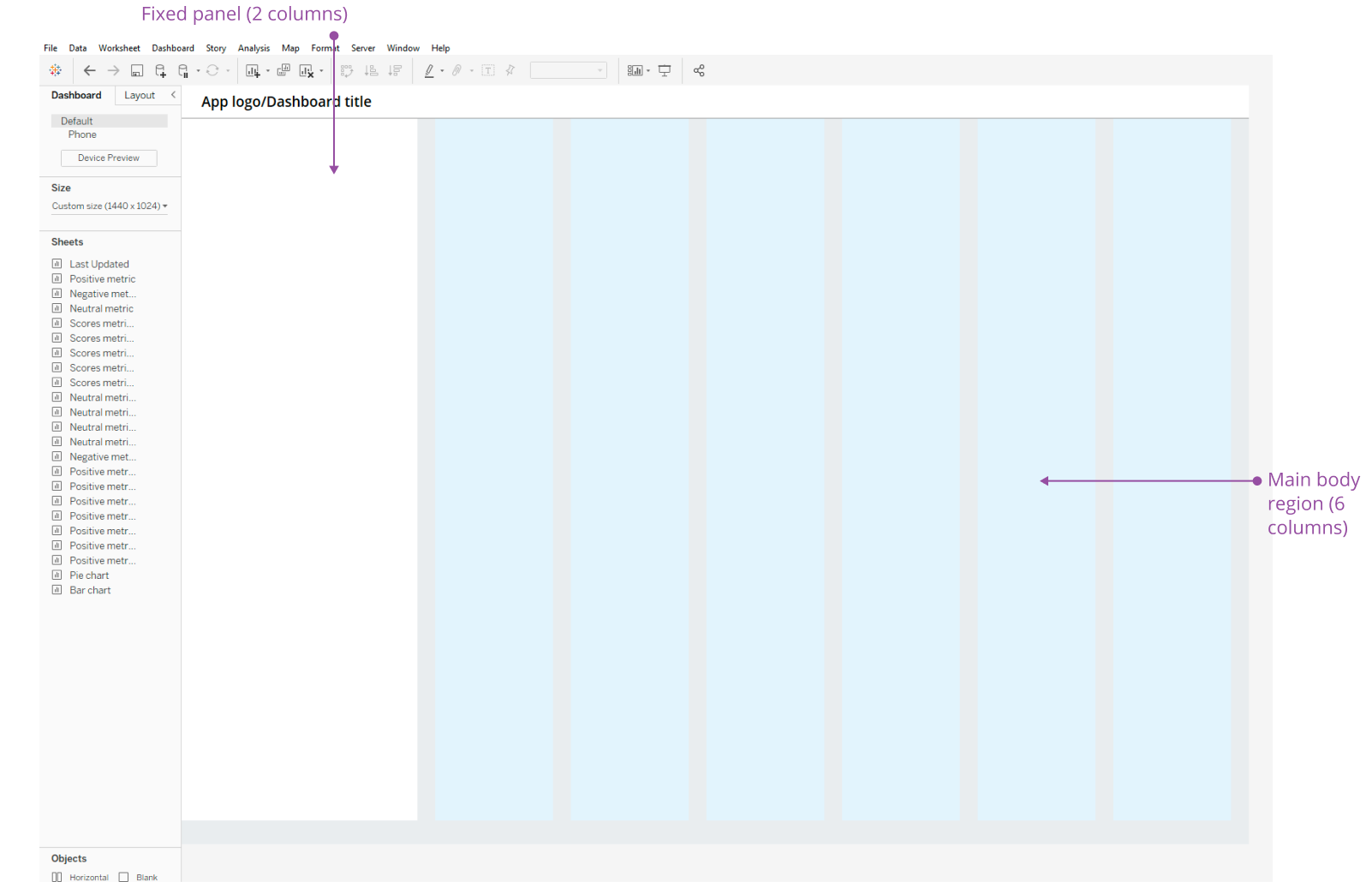
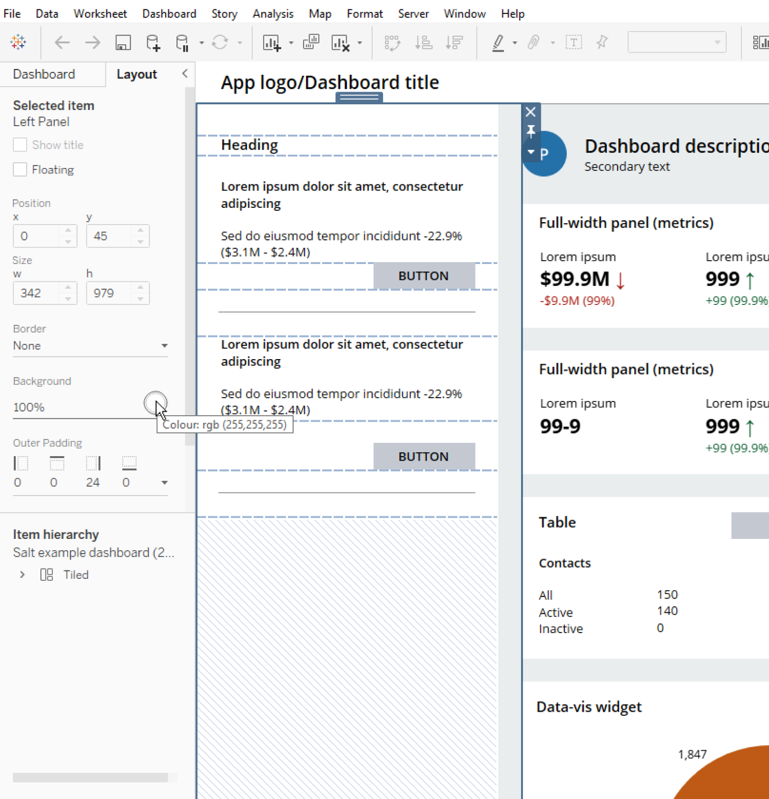
Dashboards typically have a layout comprising a main body region supported by a fixed panel.
Since the main body region contains panels positioned to accommodate content and maintain visual hierarchy, it's good to establish a base container in Tableau for additional containers. Drag and drop a horizontal container from the Objects panel on the right-hand side and resize it to the intended span of columns. The Salt example dashboard uses a six-column area for the main body region.
A fixed panel can be a floating or tiled container. The Salt example dashboard utilizes a floating container for flexibility of positioning and ease of adjustment.
Using nested containers, you can define the content layout and structure. You can nest the different container types within each other depending on the direction of content layout.
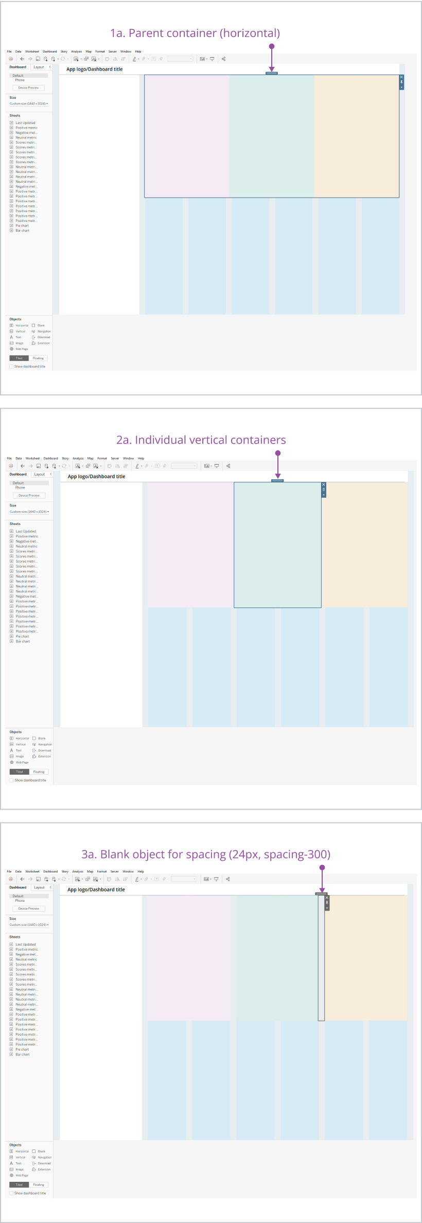
Place vertical containers within a parent horizontal container to layout content in a horizontal orientation.
- Place a horizontal container.
- Drop multiple vertical containers within the horizontal container.
- Use blank objects to create spacing between vertical content modules. Alternatively, apply inner padding to the left/right edges of the vertical containers to create padding.
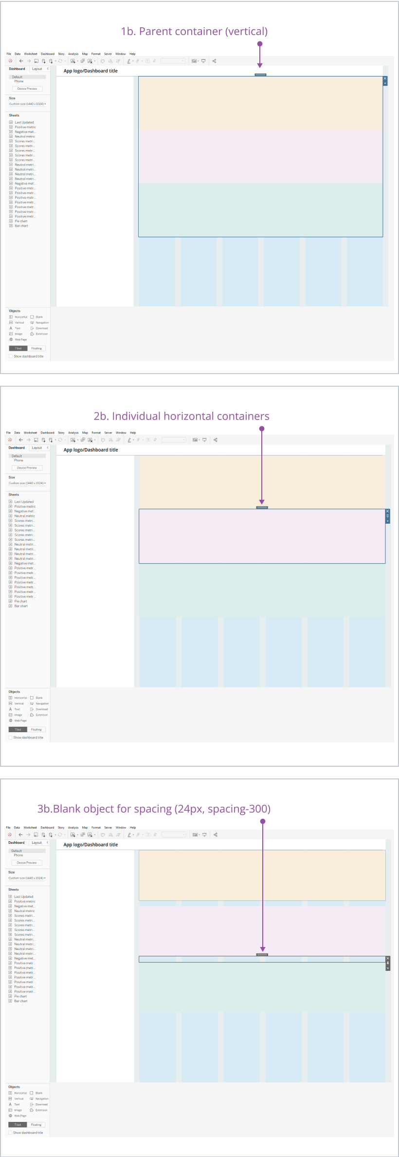
Place horizontal containers within a parent vertical container to layout content in a vertical orientation.
- Place a vertical container.
- Drop multiple horizontal containers within the vertical container.
- Use blank objects to create spacing between horizontal content modules. Alternatively, apply inner padding to the left/right edges of the horizontal containers to create padding.
Place vertical containers within a parent horizontal container to lay out content in a horizontal orientation.
- Place a horizontal container.
- Drop multiple vertical containers within the horizontal container.
- Use blank objects to create spacing between vertical content modules. Alternatively, apply inner padding to the left/right edges of the vertical containers to create padding.
Place horizontal containers within a parent vertical container to lay out content in a vertical orientation.
- Place a vertical container.
- Drop multiple horizontal containers within the vertical container.
- Use blank objects to create spacing between horizontal content modules. Alternatively, apply inner padding to the left/right edges of the horizontal containers to create padding.
The key indicator that you're placing a blank object inside a container is the thicker, blue line around the parent container and the populated grey area. Once you've placed the objects, double-click the handle of a lower-level object to select the parent container. A dashed line indicates the boundaries of objects within a parent container.
Another example of where some complex nesting may be required to align elements is buttons (known as ‘Navigation’ from the Objects panel). In the Salt example dashboard, the buttons at the top of the dashboard are aligned to the text content on the left-hand side. They cannot be directly nested into the same underlying container as the text and avatar item.
By nesting the buttons within their own container, you can control the spacing and positioning of the buttons. The containers can be used to determine the height of the buttons. Width is controlled via the dropdown menu on the individual buttons. Select ‘edit width’ to amend the value.

To horizontally align a set of buttons, place two or more buttons inside a horizontal container to control the height of the buttons.
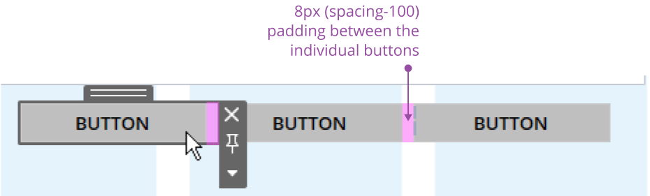
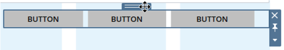
Place the horizontal container containing the buttons inside a vertical container. Add a blank object directly below the buttons inside the vertical container to act as padding for the positioning of the buttons in relation to the rest of the content it’s aligned to within the dashboard.
Each container type, including the buttons, has it’s own inner and outer padding values that can be used to arrange the buttons on the grid. It is important these values are set in a logical manner to aid with ease of spacing management.
Typography enhances readability and establishes hierarchy for more effective communication. Refer to the Salt typography foundation for further guidance on how to apply type styles.
The Tableau template doesn't contain a font palette with the design system’s type scale, Open Sans. The font is available within the software; however it's necessary to apply it manually to text elements and format it in accordance with the design system’s recommendations.
It's also important to note the font preset sizes within Tableau don't visually render and align with the Salt equivalent typography sizing. We've designed the Salt example dashboard in MD, so it utilizes the MD type styles. Refer to the table below for a 1:1 conversion of the Salt typography scale for Tableau in medium density.
| Font style | Weight | Salt size | Tableau size |
|---|---|---|---|
| Body | Regular | 12px | 10px |
| Body strong | Semibold | 12px | 10px |
| Body small | Light | 12px | 10px |
| H1 | Bold | 24px | 17px |
| H1 strong | Extrabold | 24px | 17px |
| H1 small | Medium | 24px | 17px |
| H2 | Semibold | 18px | 14px |
| H2 strong | Bold | 18px | 14px |
| H2 small | Regular | 18px | 14px |
| H3 | Semibold | 14px | 11px |
| H3 strong | Bold | 14px | 11px |
| H3 small | Regular | 14px | 11px |
| H4 | Semibold | 12px | 10px |
| H4 strong | Bold | 12px | 10px |
| H4 small | Regular | 12px | 10px |
| Label | Regular | 11px | 10px |
| Label strong | Semibold | 11px | 10px |
| Label small | Light | 11px | 10px |
| Action | Semibold | 12px | 10px |
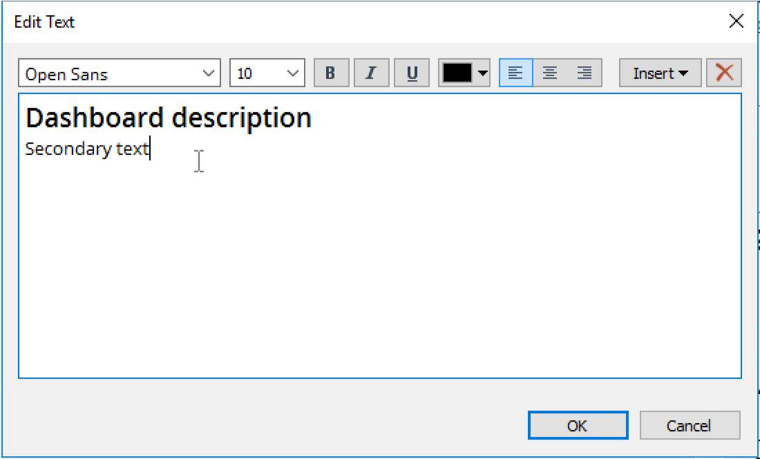
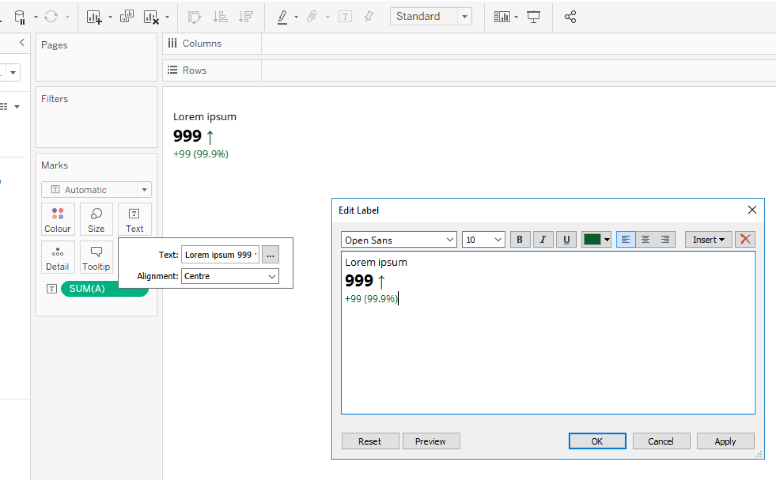
Drag and drop a text object from the Objects panel to add text. You can nest text objects within containers and apply individual padding values to them using the Layout panel.
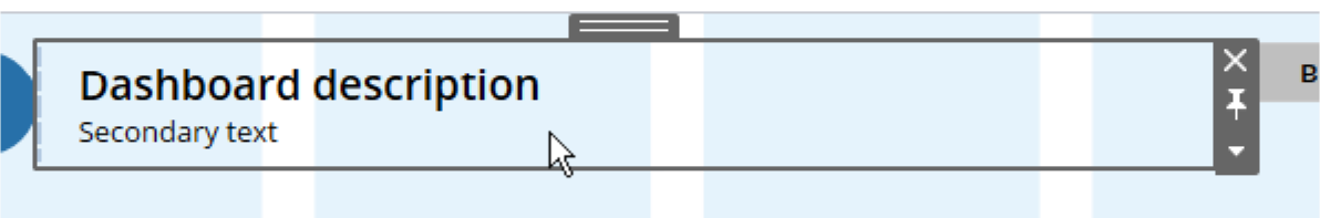
Double-click into a text object to edit the content and formatting. You can edit individual parts of a single text object separately to display the type style and color.
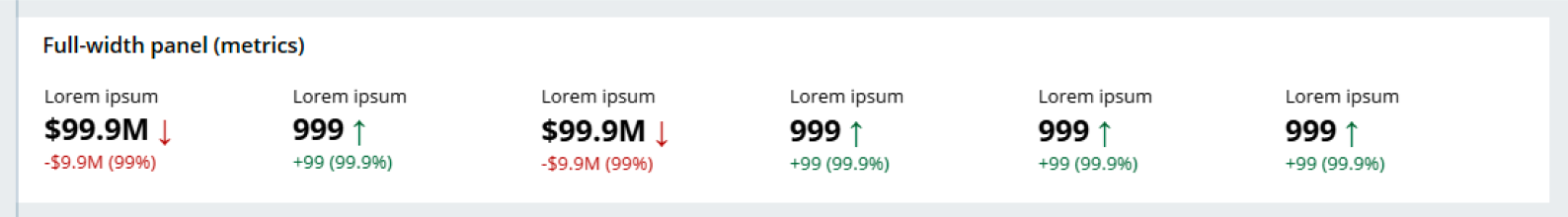
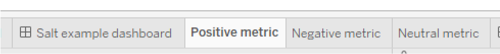
The Salt example dashboard contains three pre-styled text-based metrics you can adjust for your dashboard context:
- Positive metric
- Negative metric
- Neutral metric
You can use these to represent a change from a previous value. You can also add characters or labels to help provide context to the presented value.
You can find metrics within sheets which are single-view worksheets or stories accessible via the tabs at the bottom of the interface. A single sheet contains editable data, shelves, cards, legends, and the Data and Analytics panes in its side bar. A collection of sheets form a dashboard and its content.
To use an existing Salt metric from the file, duplicate a chosen metric tab at the bottom and rename it. It’s important to note that you can only use an individual metric once within a dashboard; even if the design requires duplicates, you must represent this via multiple sheets.
- Each time a sheet is created/duplicated, it appears under ‘Sheets’ within the Dashboard panel.
- To place a sheet/metric within a dashboard, drag and drop a sheet from the list into a container.
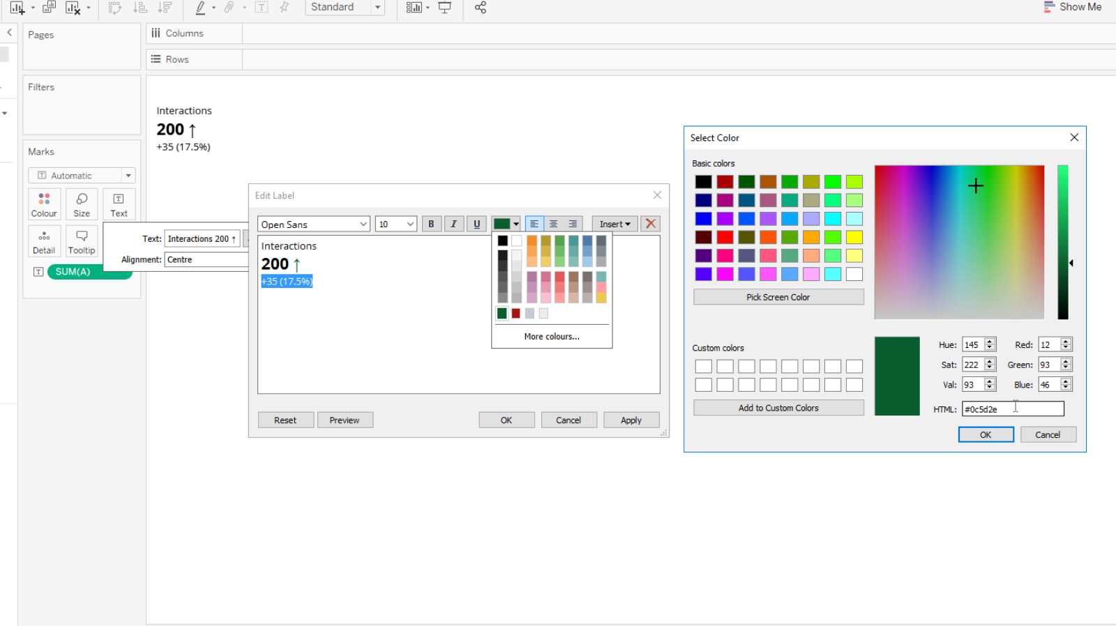
Edit text within the relevant sheet containing the metric/data. You can control the font style, weight, size and color via the Edit Label panel. You can also apply different colors to individual parts of text.
Color communicates meaning and establishes visual hierarchy, which is especially important within data visualizations. Refer to the Salt color foundation for further guidance on how to apply color.
There are fewer constraints when applying color within Tableau. Use a color selector with RGB or Hex Ref input when adding color to objects—both text and container items.
The Tableau file contains the UITK Categorical color palette to apply to data visualization widgets. You can only access this palette within individual worksheets rather than a dashboard view.
You can add additional custom palettes within a file manually using the following steps:
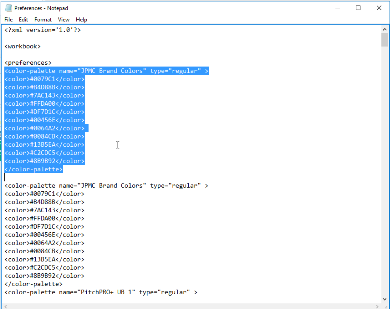
- In File Explorer, locate the "Preferences" file in the "My Tableau Repository" folder.
- Right-click on the file and select Open with > Notepad.
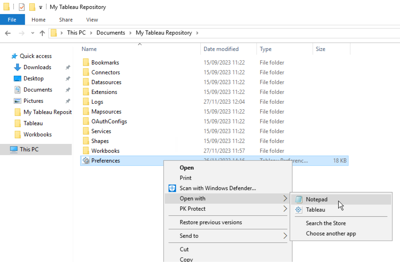
This should open up a text file containing HTML of the existing color palettes within the Tableau file.
- Duplicate the first set of color values and rename the palette.
- Replace the hex values with the color values of your choice.
- Add or delete color rows as needed.
- Save the file and reopen Tableau. You should now see the color palettes updated with the new one under the dropdown menu.
It’s important to note that in order to update the Tableau file with new color palettes, after saving the Preferences file with the updated hex values, both the Preferences notepad and the Tableau window need to be closed before re-opening Tableau.
Apply color to containers within dashboards using the background fill via the Layout panel.
Use the following Salt tokens for panels in light mode dashboards:
- Primary containers:
--container-primary-background(#FFFFFF) - Secondary containers:
--container-secondary-background(#EAEDEF)
You can apply color to text using RGB or Hex Ref inputs. Text-based sheets don't contain preset color palettes like charts do. However, you can add individual colors into the Custom colors section within the color picker for quicker reference.
Use Tableau’s desktop guidance to learn how to build common chart types from scratch.
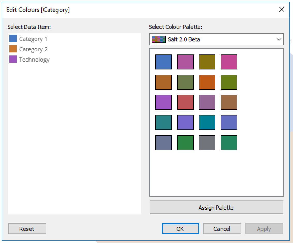
To apply color to individual elements of a chart, follow the below steps:
- Select the chart value to assign a color to from the ‘Category’ list on the right-hand side
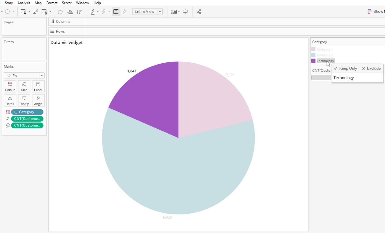
- Select edit colors from the ‘Marks’ card to the left. This will open the color palette window. Select ‘Assign Palette’ to ensure colors are assigned from the correct palette.
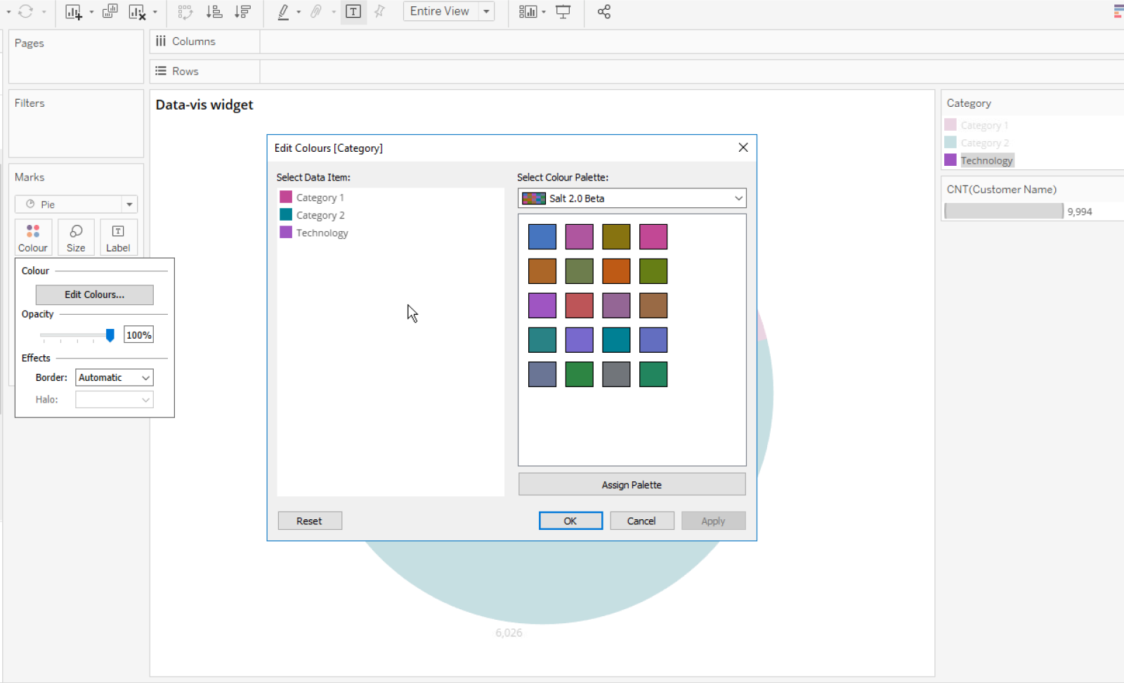
- Select a color from the ‘Salt 2.0 Beta’ palette (or a color palette of your choice), click ‘Apply’ to assign the color and then click ‘Ok’ to confirm and close the window.
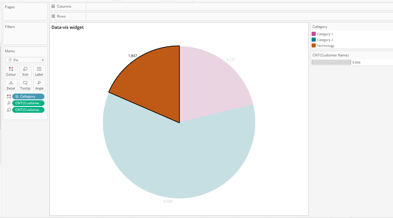
Your chart should update with the newly assigned color.
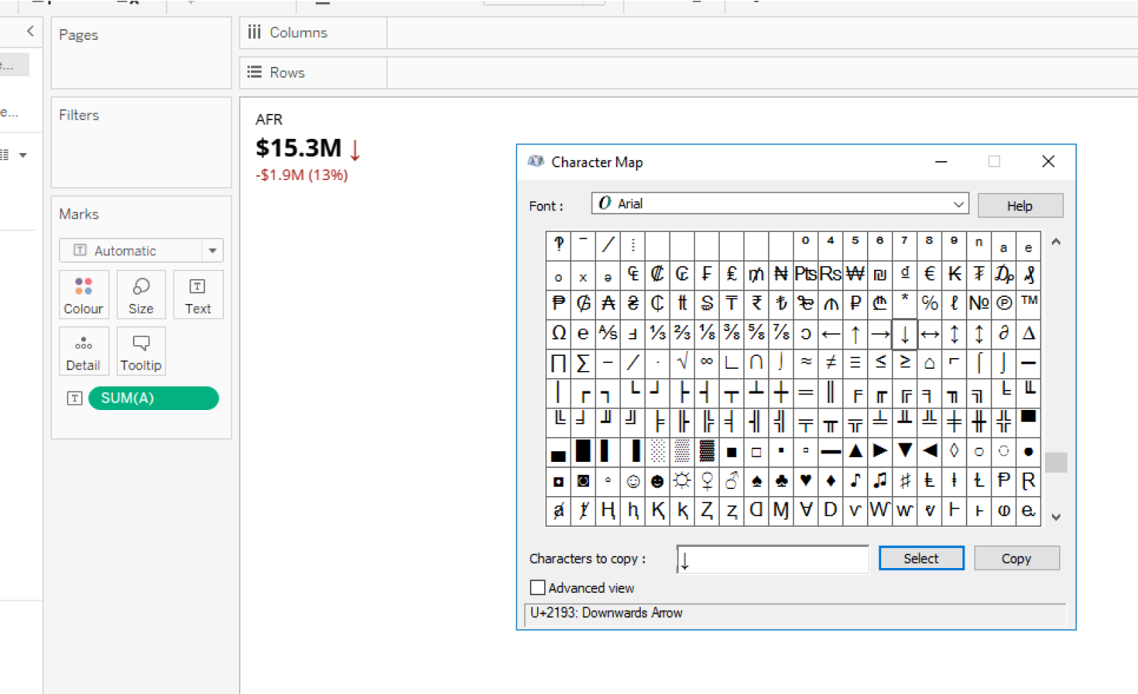
You cannot directly import interactive Salt icons into a sheet/metric type on Tableau due to the functional limitations within a working dashboard. You can import Salt icons into a dashboard as SVG images, but you cannot "hook them up" to any logic/code that enables the icon to update or change a live status as part of the dashboard’s requirements.
For instance, in the Salt dashboard example, the positive metric uses an up arrow to indicate success/increase in value. If this was to change to a negative value, an imported Salt arrow icon wouldn't change in line with this status.
Instead, an alternative solution is to use the Windows Character Map utility to copy and paste characters such as up/down arrows as part of the metric text. This allows a metric to adapt to the dashboard’s functional requirements.