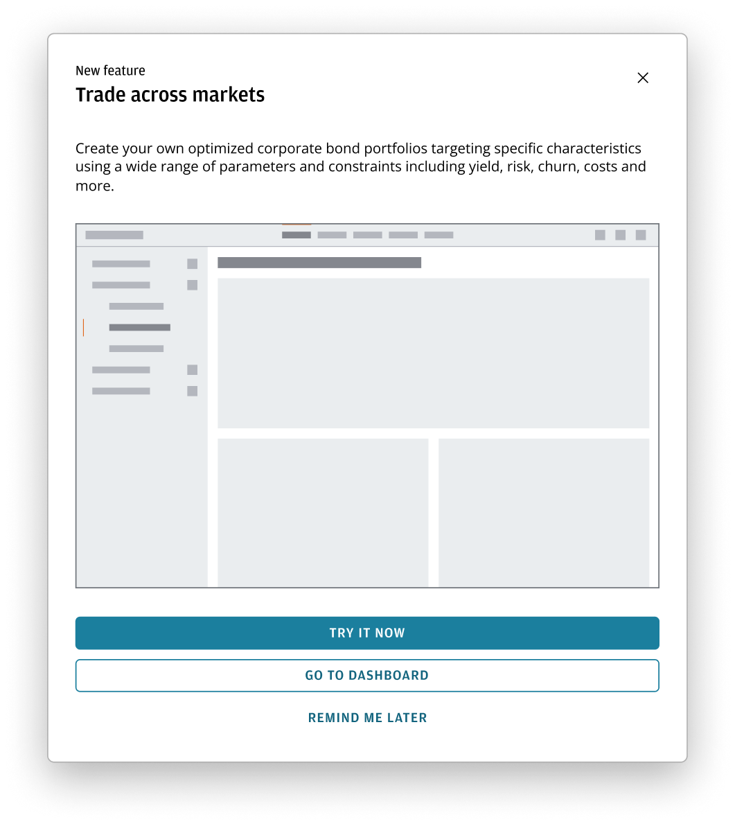
Announcement dialog
An announcement dialog promotes new features and can provide users with access to onward action, such as installing version updates.
Use an announcement dialog to focus the user's attention on new product features or the highlights of a recent release with a follow-up action, such as Download update or Upgrade. They can also be used to display a notification that doesn't require a response from the user, such as a welcome message for new users or an upcoming site-maintenance notification.
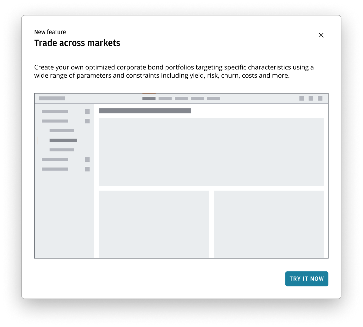
An announcement dialog comprises of the following components:
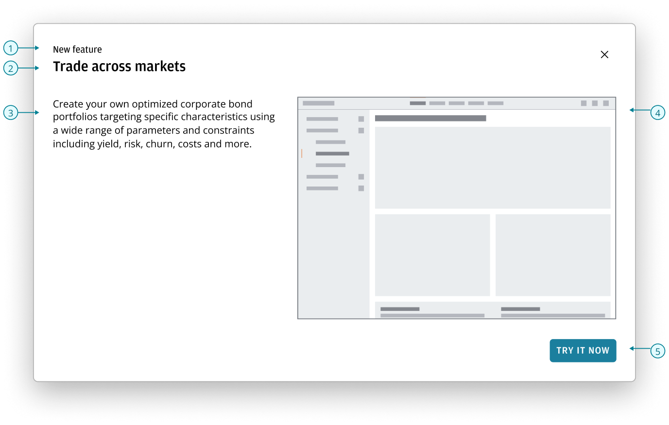
- Pre-header: optional labels that can be used to display the product name, announcement type, or a common descriptor when there are multiple announcements.
- Heading: serves as the main title of the announcement.
- Content area: provides additional information or context to the announcement.
- Image: an image of the new feature or visual elements that add appeal and clarity to important messages.
- Button bar: possible actions for users to take.
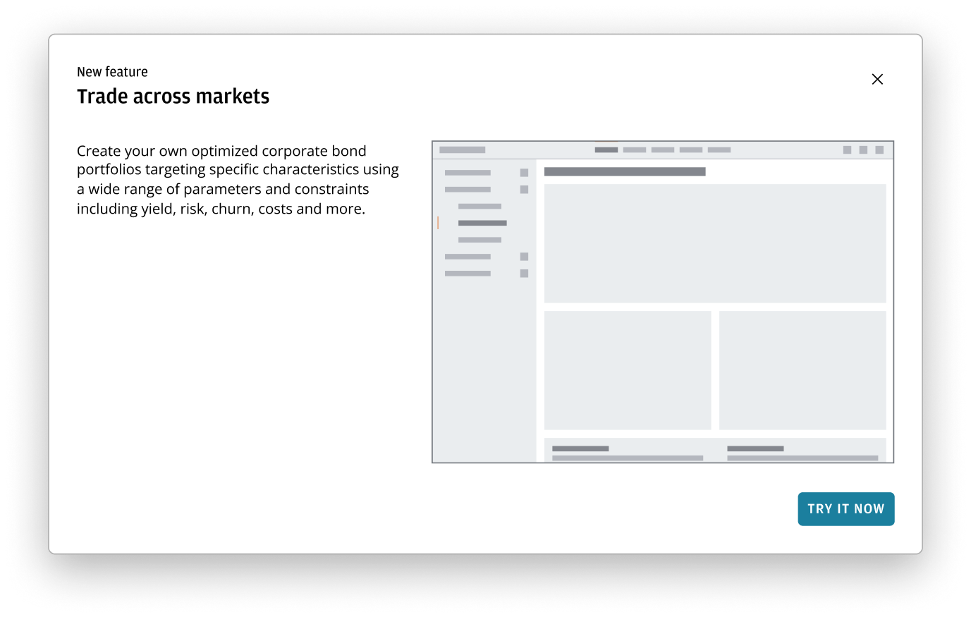
- Use the Header block to display a header and pre-header.
- Use the Dialog and it's components as the base structure of the announcement dialog.
- Use a Button bar to display any actions at the bottom of the dialog. See the button bar pattern to understand how to implement actionable interactions within dialogs across your applications.
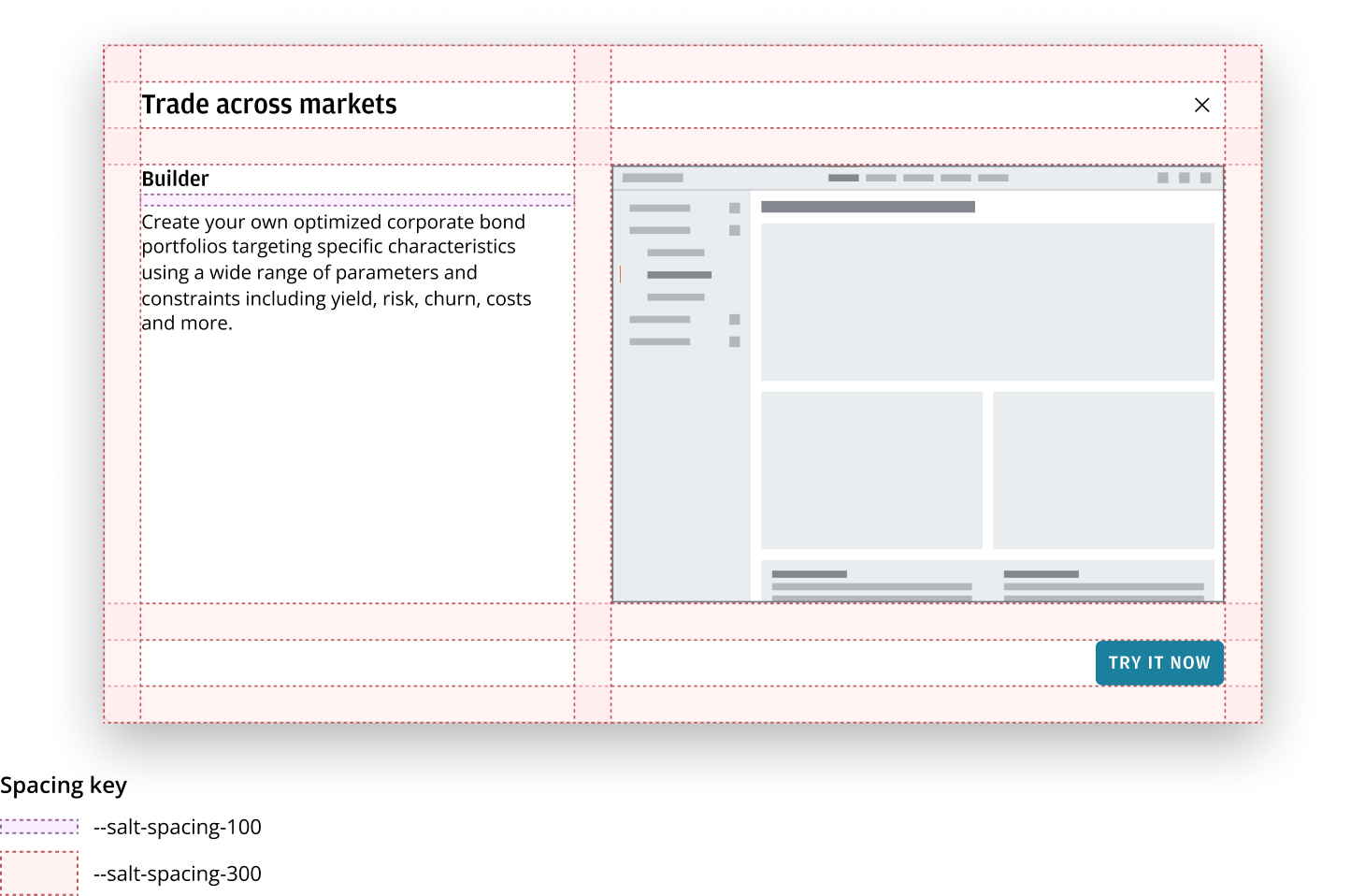
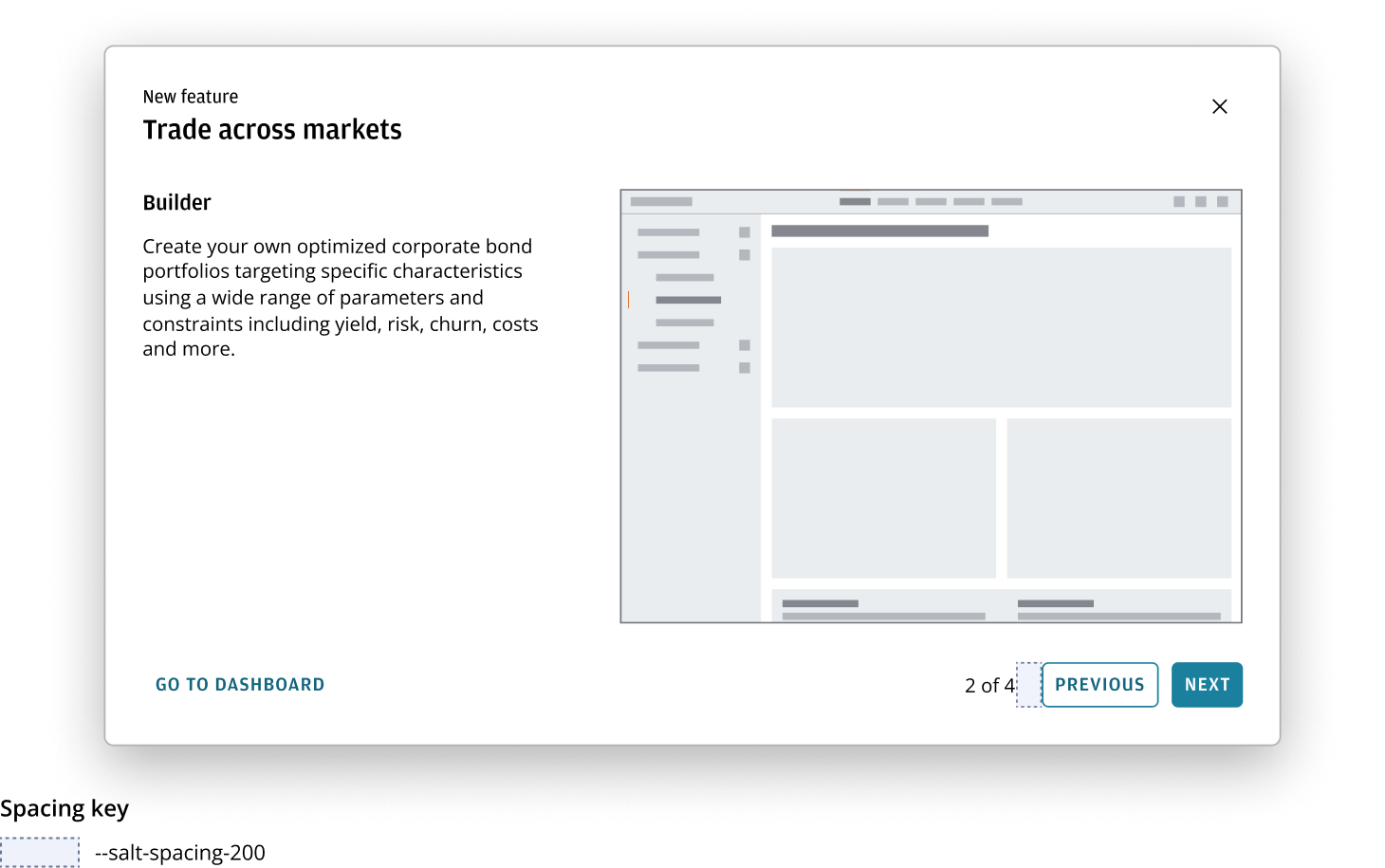
If there are multiple features that need to be announced, include a progress label showing the current and total number of slides in the button bar. The slide indicator uses --salt-spacing-200 from the core buttons.
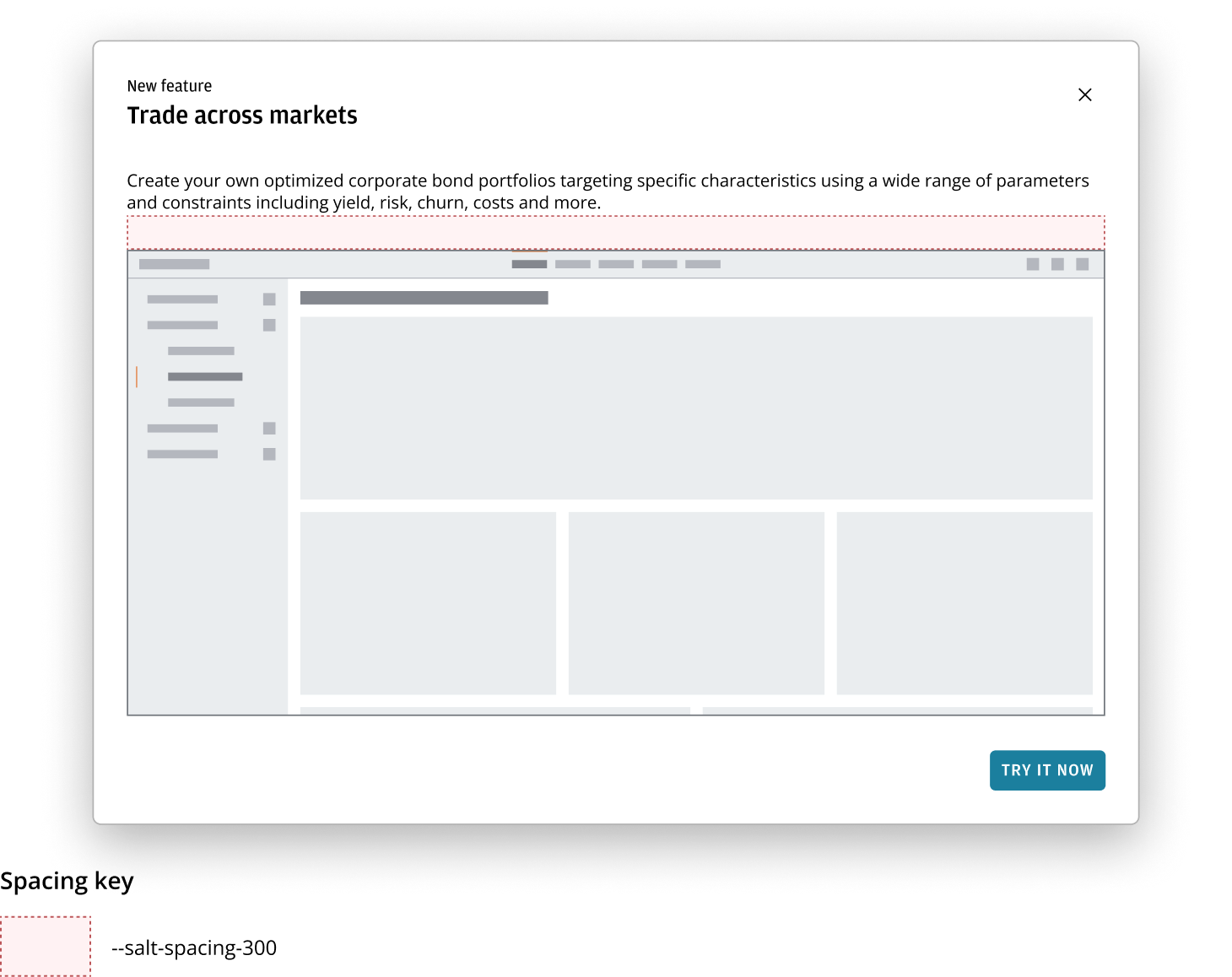
If your announcement would benefit from a large image, vertically stack the content area and image. Apply --salt-spacing-300 between announcement description and image.
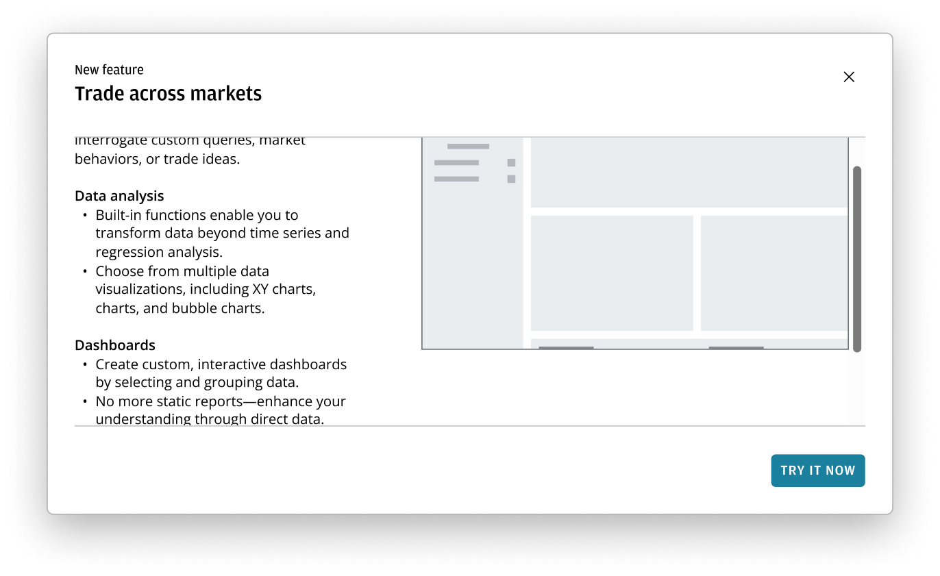
In most cases, scrolling shouldn't be required. If additional content does exceed the available space, only the content area and image should scroll together—keeping the header and button bar visible at all times.
Best practices
- The content in the announcement description should be short and concise. This allows users to quickly grasp the necessary information, reducing cognitive load and preventing abandonment.
- By default, the entire image or infographics should be visible without scrolling. To achieve this, adjust the size of the dialog or check that the image is appropriately cropped.
Once the announcement dialog hits a certain breakpoint, you can configure the layout to either:
- Stack the announcement description and image.
- Change the orientation to stack the button bar.
This mirrors the full image dialog mentioned above.
Refer to the stacked button bar guidance for more information. For a multi-announcement dialog, the progress label appears above the buttons.