Contact details
Contact details display communication information for a person, company, distribution list or individual channel. This can include a name, a phone number or email address.

Use this pattern to:
- Provide details and direct channels of communication for sales or support purposes.
- Display contact information in a directory or CRM (Customer Relationship Management) system.
- Allow users to populate form fields in a workflow with details from a list of contacts, e.g., client contact selection for a ticket.
Consider a data grid when you need to display many contacts with a standardized set of contact information.
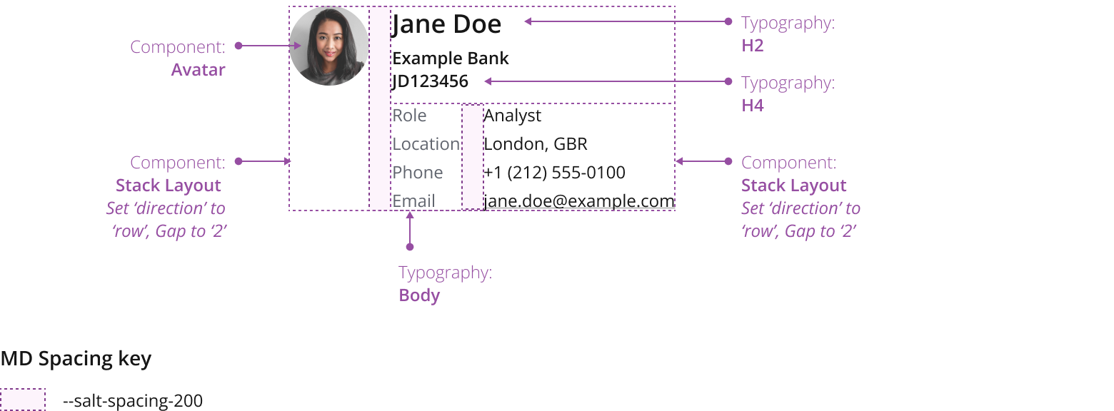
The contact details pattern comprises an avatar and text elements:
- Avatar: A visual representation of the contact that provides a point of reference at glance.
- Header: Contains the name of the contact. Optionally, use text to display further information such as company names or company ID.
- Additional details: Relevant meta data, e.g., role, location, phone number or email. You can define the details as links, making them interactive, to enable immediate communication to a contact from within your application.

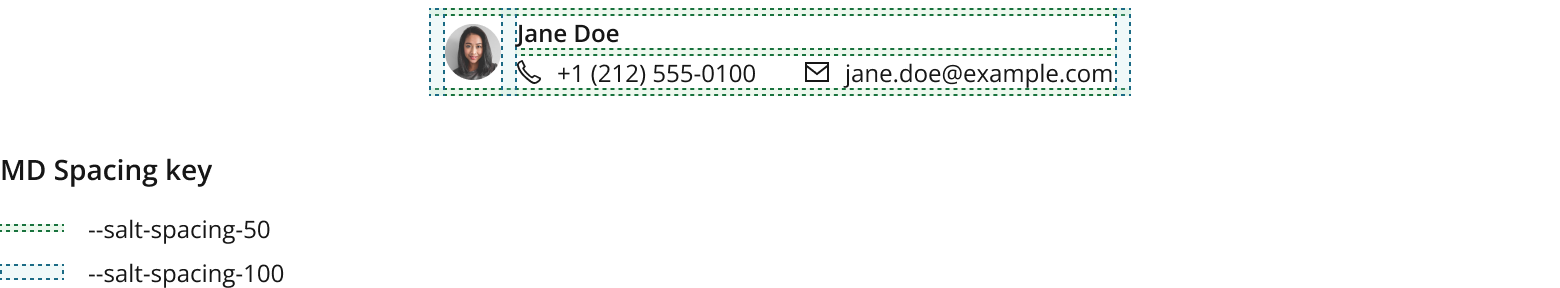
Keep label lengths similar to ensure close proximity to their respective values. If you’re displaying supplementary details, we recommend that you left align their labels.
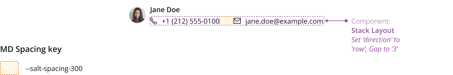
Use StackLayout to display the avatar and all text elements that make up contact details in a row.
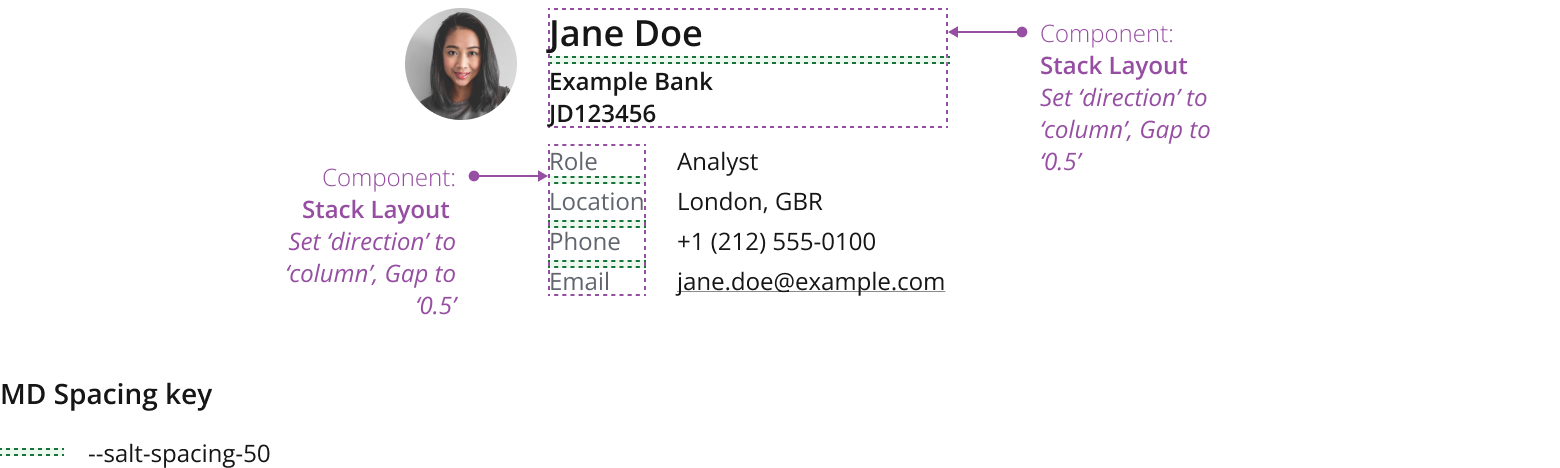
Use StackLayout to display the additional details in a row.
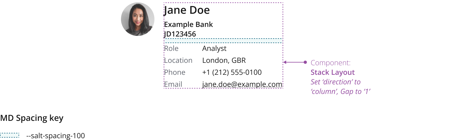
Use StackLayout to display the header and additional details section in a column.
You can use icon descriptors as a visually concise alternative to textual labels—to help users quickly identify the available communication channels.
Refrain from using icon descriptors when you have multiple values for similar channels, such as work and cellphone numbers.
We recommend emails to be interactive links by default, you can also define other details (e.g. phone number) as links, making them interactive—to enable immediate communication to a contact from within your application.

You can embed contact details in a range of container components.
This example demonstrates the component embedded within a card.

You can define quick actions, one-click shortcuts to specific functions or features. This can include starting a new email in Outlook, or calling a contact in Zoom.
Ensure that quick action buttons have a tooltip displayed as per the icon only button best practices.
For layout guidance, refer to the button bar pattern.

If you’re displaying supplementary details, you can configure them to be collapsible.
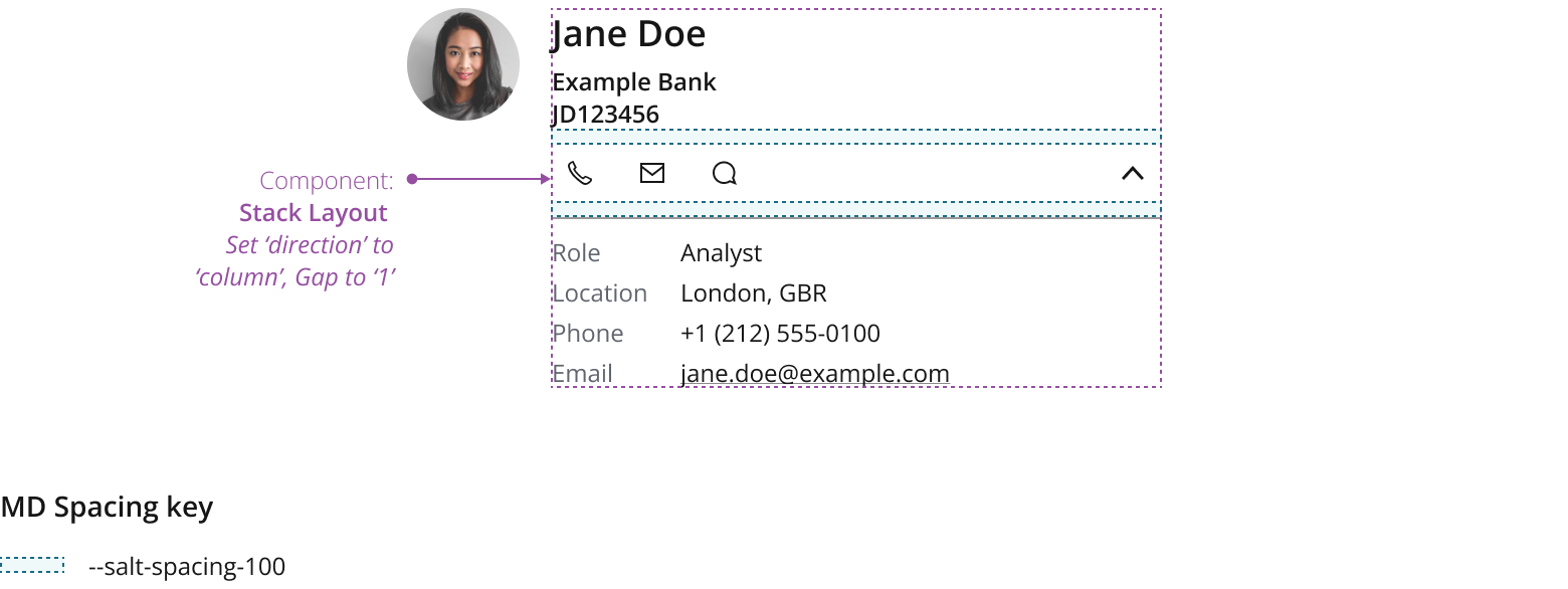
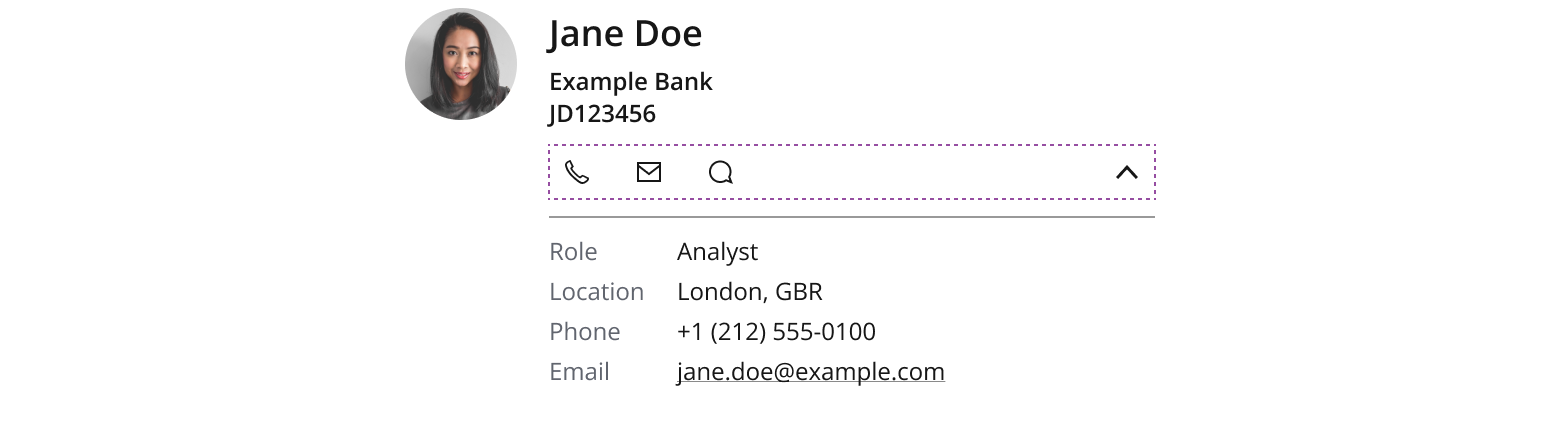
Consider making supplementary details collapsible when they contain secondary information, and don’t need to be always on display.
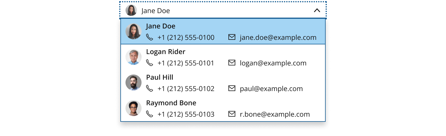
The list version allows you to display a snapshot of key details. It’s ideal when you have restricted real estate, such as in a client picker dropdown menu or a contact directory list.
To show as many options as possible, we recommend you keep data points to no more than one line. Prioritize the most important values.
The link function won't be able to be applied to the text content (e.g. email or phone number) as it is an list item that users select as a whole option from the dropdown.
Use StackLayout to display the text elements underneath the header in a row.
| Date | Summary |
|---|---|
| 2024-09-27 | Updated email with Link. |
If you need to expand the pattern or share feedback with us, please contact the team.