Wizard
The wizard allows a workflow-based task to be displayed in a sequence of manageable steps, for easier completion.
Use wizards to guide users through a series of steps or tasks in a specific, linear order, often with the goal of completing a complex process (e.g., software installation, account setup/onboarding, checkout). Users must complete each step in order before moving on to the next.
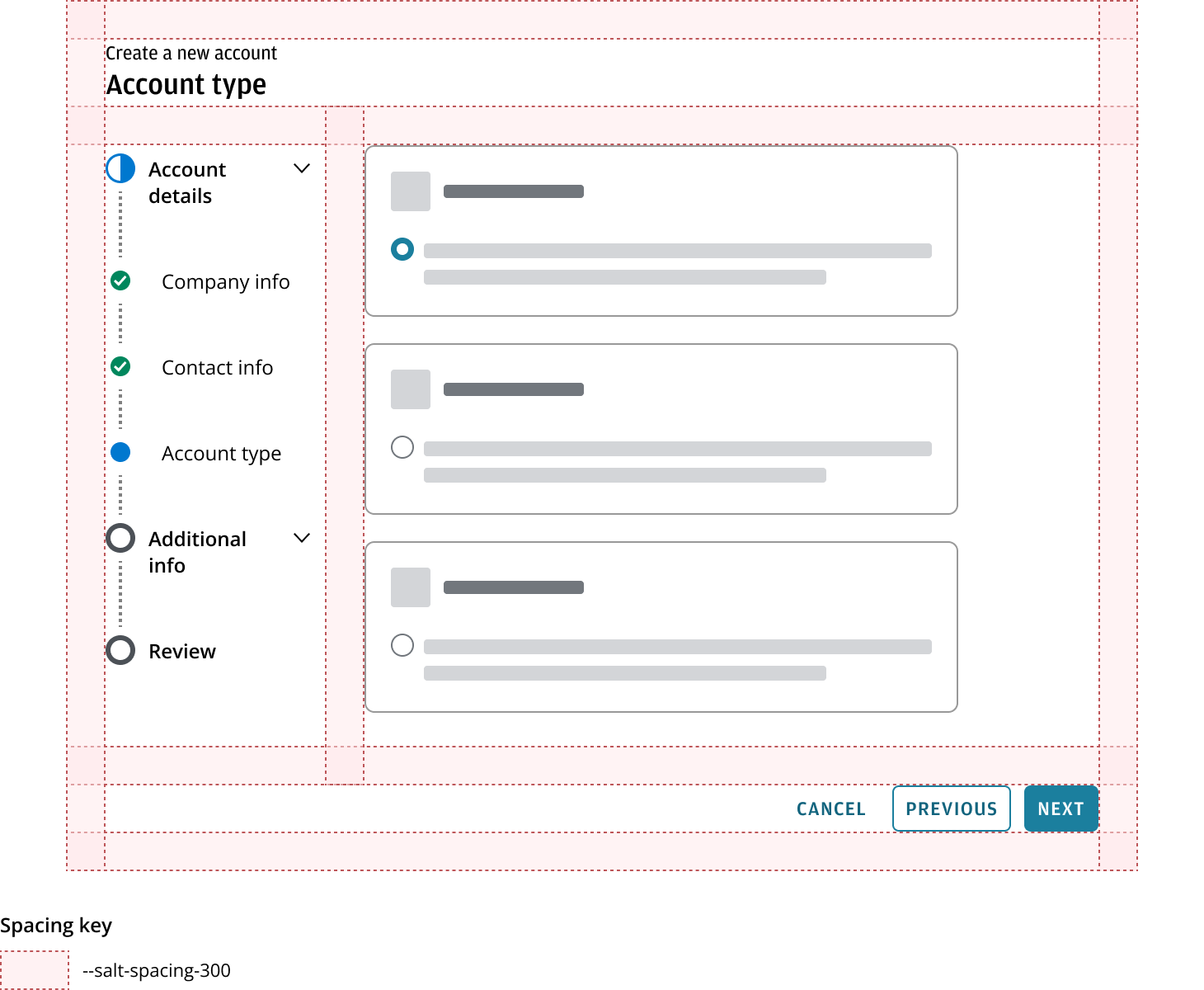
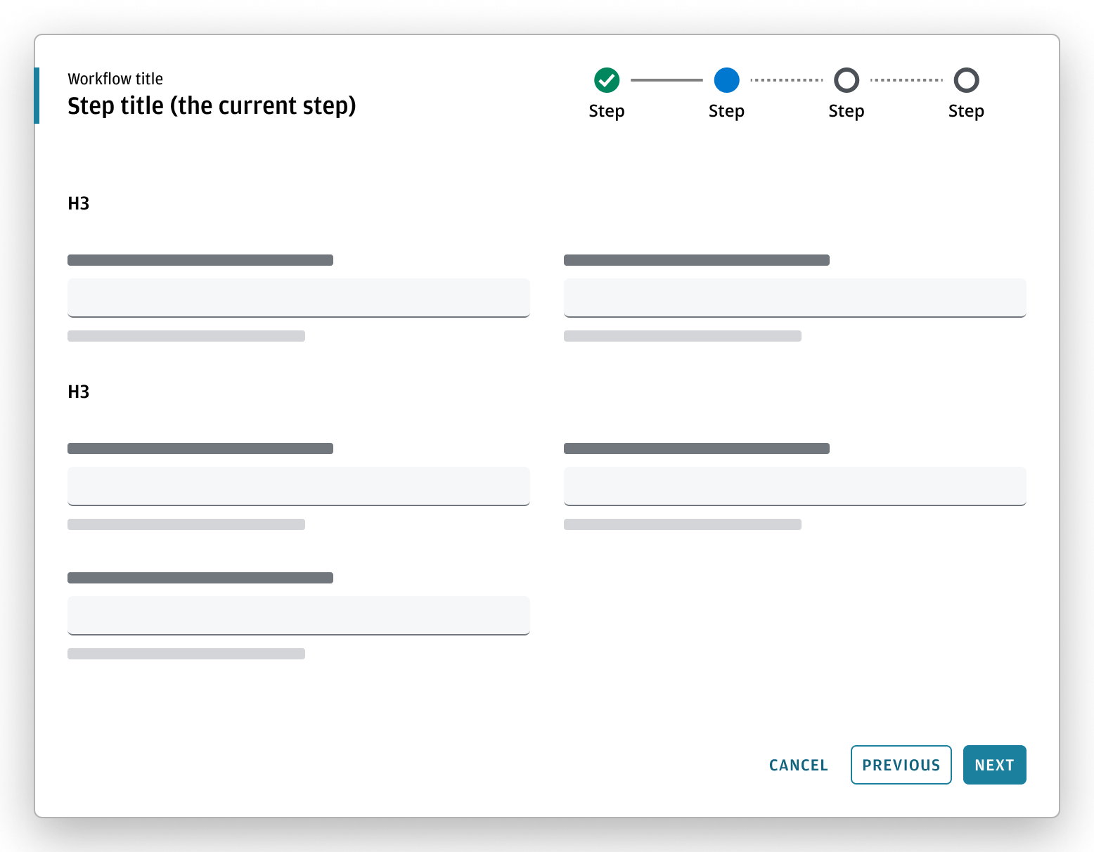
Wizard contains:
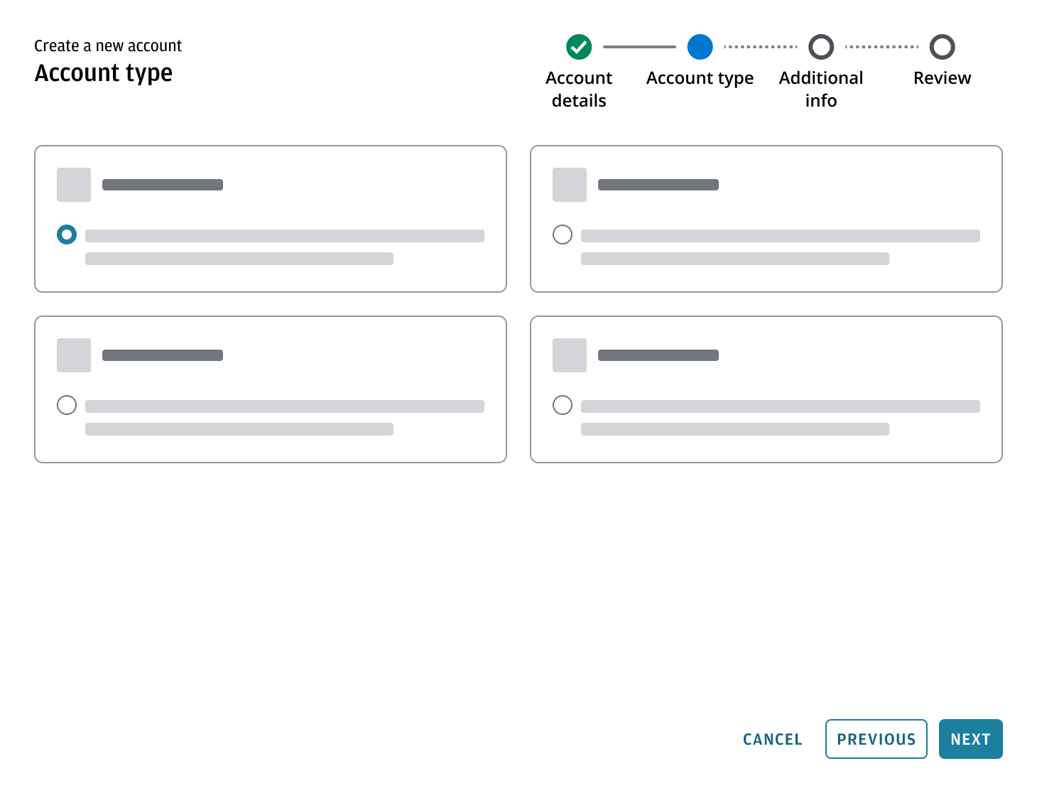
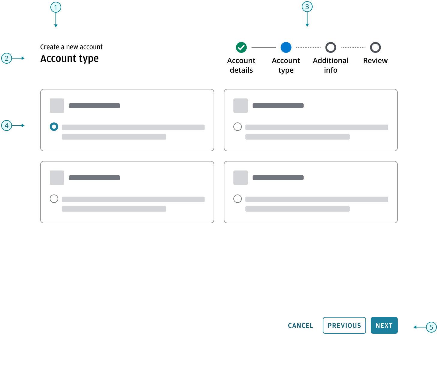
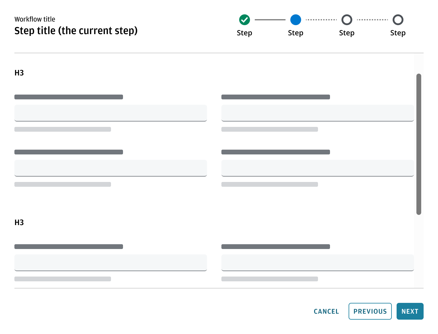
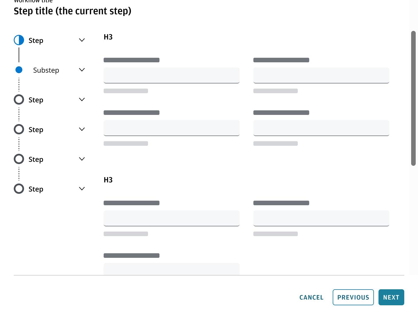
- Workflow title: use a standardized, actionable title that clearly reflects the intent of the wizard (e.g., “Create a new account”). The title should remain consistent across all steps to maintain context.
- Step title: to reflect the current step. Step titles should be concise, descriptive, and clearly reflect the purpose of each step. Use plain language that's easy for users to understand.
- Stepper: to reflect status and progress through steps.
- Content area: displays the relevant content for the current step, guiding the user’s attention to a specific task or piece of information.
- Button bar: possible actions for users to take.
The wizard pattern can be used in different containers depending on your use case, primarily the main region of an application or in a dialog breaking out from the user's current flow.
A wizard should focus on a specific set of tasks, collecting information for a clear purpose. If you need to collect different types of information from a user, provide multiple wizards, each accessed separately at an appropriate time. Avoid linking from one to another directly, ensuring users can complete one flow before starting another.
- The title area of the wizard uses Salt header block pattern.
- Use a Stepper component to display the steps of the flow.
- Follow the button bar pattern guidance for button order layout and button positions in multi-step flows.
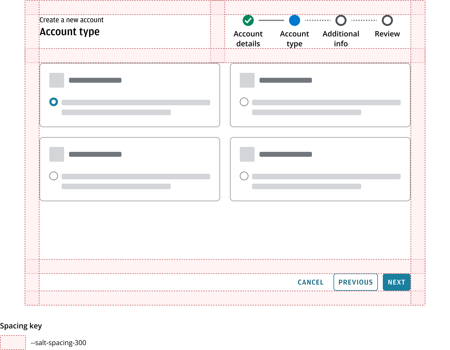
The wizard should maintain a consistent size as users navigate between steps, ensuring a stable and predictable layout throughout the workflow.
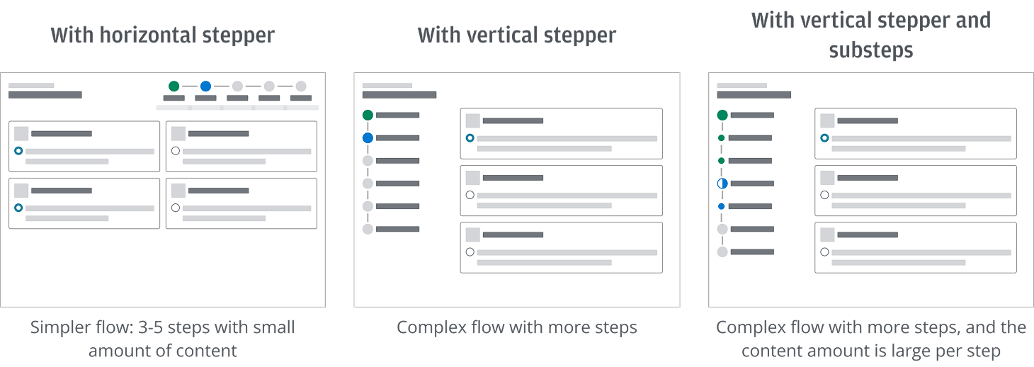
We recommend using a horizontal stepper for shorter and simpler tasks. For more lengthy and complex task flows, use a vertical stepper to break down the process into steps and substeps.
For simpler flows, a horizontal stepper with fewer steps is usually sufficient. If your process involves a large amount of content, we recommend a vertical stepper and a wide, shallow structure. This means breaking the process into more steps with fewer fields per step (use Miller's Law of 7 ± 2 items as a guide) which are easier for users to complete and recollect. Additionally, use substeps to further group closely related fields. This approach can reduce cognitive load and improve usability compared to having fewer steps with many fields.
Fix the button bar at the bottom of the wizard—refer to the fixed approach in Button bar position—so users can always access actions. Allow the main content area to scroll as needed, but avoid duplicate scrollbars in different orientations (for example, both in the browser and within the wizard). This keeps the interface clean and ensures actions remain accessible at all times.
Workflows using a horizontal stepper typically involve fewer fields and simpler layouts. In most cases, scrolling shouldn't be required. If additional content does exceed the available space, only the central content region should scroll—keeping the stepper and button bar visible at all times.
Vertical steppers are used for longer or more complex workflows that may include multiple steps and substeps. In these cases, allow the main content area (i.e., everything above the button bar) to scroll vertically to accommodate more content on the screen. The bottom button bar remains fixed so users can always access key actions without needing to scroll back down.
For guidance on displaying form fields across multiple columns within a wizard, refer to the forms pattern. It provides recommendations on the accessible layout of multi-column forms, including when to use them—such as for experienced users, routine tasks, or when vertical space is limited and scrolling should be minimized.
You can use a Dialog component as a structure base for a modal wizard with a stepper when you need to insert the wizard within another task or flow. The header in the dialog should include the wizard title and stepper.
For shorter tasks that temporarily become the user’s main focus, a modal experience is preferable, as it prevents interaction with the rest of the UI and helps focus the user’s attention on the specific task or information at hand.
Don't include a close button, as it can be ambiguous whether the progress or the entered information will be saved or lost. Use a cancel button instead to clearly indicate the user’s intent to exit the flow, ensuring a conscious, deliberate action to stop the process.
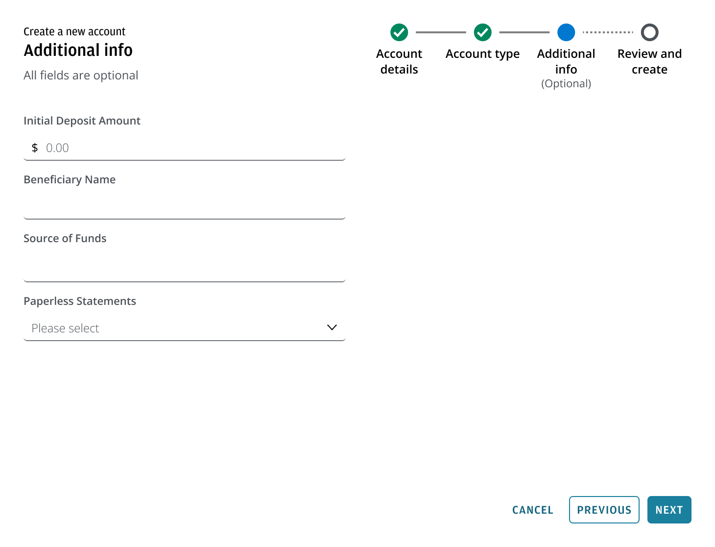
When a step is entirely optional and contains no required fields, you can indicate this beneath the step title (in the stepper). We also recommend to use the “All fields are optional” text in the description under the step title.
For optional steps, keep the next button enabled so users can easily skip the step if they wish.
Indicate the minority: When a step contains both required and optional fields, label only the few optional or required fields as needed.
Wizard can show validation feedback. Feedback can occur either in real time (dynamically) as the user interacts with the form or after submission (when clicking the final action button, e.g., Submit), depending on the validation approach implemented.
When validation feedback is triggered:
- The stepper updates to reflect the validation state.
- All action buttons remain enabled throughout the flow for accessibility and discoverability.
- You should give the user options to resolve issues before they proceed.
- Users can still go back or cancel the flow if needed.
When navigating back through previous steps, the current step is always updated to show ‘Active’ and the steps ahead of the user's current step should always be shown as ‘Pending’ (this includes any steps which were showing validation errors, since these may be corrected, or become unnecessary as the user progresses through the wizard).
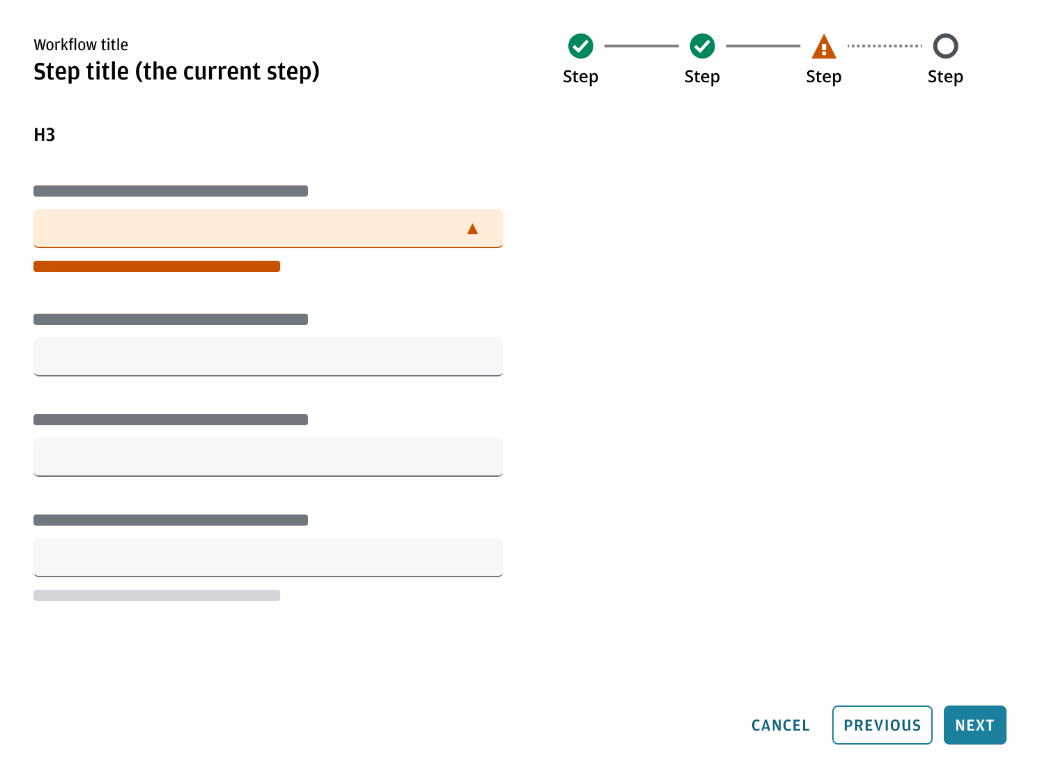
If a step contains a warning after validation:
- The step displays a warning icon.
- The next button remains enabled, as the next step can be accessed without the issue being resolved.
- The warning can appear dynamically (real-time validation) or after the action (on submission), depending on the system’s validation logic.
- Users can go back to review or adjust information as needed.
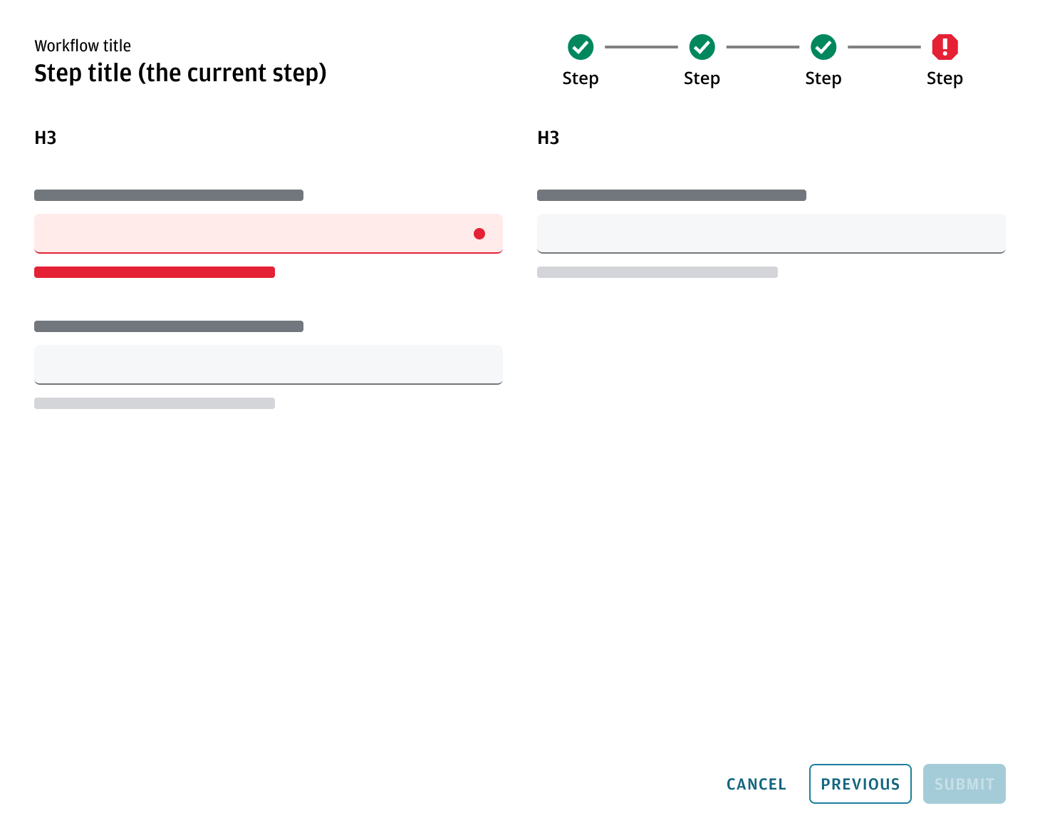
When a step contains an error after validation:
- The step displays an error state.
- Issues in the specific fields or areas that need attention to be resolved are highlighted.
- The next or submit button remains enabled for accessibility and discoverability, but clicking it again should refocus or re-highlight unresolved errors.
- The cancel and previous buttons remain enabled, allowing users to exit or navigate backward in the flow.
- If all errors are resolved and validation passes, the user proceeds to the next step or confirmation screen.
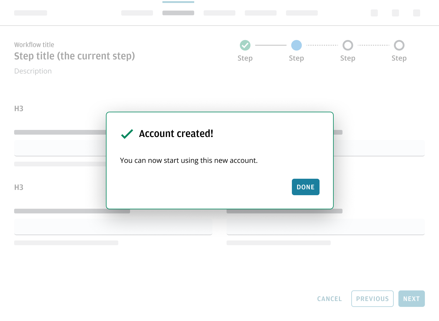
In certain use cases, you may want to provide additional feedback to users after an action is triggered. This includes showing warning, success or other confirmation messages that help users stay informed and confident in their next steps.
Confirmation messages can appear:
- As a dialog over the app’s main content area, or
- As part of the wizard flow within a modal wizard.
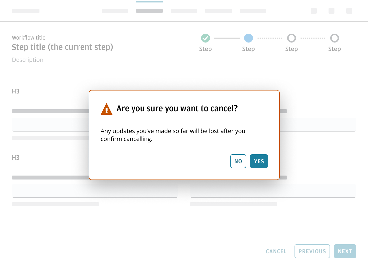
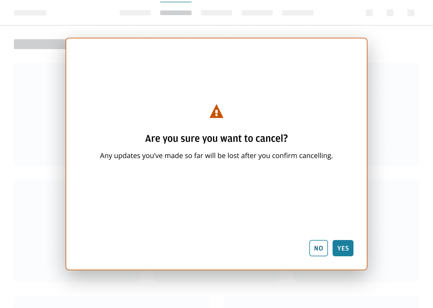
When the user clicks the cancel button, display a warning message if there’s a risk of losing progress. This is especially useful in lengthy or critical flows where saving isn't supported. After confirming the cancel action, it should restore the state to how it was before the wizard began.
Use a completion message to confirm that the wizard task has finished. This message should clearly indicate whether the action was successful or if an error occurred, providing the users with confirmation and closure.